
In this article, we look at how a correlation matrix or a heat plot can be created in Stata. Heat plots are a more visually appealing way of representating the correlations between different variables. You can adjust the colour palette and what each colour represents on your own, though typically, a darker red colour indicates a high correlation while blue tones represent low correlations. Following is an example of how the heat plot will look like, one can change the colour scheme or other formating of heat plot as explained in this article.
Download Example File
To make heat plots in this article, we will use Stata’s built-in auto dataset.
sysuse auto.dta, clear
To obtain a simple correlation matrix, we use the correlate command followed by a list of the variables whose correlations we are interested in.
correlate price mpg weight length
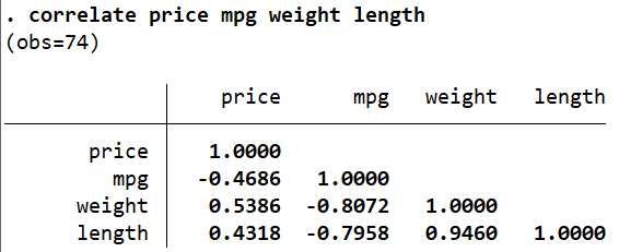
Typically, values between (+/-)0.3 and (+/-)0.5 are considered moderate correlations. Higher (or lower) values indicate a strong positive (or negative) correlation between two variables. ‘price’ and ‘mpg’ appear to have a moderate, negative correlation (when one increases, the other decreases), while, ‘weight’ and ‘length’ understandably have a high positive correlation (when one increases, the other also increases).
These correlations can be represented in a colour-coded manner through a heat plot.
Related Book: A Gentle Introduction to Stata by Alan C. Acock
Heatplot
heatplot is a user-written command that serves the above purpose. Since it is user-written, you may have to install it if it hasn’t already been done so on your Stata.
ssc install heatplot
You may have to install two other user-written commands, palettes, and colrspace to make the heatplot command work.
ssc install palettes, replace ssc install colrspace, replace
The first step to making a heatplot is to store our correlation matrix above in a variable that will store this matrix. Remember that whenever we run an R-Class command, we can use the command return list to see what Stata has stored after the command is run. After the correlate command, Stata saves the following statistics:
return list
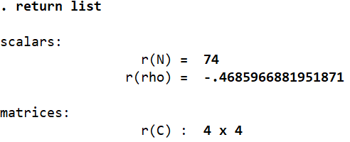
For example, we can see that the number of observations is stored in the scalar ‘r(N)’. The 4×4 correlation matrix itself is stored in ‘r(C)’. We can use this to name the matrix so that we can use it and refer to it in subsequent commands.
matrix corrmatrix = r(C)
Here, we use the matrix command to define a matrix that we named ‘corrmatrix’ as being equal to ‘r(C)’. Let’s now begin exploring the heatplot command.
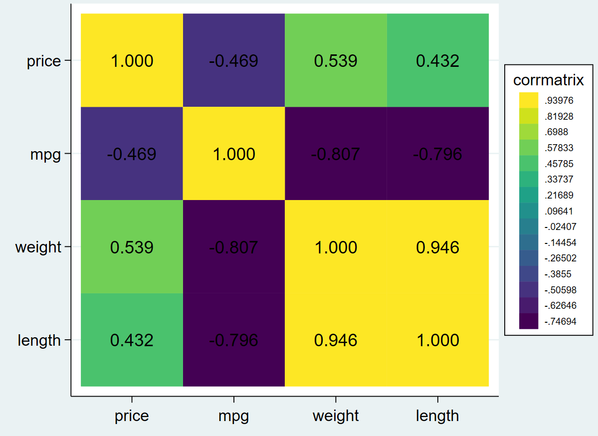
heatplot corrmatrix
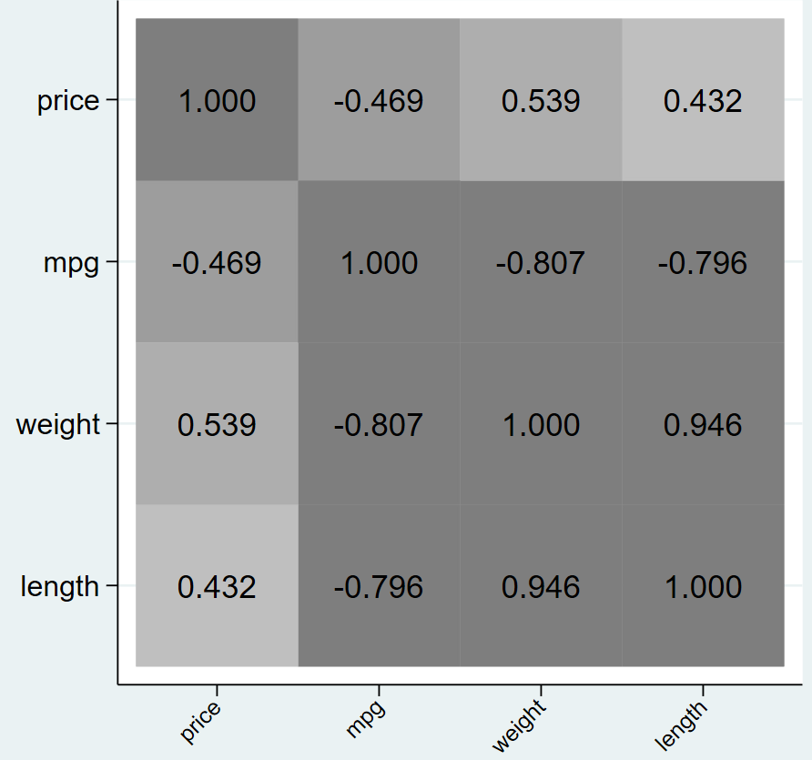
The above command will give us, a simple, colour-coded heatplot made from the correlation matrix we stored in ‘corrmatrix’. It is accompanied by a legend which indicates, for example, that the colour yellow represents values above 0.93976. The diagonal on the heatplot will always be represented by one colour since, as in the matrix, the diagonal stores a variables correlation with its own self (i.e. the values on the diagonal always equal 1, the highest possible correlation).
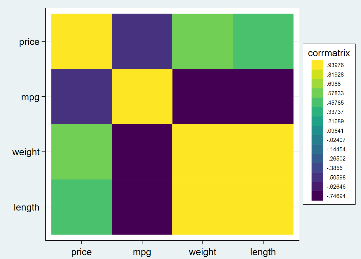
Remember that heatplot is a user-written command. We cannot alter our graphs through menu options when we use it. All alterations will be done through typing out commands with relevant options manually.
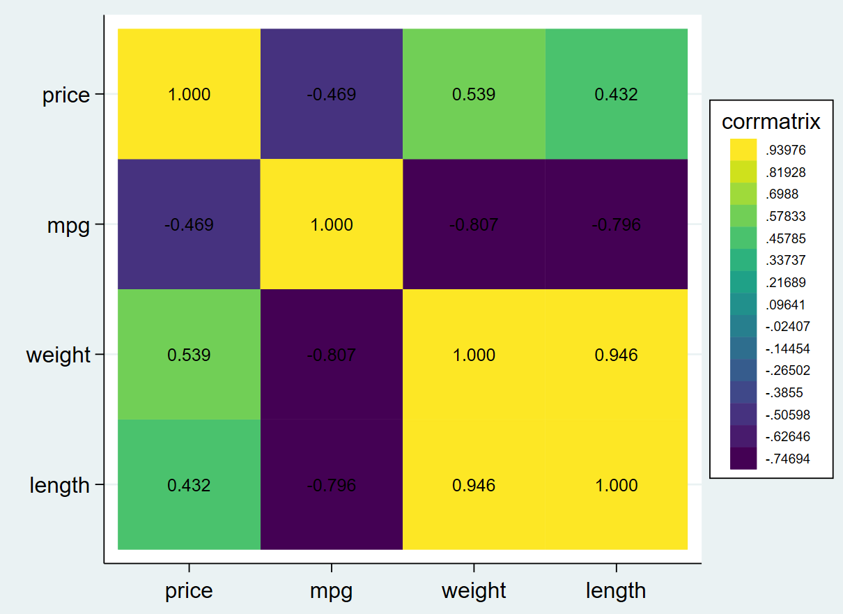
We will now add labels to each box to show the correlations they represent. This is done using the values() option. We can also format these values by specifying a display format within the brackets of this option using the option format(), Here, the format is specified as %4.3f. This means that a total of 4 digits are to be displayed, with 3 digits after the decimal point. The ‘f’ means that the formatting is fixed.
heatplot corrmatrix, values(format(%4.3f))
Now, let’s change the size of these correlation values in this heatplot. Stata has a range of size descriptions that are used for graphs that can be viewed by following the menu options: Graphics -> Two graph (scatter, line, etc.) -> Create -> Market properties -> Size
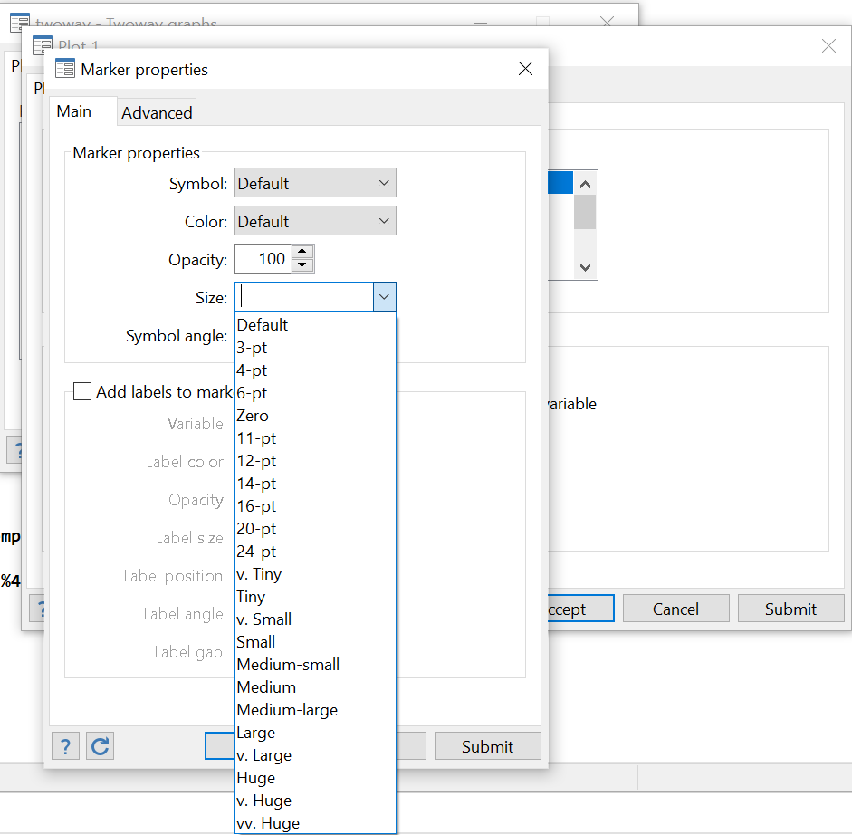
The dropdown menu has a list of all kinds of sizes that Stata allows us to specify when writing commands for graphs. For this example, we will use ‘medium’.
heatplot corrmatrix, values(format(%4.3f) size(medium))
Related Article: Combine multiple graphs in Stata
The correlation values in each box are slightly larger than before. You can experiment with other sizes available to see how the value size changes.
We now want to remove the legend as well since we want the colours on the heatplot to be self-explanatory about the values they represent.
heatplot corrmatrix, values(format(%4.3f) size(medium)) legend(off)
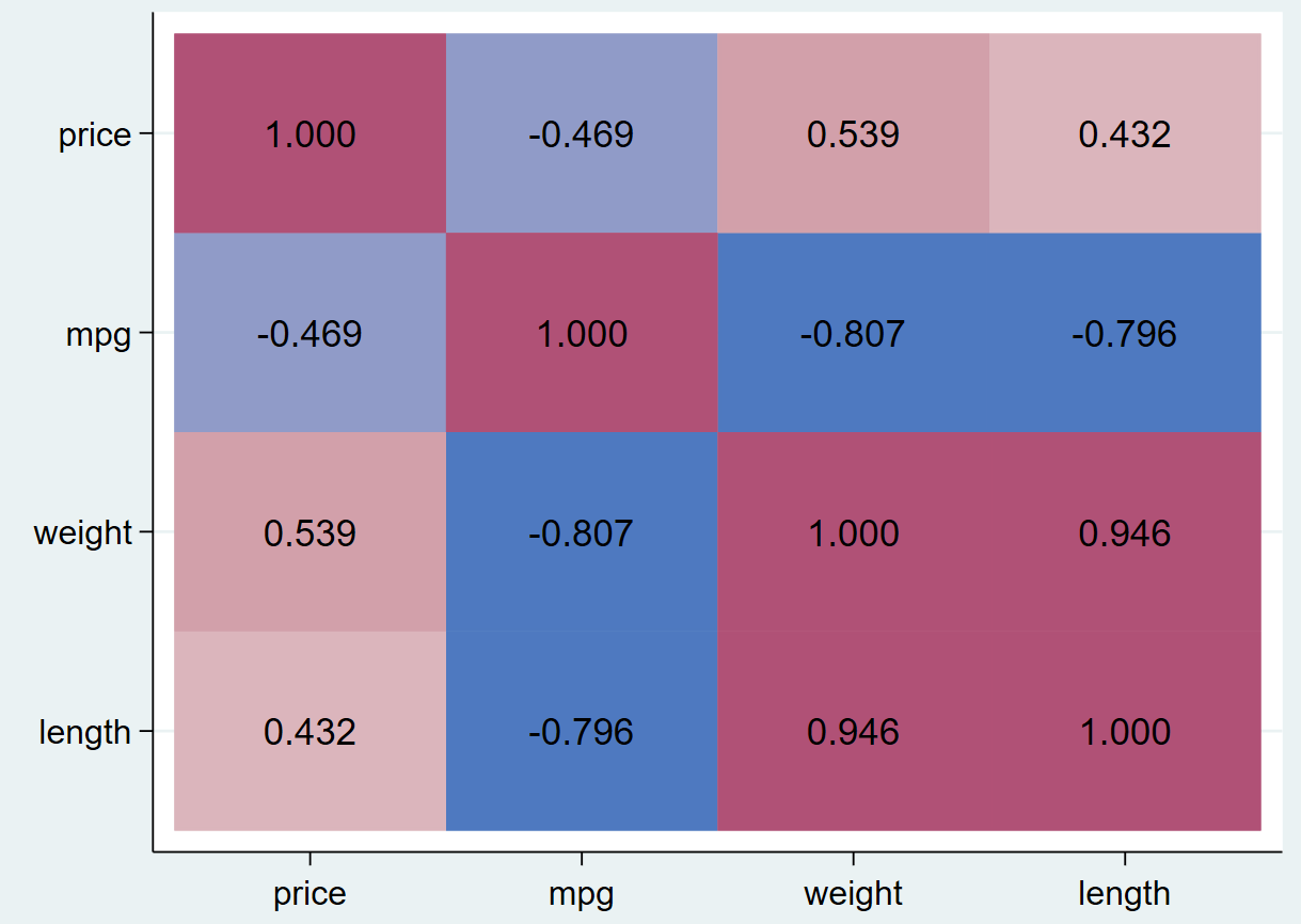
This command removes the legend from the right slide of the graph. Let us change the colour scheme of this heatplot. The option used to do this is called color(). In the parenthesis, we first specify the palette that needs to be applied to the heatplot. In this case, we use the palette called ‘hcl’. More of these can be explored through help heatplot.
The intensity() option in the command below reduces the intensity of the colors of the graph. If you remove it, the color displayed are quite deep – it is rather difficult for the correlation value labels to stay legible. This option allows us to lighten the colors. You can again experiment with different values. Here we reduce the original intensity by 30% by specifying 0.7 in the parenthesis.
This diverging option makes the colours gradually diverge from dark for high correlations to light for low correlations.
heatplot corrmatrix, values(format(%4.3f) size(medium)) legend(off) color(hcl diverging, intensity(.7))
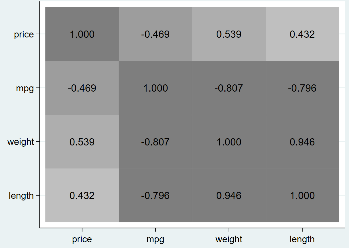
This exact heatplot can also be displayed in a grayscale color palette.
heatplot corrmatrix, values(format(%4.3f) size(medium)) legend(off) color(hcl, gscale diverging intensity(.7))
Related Article: Publication Style Correlation Table in Stata
Furthermore, the aspect ratio of the heatplot graph can also be adjusted. An aspect ratio of 1 produces a square graph. This can be achieved by adding on the option aspectratio(1).
heatplot corrmatrix, values(format(%4.3f) size(medium)) legend(off) color(hcl, gscale diverging intensity(.7)) aspectratio(1)
An aspect ratio of 2 would produce a graph that is twice as tall as its width.
The labels displayed on the x-axis of the graph can also be altered through the xlabel() option. Here we change their size to small, and angle to 45 degrees.
heatplot corrmatrix, values(format(%4.3f) size(medium)) legend(off) color(hcl diverging,gscale intensity(.7)) aspectratio(1) xlabel(,labsize(small) angle(45))
Similarly, we can add an option for the labels for y-axis as well.
heatplot corrmatrix, values(format(%4.3f) size(medium)) legend(off) color(hcl, gscale diverging intensity(.7)) aspectratio(1) xlabel(,labsize(small) angle(45)) ylabel(,labsize(small))
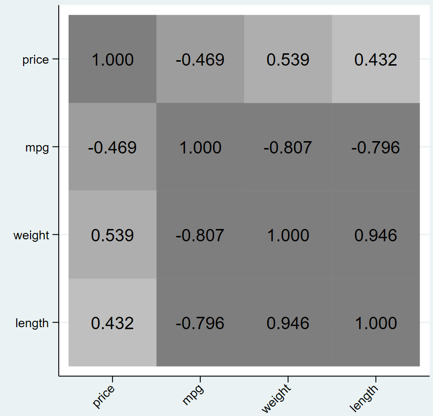
Note that darker tones are always used for higher correlations which does not mean positive values only. Negative values that denote a high negative correlation will also be displayed in a dark colour.
Finally, you can save your graph using the graph save command and naming your graph. Here, we save our graph by the name ‘heatmap.gph’
graph save "heatmap.gph", replace
Sorry to have bothered you. For some (happy) reason it works fine now. I used to have to jump to R to do this and you make it so much simpler! Thanks for this resource.
I verified that it *does* work with the auto dataset.
I was so happy to find this program, but for me it doesn’t work. Here is where it dies (run with set trace on)
– qui replace
X' =x’ + `X’= qui replace __00000N = __00000J + __00000N
variable __00000N not found
I have palettes and colrspace installed.
Thanks for any advice you can give me.
Hi, thank you very much for the instruction. Is it possible to drop values from the heatplot, e.g. only show correlations >0.3? THANK YOU!
There is no option within heatplot, but as heatplot requires a matrix to make a plot, theoretically we can make our own matrix and input it into heatplot.
I replicated the commands as here suggested, and it worked! It is uncommon to read about hints on how to insert commands in a workspace of a statistical software that do actually work (unless they are experts or academic staff members), since the majority of those bloggers who claim to be expert of computer programming has no educational skill, nor they have any kind of expertise on how to correctly assess learners’ feedback.
Thanks for reading the article