
In Part 1 and Part 2 of this series, we examined how an individual’s qualitative characteristics can affect the results of our regression model. First, we analysed how a categorical variable, such as [gender], changes the constant of our regression model (also known as intercept dummy). Subsequently, we examined the impact of multiple categorical and continuous variables, such as [education], [gender], and [age], on predicting [salary] levels.
However, in some instances, not only the intercept of our model can be changed by such variables, but the slope coefficients might also be affected by differences among multiple variables; due to the interaction between categorical variables, and continuous variables. This phenomenon, often referred to as the moderation effect, means that the relationship between [age] and [salary] is influenced by [gender] as well; being “male” or “female” plays a significant role in predicting the impact of [age] on [salary] levels. Part 3 of the series aims to explain methods for incorporating such information into an econometric model.
We start this article by executing the following commands which are used for installing and loading the mandatory libraries:
install.packages(c("dplyr","ggplot2", "ggeffects", "magrittr")) library(dplyr) library(ggplot2) library(ggeffects) library(magrittr)To load the data, execute the following commands again:
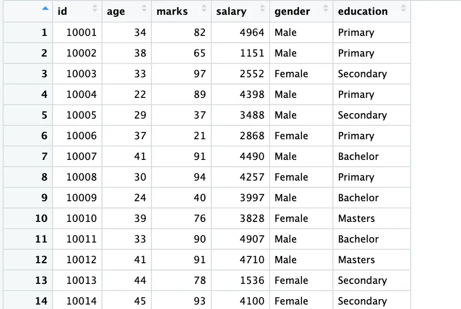
set.seed(123) data <- data.frame(id = 10001:10500, age = sample(20:45, 500, replace = TRUE), marks = sample(20:100, 500, replace = TRUE), salary = sample(1000:5000, 500, replace = TRUE), gender = sample(c('Male', 'Female'), 500, replace = TRUE), education = sample(c('Primary', 'Secondary', 'Bachelor', 'Masters'), 500, replace = TRUE))Execute the following command for an overview of the data:
View (data)
In Part 2, following a traditional way, we converted our string variables (education and gender) into a factor. However, generally, this exercise is not compulsory in R, we do not have to encode variables again and again, as R takes [gender] and [education] as encoded, within the model. Following is a proof of this exercise.
Initially, we will manually encode variables to demonstrate the process. Subsequently, we will verify by manually encoding our variables or using any other built-in method.
To encode the [gender] variable while giving a specific code to our [gender] variable, execute the following command:
data <- data %>% mutate(gender_e = recode(gender, “Male” = 1, “Female” = 0))
Execute the following command to see the [data] again.
View(data)
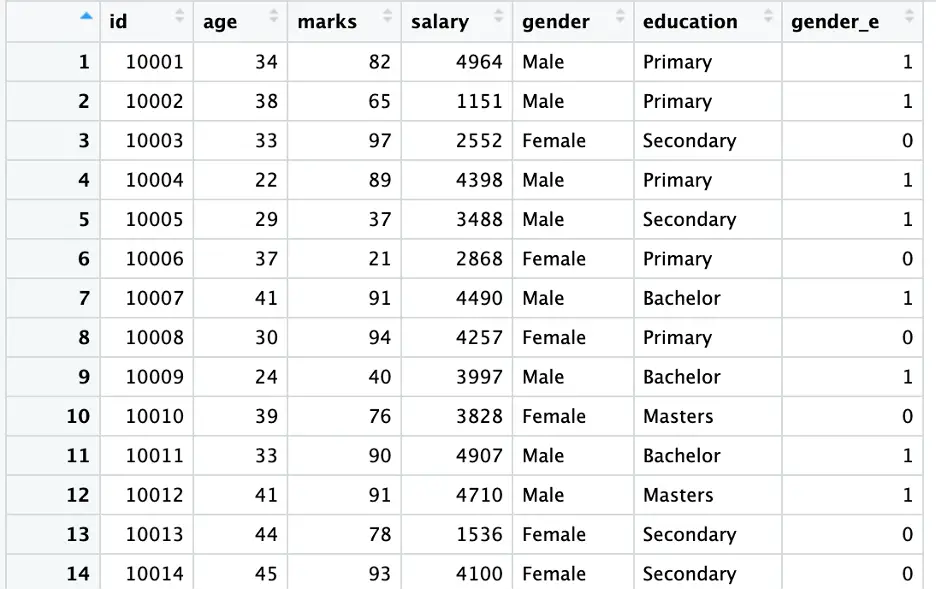
In the above command, we used the [mutate()] function from [dplyr] library along with [recode()] to create a new column [gender_e] based on the values of [gender]. In this example, [Male] is encoded as [1] and [Female] is encoded as [2] (as shown in the above figure).
Note: This command can also be used to give specific codes to a category; taking a category as a benchmark.
As our data is now ready for analysis, we will examine the interaction between variables by fitting three dummy regression models (following three different ways) using the following commands:
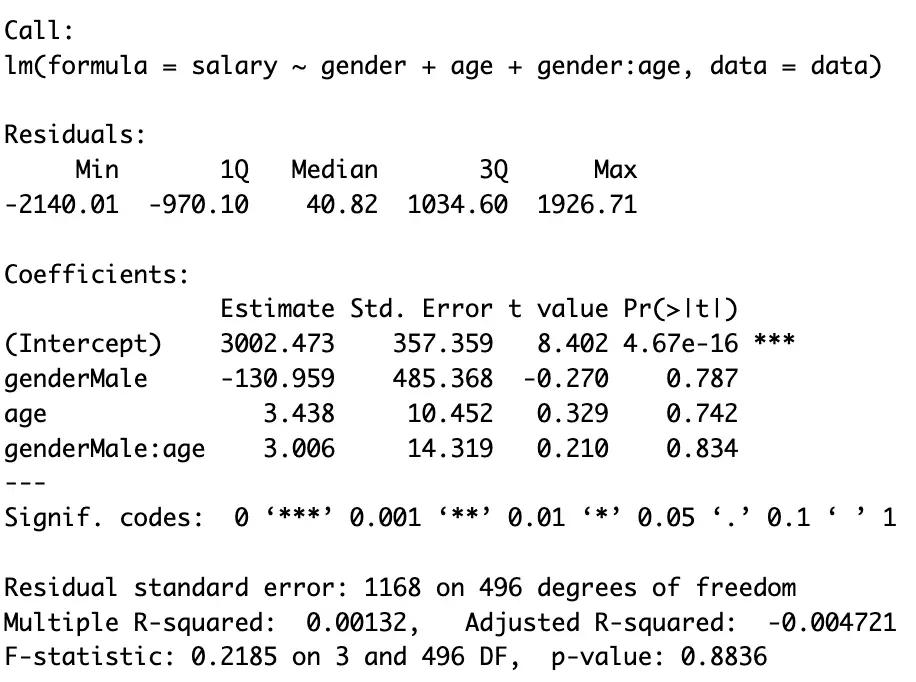
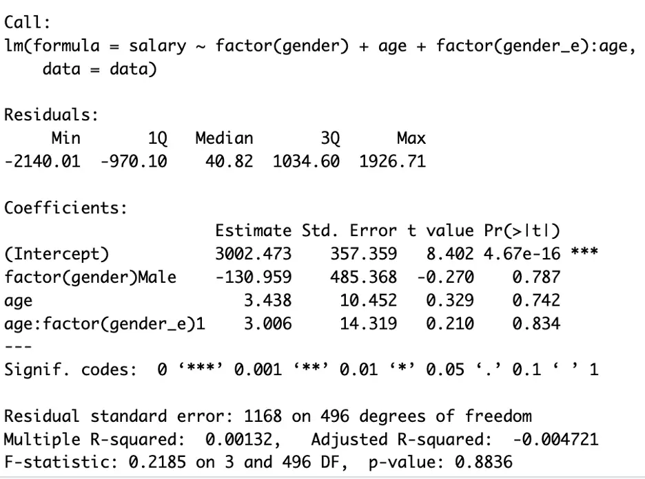
model1 <- lm(salary ~ gender + age + gender:age, data = data) model2 <- lm(salary ~ factor(gender) + age + factor(gender_e):age, data = data) model3 <- lm(salary ~ gender_e + age + gender_e:age, data = data)
To see the results of all three models execute the following commands (results are provided in the following figures):
summary(model1)
summary(model2)
summary(model3)
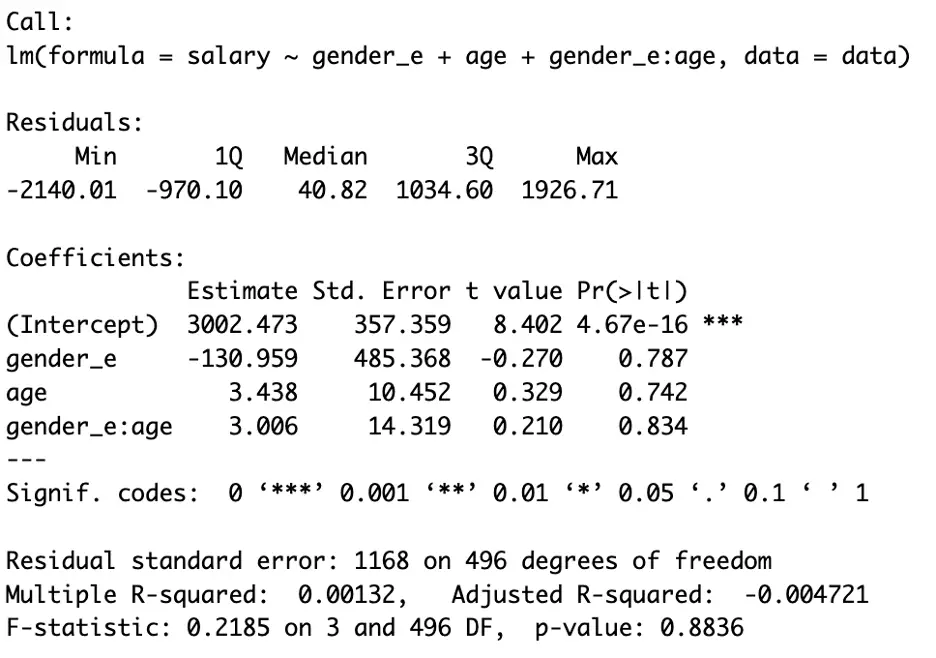
In the above three figures, we can see all the model has the same results.
In the first command [model1] we regressed [salary] on [gender], [education] and the interaction of both [gender] & [age] without encoding; [salary] on [age], [gender] and for the combined effect of age and gender; [age:gender]
In the second command [model2], we followed the built-in way of encoding a categorical variable, and in the third command [model3], we followed the manual way. The rest of the intuition behind the above model is the same (see Part 2 for details), except we use [:] for the moderation or interaction effect.
In the above three figures, we can see the results are the same. In general settings, readers should avoid encoding unless performing the exercise (encoding) is compulsory.
Moreover, another consideration regarding the function performed by this sign [:] should be taken into account. The colon (:) excludes the main effect (individual effect) that [age] and [gender] play in defining [salary]. That’s why we have included both variables in the above commands. Another shortcut way of incorporating the main effect of the two variables can be done using the [*] sign. For the shortcut, execute the following command:
model1_1 <- lm(salary ~ gender*age, data = data)
To see the results execute the following command:
summary(model1_1)
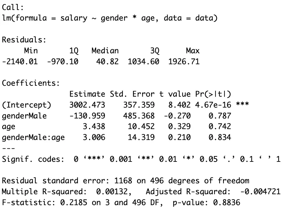
Readers can compare the results of [model1] and [model1_1]. Moreover, they can use these commands based on their preferences and the specific objectives of their analysis.
Interpretations
The interpretation for [female] is that each additional year of [age] is associated with a salary increase of $3.438 (measuring salary in dollars).
[male], on average, earns $130.959 less than [female] (keeping others constant).Additionally, the interaction effect suggests that the [salary] increase per year (assume year as a unit) of [age] is $3.006 higher for [male] compared to [female], although, initially [female] earns higher than [male]. This implies that [age] has a stronger impact on [salary] for [males] as compared to [female].
Interpretations using graphs
We have seen that this interpretation is a bit narrow. Another easy way of doing this exercise is to plot the results of the regression model. Here we will be focusing on plotting our model using a graph by executing the following commands:
First of all, we will fit our regression model:
inter_model_plot <- lm(salary ~ gender + age + gender:age, data = data)
We have a large number of observations. Plotting all of them at once makes the graph messy (an example is provided hereunder). So, we will predict salaries for the age interval of 35 to 40 for both genders using the following commands:
ages_to_predict <- seq(35, 45, by = 1) predicted_salaries_interval_male <- predict(inter_model_plot, newdata = data.frame(gender = "Male", age = ages_to_predict)) predicted_salaries_interval_female <- predict(inter_model_plot, newdata = data.frame(gender = "Female", age =ages_to_predict)) plot_data_interval_male <- data.frame(age = ages_to_predict, predicted_salary = predicted_salaries_interval_male, gender = "Male") plot_data_interval_female <- data.frame(age = ages_to_predict, predicted_salary = predicted_salaries_interval_female, gender = "Female") plot_data_interval <- rbind(plot_data_interval_male, plot_data_interval_female)
The above list of commands aims to predict salary based on [gender], [age], and their interaction within the [age] group (range) of 35 to 40 years. These predictions are then organized into separate data frames [plot_data_interval_male] and [plot_data_interval_female] for plotting purposes. Finally, these data frames are combined [rbind()] to create a single data frame [plot_data_interval] containing the predicted salaries for both genders across the specified age range.
Finally, to plot our results for the [age] group based on the stated exercise, execute the following command:
ggplot(plot_data_interval, aes(x = age, y = predicted_salary, color = gender, group = gender)) + geom_line() + labs(x = "Age", y = "Predicted Salary", title = "Predicted Salaries for Interval 35-40 by Gender")
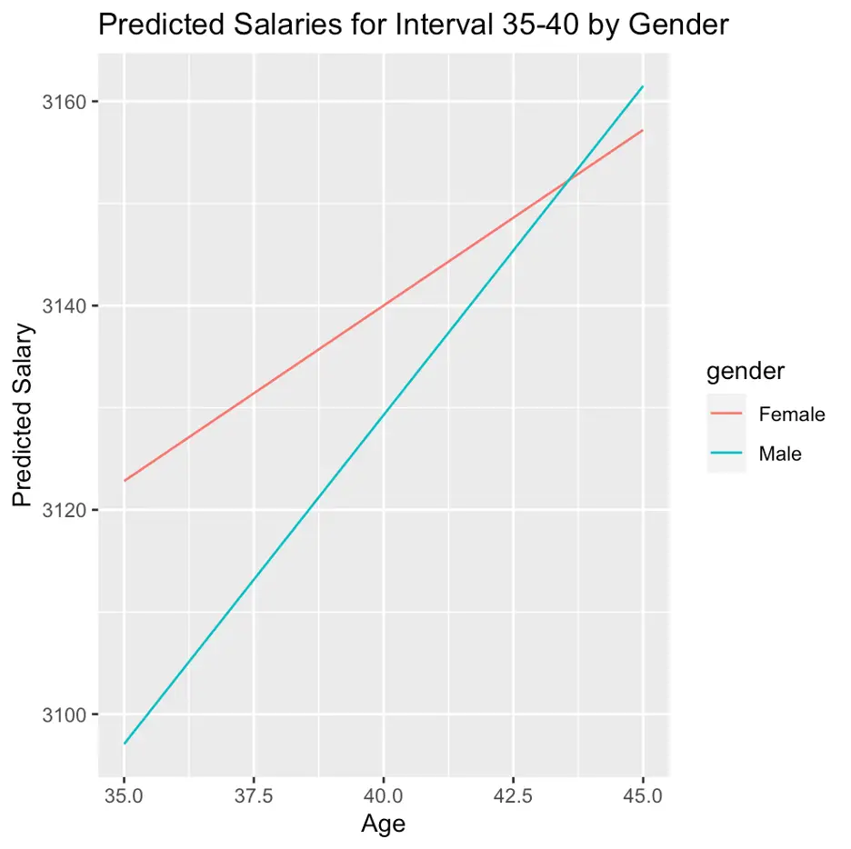
The above command generates a line plot while depicting the predicted salaries for the stated age interval [35-40], using [ggplot2] library. Here, the two lines represent genders. Any label can be given to the axis and any variable can be placed on any axis. Moreover, a title for the plot can be used in the above command. For instance, here [x] represents the horizontal axis. we used/named our horizontal axis as [Age].
The above figure states that initially (at age 35) [female] on average earns more than male (keeping others constant). However, [age] has a stronger impact on [salary] for [males] as compared to [female].
Note: the results may vary between the main model and the age group selected here; 35-40 age group, as the last model only provide results for a specific [age] group.
Interaction between two categorical variables
So far, we have analysed the interaction effect between a continuous and categorical variable; the impact of [gender] on [salary]. However, in Part 2 we also have explored that, both [gender] and [education] impact the [salary] variable. Here, we will explore the interaction of these two variables; [gender] and [education]. For this, first, we will fit our model using the following command:
inter_model1 <- lm(salary ~ gender:education, data = data)
As we have seen that, graphs are more convenient in the dummy regression model. Here, we will plot our results using a graph by executing the following set of commands:
predictions <- expand.grid(gender = unique(data$gender),education = unique(data$education)) predictions$salary <- predict(inter_model1, newdata = predictions)
the above command created a new new data frame for the plotting the results.
To plot the results stored in the above command, execute the following command:
ggplot(data, aes(x = education, y = salary, color = gender)) + geom_line(data = predictions, aes(group = gender), size = 1) + labs(title = "Interacion of Gender and Education on Salary", x = "Education Level", y = "Salary")
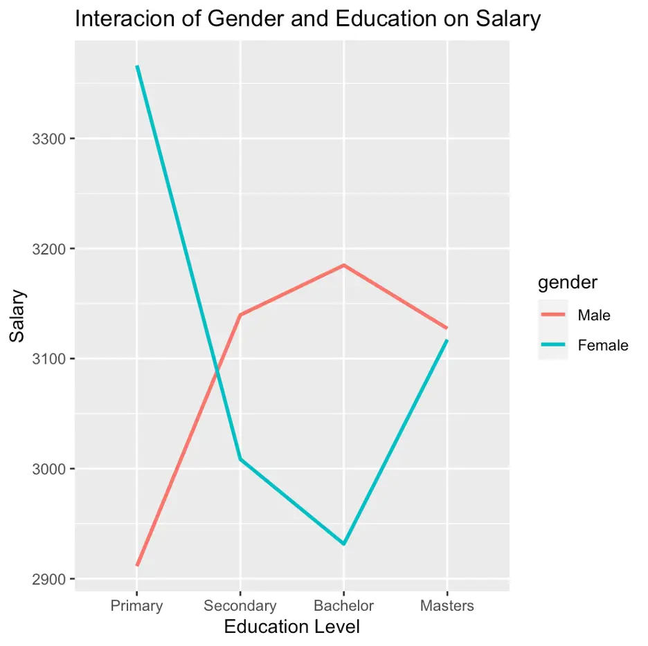
The above figure depicts that having [primary] education [male] earns less than [female], however, for the rest of the education [male] earns more than [female].
Interaction Between two continuous variables
In the previous paras, we have explored the interaction [gender] and [education]. Likewise, there is still a possibility that two continuous variables can also play a role together in the results of our regression model; [age] and [marks] can also interact to impact [salary]. Execute the following command to analyse the interactive role of [age] and [marks] in defining [salary].
cont_inter_model1 <- lm(salary ~ age * marks, data = data)
The above command is used to create a new data frame for predictions
predictions <- expand.grid(age = unique(data$age), marks = unique(data$marks)) predictions$salary <- predict(cont_inter_model1, newdata = predictions)
Likewise, this command is used to create a new data frame for the predictions
ggplot(data, aes(x = marks, y = salary, color = factor(age))) + geom_line(data = predictions, aes(group = age), size = 1) + labs(title = "Interaction of Age and Marks on Salary", x = "Marks", y = "Salary", color = "Age") + theme_minimal()
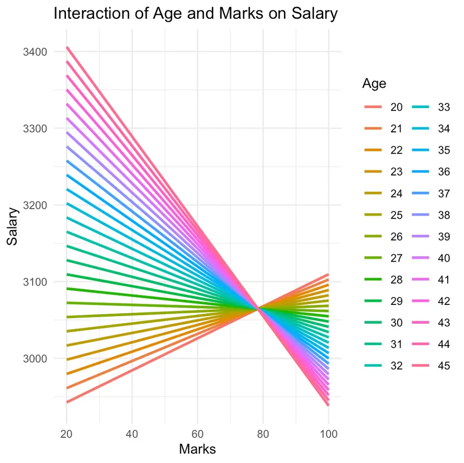
The above command is used to plot the results obtained from the model; [cont_inter_model1]. However, in the above figure, an issue can be noticed; we are unable to interpret our results, even, by using graphs. In our data, we have 500 observations (assume we have data of 500 students). Among them, there are multiple students with different age groups and marks. Here, the analysis of all the 500 students at once, made the graph a bit messy. To overcome this, we will analyse them by making groups of [age] and [marks], as we did previously. Execute the following command to perform this task:
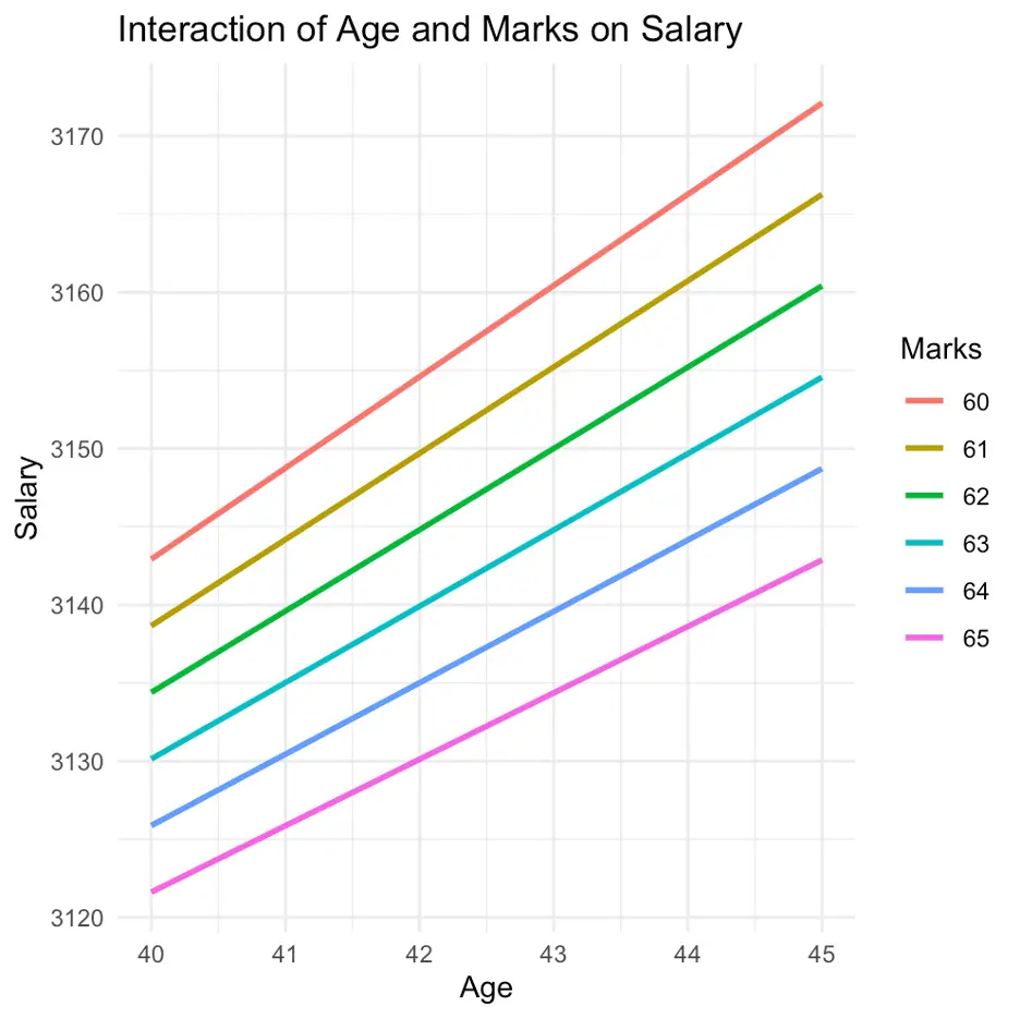
cont_inter_model2 <- lm(salary ~ age * marks, data = data) age_range <- c(40, 45) marks_range <- c(60, 65)
We defined the specific ranges for [age] and [marks] using the last two commands (as stated, the first command is used for the model)
filtered_data <- subset(data, age >= age_range[1] & age <= age_range[2] & marks >= marks_range[1] & marks <= marks_range[2])
we filtered the data using the above command
The following command will create a new data frame for predictions
predictions <- data.frame(age = rep(seq(age_range[1], age_range[2]), each = length(seq(marks_range[1], marks_range[2]))), marks = rep(seq(marks_range[1], marks_range[2]), times = length(seq(age_range[1], age_range[2])))) predictions$salary <- predict(cont_inter_model2, newdata = predictions)
the above commands again created a new data frame for the predictions
ggplot(filtered_data, aes(x = age, y = salary)) + geom_line(data = predictions, aes(group = marks, color = factor(marks)), size = 1) + labs(title = "Interaction of Age and Marks on Salary", x = "Age", y = "Salary", color = "Marks") + theme_minimal()
Finally the above command from [ggplot2] library will plot our results as shown in the following figure
However, an important consideration should be taken into account before plotting the results in the above case. Both axis of the graph should be appropriately selected. If we mistakenly change the axis of the model, the interpretations of our results may be misleading. The issue has been explored in the following example
Again, fit the regression model
cont_inter_model3 <- lm(salary ~ age * marks, data = data)
Define [age] and [marks] group
age_range <- c(30, 35) marks_range <- c(70, 75)
Filter the data
filtered_data <- subset(data, age >= age_range[1] & age <= age_range[2] & marks >= marks_range[1] & marks <= marks_range[2])
Create a new data frame for predictions
predictions <- data.frame(age = rep(seq(age_range[1], age_range[2]), each = length(seq(marks_range[1], marks_range[2]))), marks = rep(seq(marks_range[1], marks_range[2]), times = length(seq(age_range[1], age_range[2])))) predictions$salary <- predict(cont_inter_model3, newdata = predictions) ggplot(filtered_data, aes(x = marks, y = salary)) + geom_line(data = predictions, aes(group = age, color = factor(age)), size = 1) + labs(title = "Interaction of Age and Marks on Salary", x = "Marks", y = "Salary", color = "Age") + theme_minimal()
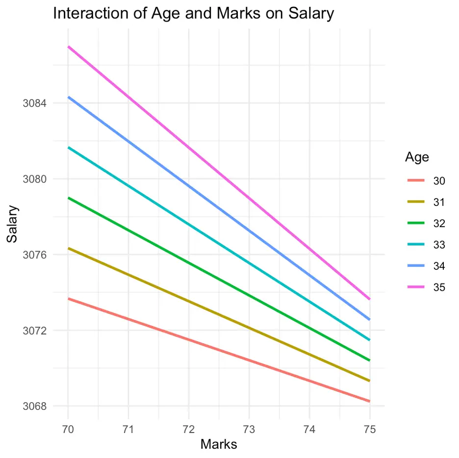
In the above figure, it can be noticed that changing the axis impacts the results significantly and the results have been changed, as well as the way of the interpretation.
In Part 1 and Part 2 of the tutorial, we assessed the impact of categorical and continuous variables on predicting salary levels. Furthermore, in Part 3 we have seen, how the relationship between variables can be influenced by different interactions by presenting both graphical and tabular representations of our models. In Part 4 (the last part of this tutorial) we will analyse how multiple variables collectively play the role of moderation in our model.
Thanks for reading our tutorials. Stay tuned in to thedatahall.com for more insightful tutorials.