
Heat plots, also known as heatmaps, are one of the best visualization tools in a data science. It allows you to quickly assess a dataset, whether you’re just looking for patterns in a set of variables, or need to perform more complex multivariate analysis. A heatmap uses color gradients to create a visual representation of numerical data. This allows you to quickly discern what variables correlate off each other, if there are any interesting patterns or outliers, etc.
In this article, we will dive into creating heatmaps in R, using the widely-recognized “mtcars” dataset. This dataset is convenient for illustration, and it is included by default in R. To load the data set in R, use the following
data(mtcars)
While there are ways to create heat maps with using base R and ggplot2 package, we follow both ways to understand the creation of heat maps using both methods.
Creating a Basic Heatmap using Base R
Creating a heat plot in R can start with the base R function heatmap(), which is straightforward and effective for basic needs. Here is how you can use heatmap() function in a command.
heatmap(as.matrix(mtcars))
This command first converts the mtcars data frame to a matrix. It is essential to convert the data frame to matrix, or R will give an error. The above command will then generate a basic heatmap of the mtcars dataset, with cars on the y-axis and variables on the x-axis. The color indicates the value of each variable for each car.
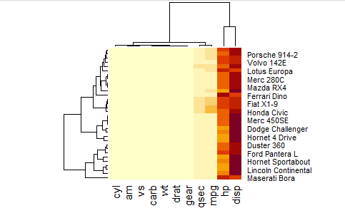
In the above heat map, you can also see a tree like structure, which is called as dendogram. In the context of heatmaps, dendrograms are often used to show the similarity levels between variables or observations, providing a visual summary of the clustering process. We can also remove these dendograms from the heat map using the following command
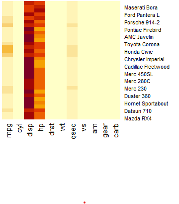
heatmap(as.matrix(mtcars), Rowv = NA, Colv = NA)
In the above command, we are specifying to disable clustering of rows and columns, setting Rowv and Colv to NA respectively.
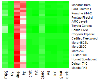
Although there are packages like ggplot2 that can help in customizing the heat plots, but we can also change the color pallet of heat plots manually. To do so, we can control the color scheme by setting the col parameter to a color palette of your choice, created with functions like colorRampPalette(). To customize the color for heat plot of our own choice, let’s use the following command.
heatmap(as.matrix(mtcars), Colv = NA, Rowv = NA, col = colorRampPalette(c("green", "white", "red"))(100))In the above command, while the first part is the same as the previous command, which creates the basic heat map without dendogram, the second part defines a custom color palette ranging from green to white to red, with 100 gradations. The heat map created will look like following
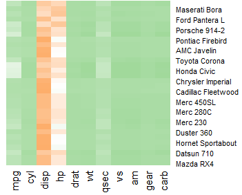
While this heat map looks good, we can also change the intensity of colors, if this seems too bright for your visualization. To change the intensity of green and red colors in the above heat map, we can use the following command.
heatmap(as.matrix(mtcars), Colv = NA, Rowv = NA, col = colorRampPalette(c("#a1d99b", "white", "#fdae6b"))(50))In the above command, #a1d99b is a lighter shade of green, which is less intense than a pure or dark green and the color #fdae6b is a softer shade of red. The above command will generate the following heat map
The codes for colors, used in above command, are supported by R, and to know further about these colors, you can use the following command
?colors
Creating Heat plots using ggplot2
Other than base R, we can also create advanced heat plots using ggplot2. For more advanced visualizations, the ggplot2 package offers greater flexibility and customization options.
Next, we need tidyverse and ggplot2, and reshape2 packages for the creation of heat plots in R. The ggplot2 package is good for creating visualizations and for creating heatmaps. The reshape2 package is necessary to change our data from a wide format to a long format. If you have already installed the packages, just load the packages for creating heat plots using the following command
library(tidyverse) library(ggplot2) library(reshape2)
Creating a heat plot with ggplot2 involves using the geom_tile() function, which fills a space for each combination of x and y with a color corresponding to the data value. To use ggplot2 for creating heat plots, it requires us to convert data from wide to long. To convert data into this shape, we use the reshape2 package that we already have loaded. The next step is to create data in long form, which can be done using the following command
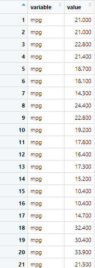
mtcars_long <- melt(mtcars)
In the above command, melt() function is used to convert wide data into a long format and now data looks like following
Now as we see in above data set that row names, which were models of cars, have been removed. However, we want to retain those model names of cars, so another way to convert data from wide to long form, while keeping the car models is using the following commands
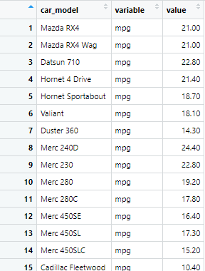
mtcars$car_model <- rownames(mtcars)
mtcars_long <- melt(mtcars, id.vars = "car_model")
The first command creates another variable in the mtcars data set by the name of car_model, and the next command converts the mtcars data from wide to long. The long data is shown as following
Next, we create a heat plot for the long mtcars data set using ggplot2. In ggplot2 package, the geom_tile() function is typically used for the creating of heat plot along with many other variables. The basic way to create a heat plot is geom_tile() function, which can be used in the following way in a command
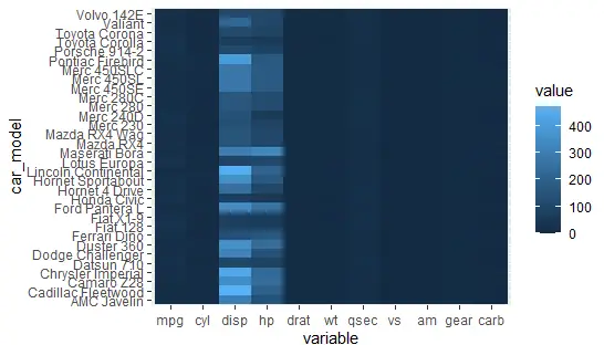
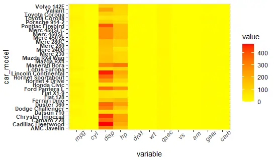
ggplot(mtcars_long, aes(x=variable, y=car_model, fill=value)) + geom_tile()
The above command creates a heatmap where the x-axis represents different variables present in the mtcars dataset, the y-axis represents different car models, and the color of each tile in the grid represents the value of the variable for that car model. The heat map created will be as following
Now, this is a very basic heat map created from the ggplot2 function. The beauty of using R for heatmaps lies in its flexibility and the ability to customize heat plots extensively. There are different ways by which you can customize the heat map, i.e., by changing the color scheme, adjusting the text size, adding annotations or labels, etc. Let’s customize the heat plot by applying the above said customizations one by one.
Changing the Color Scheme
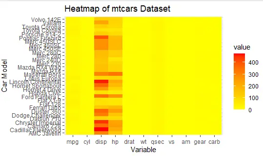
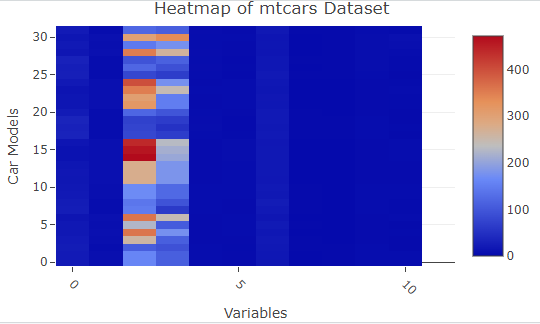
You can change the color scheme of the heat plot by using scale_fill_gradient() the function. This function is part of ggplot2 package, and it specifies the gradient colors used to fill objects based on their values, which is particularly useful for visualizing the range and distribution of data in heatmaps. You can also label the x and y-axis of the heat plot using labs() function. By defining the low and high parameters, you can set the colors for the lowest and highest data values, respectively, with a smooth gradient applied to values in between, as shown in command below
ggplot(mtcars_long, aes(x=variable, y=car_model, fill=value)) + geom_tile() + scale_fill_gradient(low= "yellow", high="red") + labs(title="Heatmap of mtcars Dataset", x="Variable", y="Car Model")
This creates the following heat map
Adjusting the text
The theme() function allows you to change the text’s size, angle, and face for better readability or aesthetics. The text size/style of both x and y-axis label’s can be changed using the theme function.
ggplot(mtcars_long, aes(x=variable, y=car_model, fill=value)) + geom_tile() + scale_fill_gradient(low="yellow", high="red") + theme(axis.text.x = element_text(angle = 45, size = 10, face = "italic"), axis.text.y = element_text(color = "grey20", size = 8, face = "bold"))
The above command might seem difficult to understand at first, but if deconstruct it, the first 3 parts are creating the heat plot and adjusting the color, the fourth and fifth part, adjust the size of the text of x and y-labels. You can change the size and shape of text as per your requirements. The heat plot created will be as following.
Creating Heat Maps using plot_ly
Let’s quickly touch the method of creating heat plot using plot_ly function in R. For this purpose, you first need to install and load the plotly package
install.packages("plotly")
library(plotly)
Next, use the following command to create the heat map.
plot_ly(z = as.matrix(mtcars), type = "heatmap", colors = c("blue", "white", "red")) %>% layout(title = "Heatmap of mtcars Dataset", xaxis = list(title = "Variables", tickangle = 45), yaxis = list(title = "Car Models"))In this command, we convert the data frame to matrix and then specify the type of plot that we want to create, which is heat map in this case. The other type of plots can be scatter plot, line charts, bar charts etc.
The heat map created will be as following
Heatmaps are a powerful tool for data visualization, offering a compact and visually engaging way to present complex datasets. By following the steps outlined in this article, you can create your own heatmaps in R using the mtcars dataset as a starting point. Experiment with different customizations to discover the best ways to convey your data’s story visually. Whether you’re a seasoned data scientist or a beginner in data analysis, mastering heatmaps in R can significantly enhance your data visualization capabilities, providing clear insights into your datasets at a glance.