
After checking the stationarity, the next step is to select the appropriate model for our data to predict future observations in order to enhance things. For this purpose, a number of models are available. We will discuss the ARIMA model. ARIMA (Auto Regressive Integrated Moving Average) model, which comprises three parts AR, I, and MA,. AR is an auto-regression component that represents the relationship between current and previous lagged values. The I component represents the differencing of our time series in order to make it stationary (which means removing trends and seasonality). The MA component determines the relationship between current observations and error terms from past observations. There are several ways to identify the order of these models. One is by using the function auto.arima. This function will automatically choose values for the (p, d, q) model. The second is that you can choose by yourself a number of ranges in order to check the validated model. One more option for selecting the model is to use autocorrelation and partial autocorrelation plots. These plots are commonly used as diagnostic tools in order to check the order of the ARIMA model. The ACF plot gives us the order for MA, and the PACF plot gives the order for AR. Spikes show us the correlation of those time lags. The number of significant spikes shows the order of AE and MA. Significant spikes are those that are above the confidence interval. In R plots, the confidence interval is indicated by the blue dashed lines. Spikes that are higher than the confidence interval are significant. Let’s understand it with an example.
Below is the code for model evaluation.
The code below will help you download the stock price data that we used before. The historical stock prices for Apple Inc. (AAPL) were received from the Yahoo Finance API.
# Download historical stock prices getSymbols("AAPL", from = "2020-01-01", to = Sys.Date(), src = "yahoo", adjust = TRUE) stock_prices <- Cl(AAPL) # Closing prices # Plot the stock prices ggplot() + geom_line(aes(x = index(stock_prices), y = stock_prices), color = "blue") + labs(title = "AAPL Stock Prices") 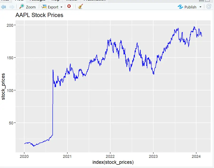
It can be seen that the data has fluctuations and does not show any specific pattern.
Continuing with the previous code from the stationarity check article,.
Library(forecast) # Fit an ARIMA model to the differenced series using auto.arima to automatically select parameters arima_model <- auto.arima(differenced_prices) arima_model # Forecast future values forecast_values <- forecast(arima_model, h = 30) # Forecasting 30 days ahead as an example # Plot the original and forecasted values plot(forecast_values) # Evaluate forecast accuracy accuracy(forecast_values)
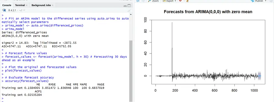
In the above example, appropriate values for p, d, and q for the model are automatically selected by the software, and the forecast for the next month is displayed in the plot. ARIMA (0, 0, 0) is selected there. This can be due to no autocorrelation in the data. This gives us an average model that does not include any components.
However, if you want to choose the model of your own choice, you can use the code below.
# Specify the ARIMA model parameters p <- 1 # Autoregressive order d <- 1 # Degree of differencing q <- 1 # Moving average order # Fit an ARIMA model with the specified parameters arima_model1 <- arima(differenced_prices, order = c(p, d, q)) arima_model1 # Forecast future values forecast_values <- forecast(arima_model1, h = 30) # Forecasting 30 days ahead # Plot the original and forecasted values plot(forecast_values) # Evaluate forecast accuracy accuracy(forecast_values)
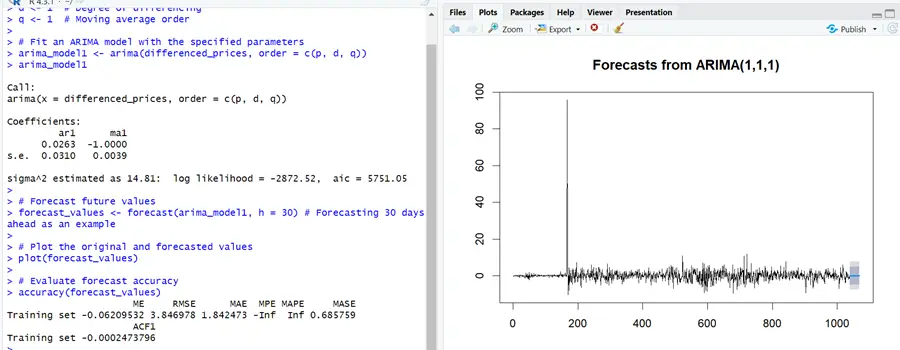
The code above will help you choose the model of your own choice.
Next are the ACF and PACF plots to determine the order of AR and MA.
# Load necessary packages
library(forecast) # ACF and PACF plots acf_result <- acf(differenced_prices, lag.max = 20) pacf_result <- pacf(differenced_prices, lag.max = 20) # Plot ACF plot(acf_result, main = "ACF of Differenced Series") # Plot PACF plot(pacf_result, main = "PACF of Differenced Series")
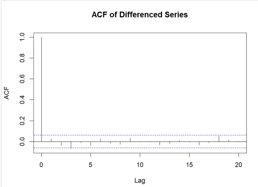
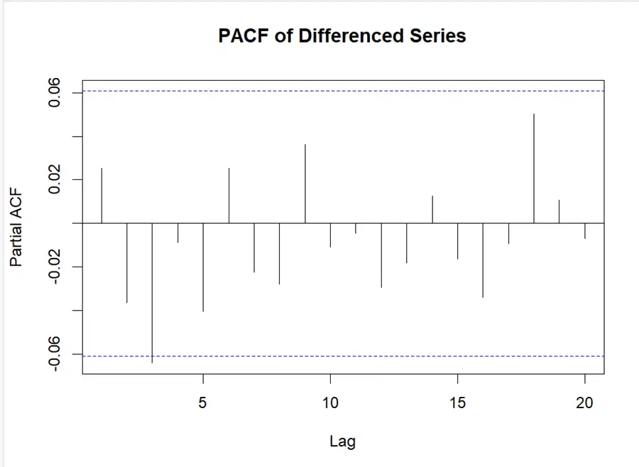
It can be seen that there is no significant spike in our data, which is showing low autocorrelation. Due to insignificant spikes in ACF and PACF plots, ARIMA (0, 0, 0) had been selected.
As in this scenario, there is no significant spike in our data, we can move on to check for different values of p, d, and q.
# Fit ARIMA models with different orders arima_model_1 <- arima(differenced_prices, order = c(0, 0, 0)) # ARIMA(0,0,0) arima_model_2 <- arima(differenced_prices, order = c(1, 0, 1)) # ARIMA(1,0,1) # Print AIC for each model cat("ARIMA(0,0,0) AIC:", arima_model_1$aic, "\n") cat("ARIMA(1,0,1) AIC:", arima_model_2$aic, "\n") # Compare AIC and select the model with the lowest AIC if (arima_model_1$aic < arima_model_2$aic) { selected_model <- arima_model_1 } else { selected_model <- arima_model_2 } selected_model # Forecast future values forecast_values <- forecast(selected_model, h = 30) # Forecasting 30 days ahead as an example # Plot the original and forecasted values plot(forecast_values)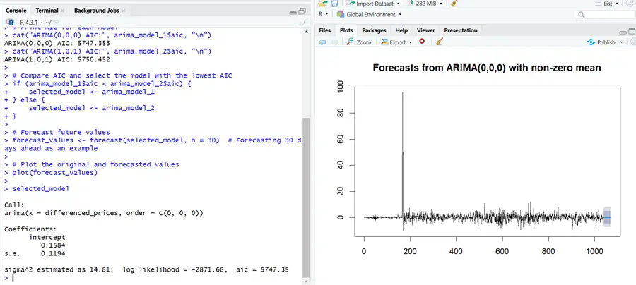
Model selection processes like AIC (Akaike Information Criterion) and BIC (Bayesian Information Criterion) are helpful to select the model with appropriate parameters. Models with the lowest AIC and BIC are the best-fit models.