
In part 1 of this tutorial, we examined how a categorical variable can affect our regression model. However, most of the time, our model not only depends on more than one categorical variable, but also on a continuous variable; education, gender, and age can together play a significant role in predicting salary levels. This tutorial aims to explain methods for incorporating such information into an econometric model.
We again execute the following commands for installing and loading the required libraries.
install.packages(c("tidyverse", "ggeffects")) library(tidyverse) library(ggeffects)Preparing the data
To load the data, execute the following commands:
set.seed(123) data <- data.frame( id = 10001:10500, age = sample(20:45, 500, replace = TRUE), marks = sample(20:100, 500, replace = TRUE), salary = sample(1000:5000, 500, replace = TRUE), gender = sample(c('Male', 'Female'), 500, replace = TRUE), education = sample(c('Primary', 'Secondary', 'Bachelor', 'Masters'), 500, replace = TRUE))Execute the following command for an overview of the data:
View (data)
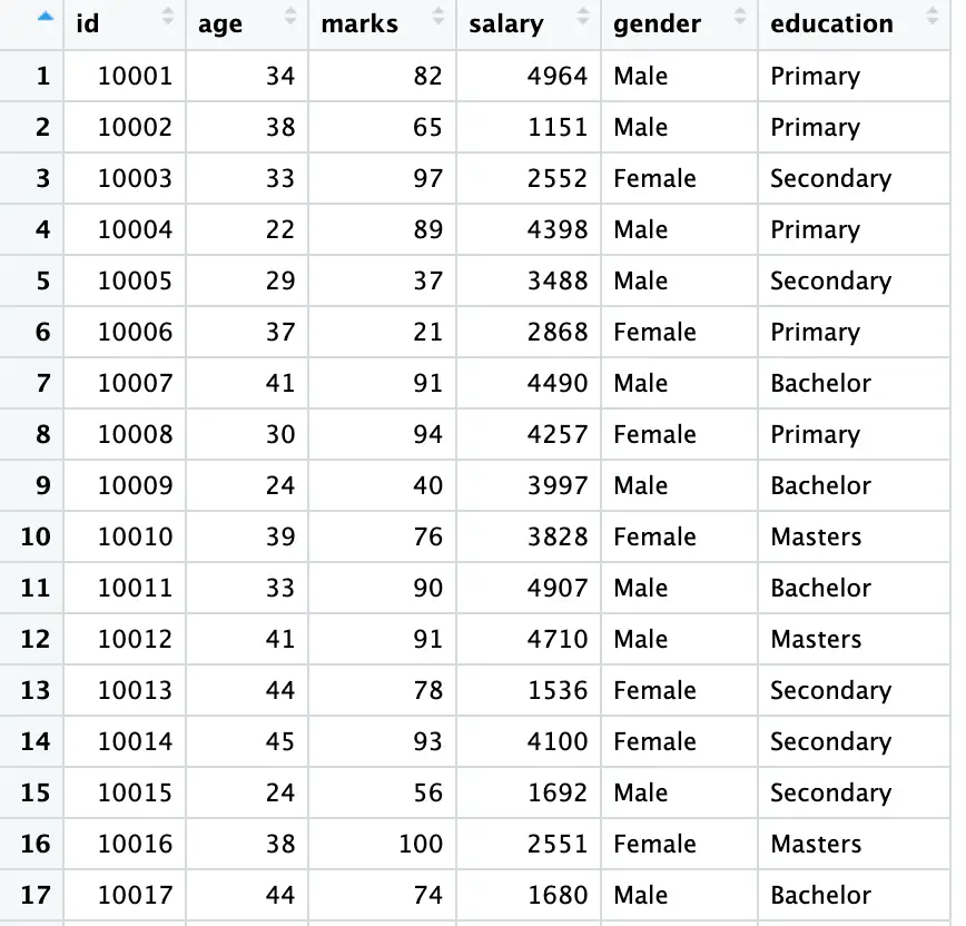
Our data shows that two of our variables are string variables with multiple categories. First, we convert these variables ([education] and [gender]) into a factor using the following codes utilising [mutate] and [factor] functions:
data <- data %>% mutate(across(c(education, gender), factor))
Here [factor] is used for the conversion of the variables. [mutate] is used for creating a new variables. The expression [>%>] (known as pipe operator) is used to link the new variables with our [data].
As shown in the above figure, our data comes with multiple categories. To see the categories execute the following commands:
unique(data$education) unique(data$gender)

Simple Regression
As we have now familiarised ourselves with the data, we are now moving to our regression model using the following command:
model_edu <- lm(salary ~ education, data = data)
The [lm] function regresses the [salary] as a function of [education]. This command again avoids the dummy trap (for details visit part 1 of this tutorial)
To examine the results of the regression model, use the following command:
summary (model_edu)
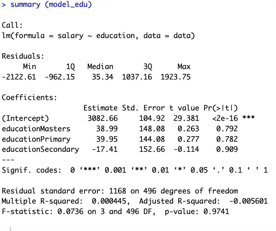
In dummy regression analysis we always interpret our results with-respect-to the omitted/benchmark category. Here, as shown in the above figure, the intercept term represents the omitted category; [Bachelor]. According to our results, an individual who has completed [Masters] earns $38.99 higher than those with a [Bachelor], an individual with a [Primary Education] earns $39.95 more than a [Bachelor]; and an individual with a [Secodary] education earns $17.41 less than those who have completed [Bachelor] (due to the negative sign of the its coefficient).
To know how much salary an individual earns, we can add/subtract the respective coefficient with the intercept to get the exact salary of an individual.
To get the [salary] for [Masters] execute the following commands:
Masters_Salary <- 3082.26 + 38.99 print(Masters_Salary)
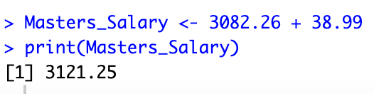
To see the results or output of a function we use the above [print] command while giving brackets to our variable or output. The above figure shows that a [Masters] degree holder earns $3121.25 (keeping other things constant).
Assigning a logical order
In our previous results, we can see that the education levels are in alphabetical order, which means that they don’t follow the actual order of an education system. To see the order of our dummies execute the following commands.
data$education_numeric <- as.numeric(data$education)
This command assigns numeric codes to our data according to its order
print(data[, c("education", "education_numeric")])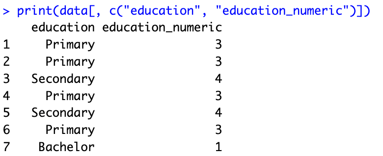
In the above figure, we can see the similarity among the results and numerical order of our data which is shown in the above diagram [summary (model_edu)]. The [Bachelors] category which is coded as [1], comes first in our regression model (represented by intercept term). The same logic applies to the rest of the categories.
To assign a desired or logical order to the categories, execute the following command
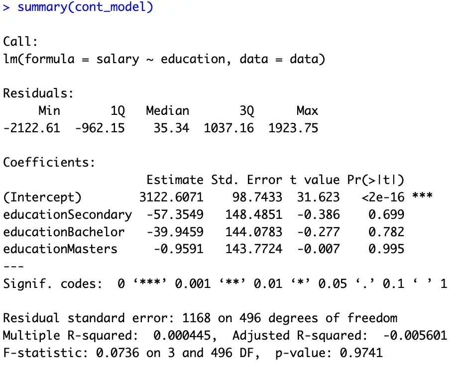
education_levels <- c('Primary', 'Secondary', 'Bachelor', 'Masters') data$education <- factor(data$education, levels = education_levels) data$education <- relevel(data$education, ref = "Primary") cont_model <- lm(salary ~ education, data = data) summary(cont_model)Here, the first command gives our desired order using a new variable. The second command factorize our data following the order of our last command. The third command is for choosing a desired benchmark dummy. We can also replace the [“Primary”] option with any preferred category. The fourth and fifth commands are for executing the regression model and seeing its results.
The results of our last command are provided hereunder. Now we can easily interpret the coefficients of our model with reference to the intercept; the [Primary] education level.
Visualizing the regression results
In econometric modelling, graphs and plots help us analyse the data more conveniently and often make our job easier. Using the command used in part 1 of this tutorial, we can also plot our results here.
To plot the [salary] levels against the four levels of education, execute the following commands:
model_plot <- lm(salary ~ education, data = data) marginal_effects <- ggpredict(model_plot, terms = c("education")) ggplot(marginal_effects, aes(x = x , y = predicted)) + geom_col()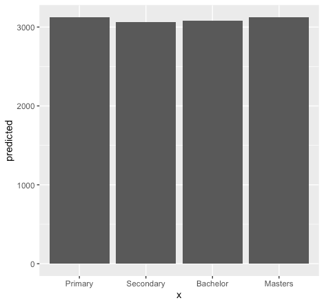
The above figure depicts the level of education associated with the [salary] levels (for more details about the commands, see part 1).
So far, we are regressing our dummies on [salary] levels. However, sometimes we are interested in seeing the relationship of [salary] with a specific dummy. For instance, to see what is the impact of [secondary education] on [salary] levels. For this, we will break our dummies into for columns using the following command then again will bind it with our data using [%>%]. Then we will regress our dummies accordingly.
data <- data %>% cbind(model.matrix(~ education-1, data = .))
To regress a specific dummy on [salary] levels execute the following commands:
Sec_model <- lm(salary ~ educationSecondary , data = data)
This command regresses secondary education [named(educationSecondary)] on [salary] levels.
For the results execute the following commands:
summary (Sec_model)
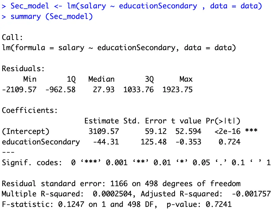
The above figure shows the results of the regression model for secondary education. The interpretation is the same; [secondary] education degree holder earns $44.31 less than the [Primary] education degree holder (we leave the exact [salary] of a [Seconday] degree holder to our readers).
Using more than one dummy variable
As stated, in the beginning of this tutorial, most of the time, our model depends on more than one categorical and continuous variable. Here we explore this possibility executing the following command:
multi_c_model <- lm(salary ~ education + age +gender, data = data)
Here we regressed [education], [age], and [gender] on [salary]. The following command shows the results of the above model.
summary (multi_c_model)
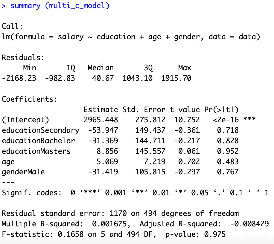
Here the interpretations are, one-year increase in [age] increases the [salary] by $5.069 keeping education and gender constant. Moreover, a [male] earns $31.419 less than a [female]. And a [Masters] degree can help in earning $40.226 more than a [Bachelor] degree (keeping [gender] and [age] constant). The bottom line behind the interpretation is the same, we always interpret our results with reference to the omitted category.
Here we again plot our results using the following commands:
model_plot <- lm(salary ~ education + gender, data = data)
Plot for gender
marginal_effects <- ggpredict(model_plot, terms = c("gender")) ggplot(marginal_effects, aes(x = x , y = predicted)) + geom_col()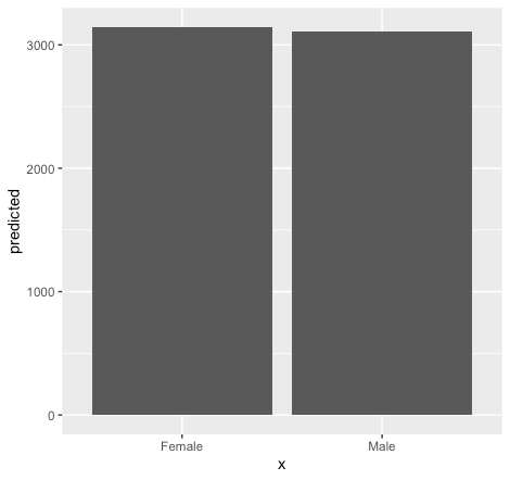
Plot for education
marginal_effects_edu <- ggpredict(model_plot, terms = c("education")) ggplot(marginal_effects_edu, aes(x = x , y = predicted)) + geom_col()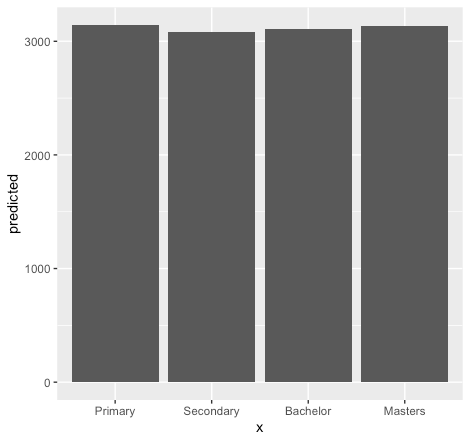
Exploring specific age groups
Depending on the model, a researcher can be interested in exploring a specific phenomenon according to the requirements of a study. For instance, sometimes we are interested in seeing the impact of a specific age (say 35 years) on [salary] levels. We can explore such possibilities using the following commands:
multi_cont_model <- lm(salary ~ gender + age, data = data) predict_salary_age_35 <- predict(cont_model, newdata = data.frame(gender = "Male", age = 35, education = "Primary")) print(predict_salary_age_35)
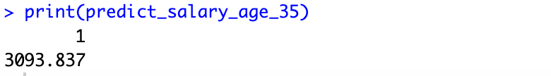
The above figure tells about the [salary] levels associated with a 35 years of [age].
We can also explore, what’s the impact of a specific age group (35-40) on our [salary] using following commands:
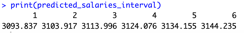
ages_to_predict <- seq(35, 40, by = 1)
The above command generates a sequence of age values from 35 to 45 (from 1 to 6, as shown in the following figure), incrementing [by=1] at each step. We can also increase the gap or select another age group by changing the corresponding values at [seq(35, 40, by = 1)]
predicted_salaries_interval <- predict(cont_model, newdata = data.frame(gender = "Male", age = ages_to_predict)) print(predicted_salaries_interval)
To plot our results execute the following commands:
plot_data_interval <- data.frame(age = ages_to_predict, predicted_salary = predicted_salaries_interval) ggplot(plot_data_interval, aes(x = age, y = predicted_salary)) + geom_line() + labs(x = "Age", y = "Predicted Salary", title = "Predicted Salaries for Interval 35-40")
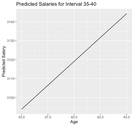
The above figure shows that an increase in [age] increases the [salary].
Analysis related to the Gender
In our regression model, we have multiple dummies. For instance, the [gender] variable has two categories; [male] and [female]. This time we are going to explore, whether there is any difference between the [salary] levels of a [male] and a [female], or in other words, how does [gender] affect our [salary] with an average [age] and [education] level?
Fit the regression model
gender_model <- lm(salary ~ gender + age, data = data)
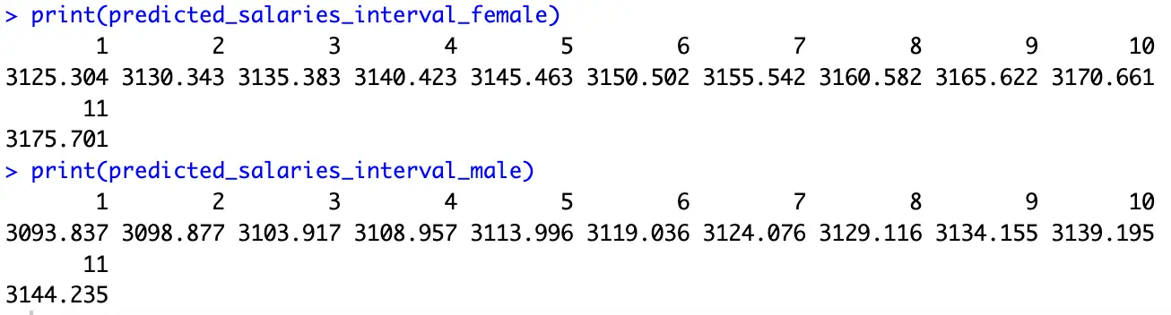
Predict salaries for the interval from 35 to 40 for both genders
ages_to_predict <- seq(35, 45, by = 1) predicted_salaries_interval_male <- predict(cont_model, newdata = data.frame(gender = "Male", age = ages_to_predict)) predicted_salaries_interval_female <- predict(cont_model, newdata = data.frame(gender = "Female", age =ages_to_predict)) print(predicted_salaries_interval_female) print(predicted_salaries_interval_male)
These commands help us in answering the above question. The last two commands display the results.
We can also plot our results to get a precise idea about the differences in male and female salaries associated with a specific education. We start by generating data frames for each possibility using the following commands:
plot_data_interval_male <- data.frame(age = ages_to_predict, predicted_salary = predicted_salaries_interval_male, gender = "Male") plot_data_interval_female <- data.frame(age = ages_to_predict, predicted_salary = predicted_salaries_interval_female, gender = "Female")
Combine data frames and ploting the results
plot_data_interval <- rbind(plot_data_interval_male, plot_data_interval_female) ggplot(plot_data_interval, aes(x = age, y = predicted_salary, color = gender, group = gender)) +geom_line() + labs(x = "Age", y = "Predicted Salary", title = "Predicted Salaries for Interval 35-40 by Gender")
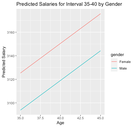
The above figure shows that the impact of age is the same for the [gender] variable; an increase in age increases the [salary] with equal proportion for both [male] and [female]. However, on average a [female] earns more than a [male] (also shown in the results of our [multi_c_model]).
In this tutorial, we analysed [salary] levels based on both quantitative and qualitative characteristics. Moreover, we have also discussed the distinct impact of specific [age] groups, [gender], and [education] on [salary] levels. However, till now, we have not explored the combined impact of [age] and [gender] on [salary] levels. We will incorporate such information in our dummy regression model in the coming part of this tutorial. Stay tuned to thedatahall.com for more tutorials.