Scatter plot shows the relationship between dependent and independent variables and can be helpful in analyzing the data visually. In Stata, scatter plots can be generated to visualize this relationship and understand the pattern of graphs. This pattern can predict the correlation that exists between two variables and can even tell us whether this relationship is positive or negative by visualizing the direction of the relationship.
Scatter plots in Stata can be created either using menu or by using relevant commands. In this article, however, we focus on creating scatter plot using menu. Once we create the scatter plot, the commands also appear in the Stata windows.
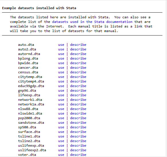
To create Scatter plots in Stata, we begin by using a given dataset in the example of the Stata. These datasets are provided by Stata for practice purposes. To use the data for creating scatter plots in Stata, click on the
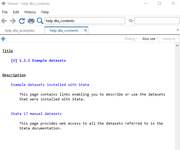
Download Example FileFile > Example Data sets Example Data Sets installed on the Stata
By clicking on the last option, a list of files or data sets is appeared, by which you can use a given data set to practice on Stata. We will continue with the auto data given on the first row to create scatter plots in the Stata. The data we choose has different variables including price of the cars, their mileage, manufacturing country etc.
Scatter Plot in Stata
Related Book: A Visual Guide to Stata Graphics by Michael N. Mitchell
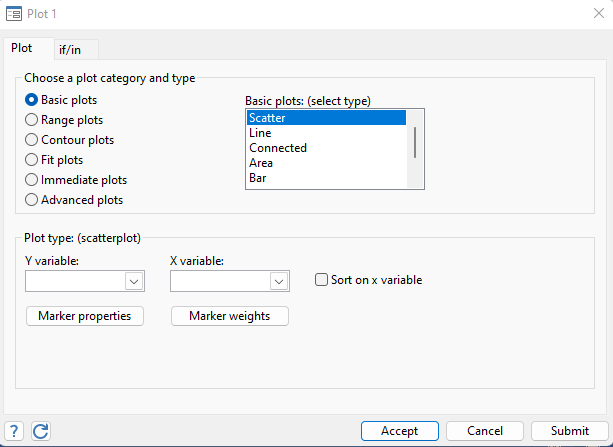
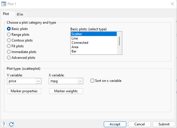
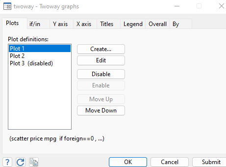
To create scatterplot for the data we used, click on Graphics in the menu bar. Looking at the drop-down list in graphics, it is visible that all kinds of graphs can be created, including pie charts and bar graphs. However, our aim is to create scatter plot here, so we will choose the first option of Twoway graphs.
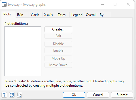
In the twoway graphs, as shown in above image, the scatter plot in Stata can be created by clicking on the create option, where scatter option is chosen.
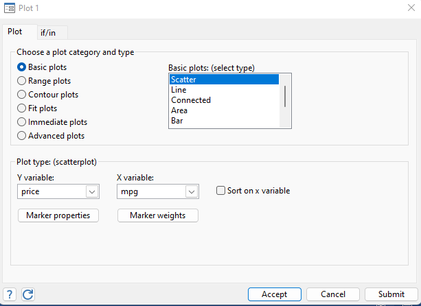
As scatter plot is the relationship between two variables, one dependent and one independent, so our dependent or y variable here is Price and independent variable or x variable is the Mpg. Simply, we want to study how mileage (mpg) would affect the price of the cars. The price and mpg will be chosen in the respective dependent and independent variable list as shown below.
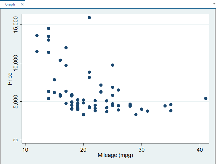
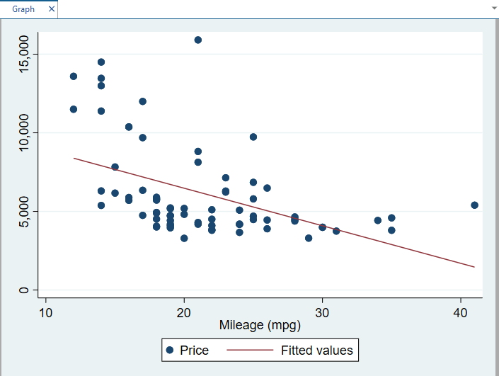
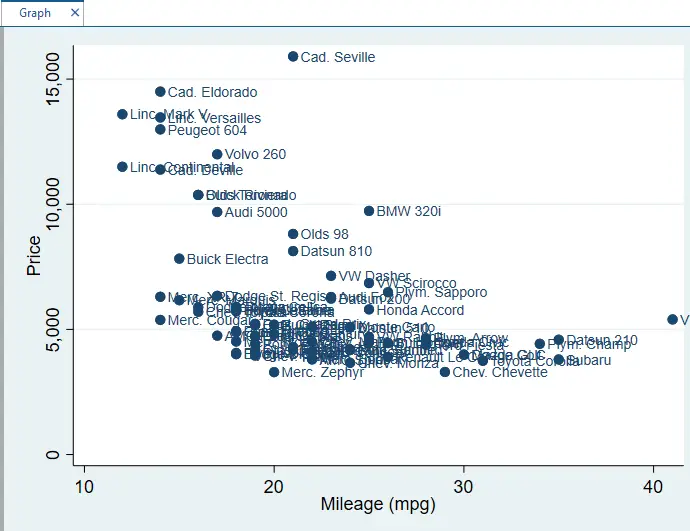
Clicking on the submit button generates the following scatter plot in the Stata. From the image below, it is clear that there exists negative relationship between mileage and price, thus price decreases when mileage increases and vice versa.
Using Fitted Line in the Scatter plot in Stata
As, the prediction is given about the negative relationship between mileage and prices. However, the best way to find a relationship between variables in scatter plot is by using fitted line in the generated Scatter plot. The fitted line can show the direction of the relationship, whether it is positive or negative. If the fitted line is upward sloping, the relationship is positive and if the line is negatively sloped, the relationship is negative.
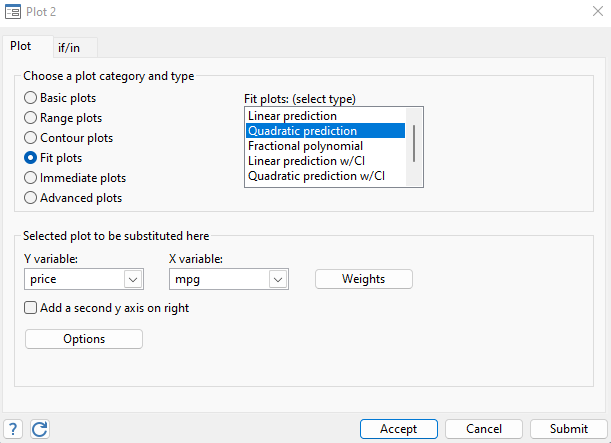
To create a fitted line in the scatter plots in Stata, select the Fit plots from the below window and click on the accept button on the twoway graph window as shown in the image below.
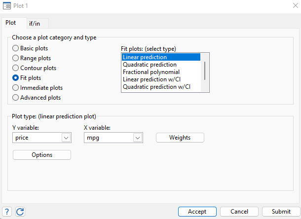
By clicking on the accept button, the new window will appear where we choose the create option again. The following window will appear where the fit plots instead of basic plot will be chosen.
The fitted line created will look like this, showing a negative relationship between price and mileage.
Using Quadratic Fitted Line in the Scatter Plot:
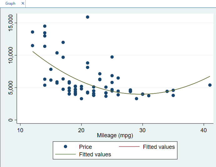
Instead of a linear fitted line, we can also get a quadratic fitted line or non-linear fitted line in the Scatter plots in the Stata. To get a quadratic line, follow the similar path that was used earlier to get a linear fitted line. But now, instead of choosing linear prediction in the window, use the quadratic prediction.
After choosing the x (independent) and y(dependent) variables, click on the submit button, Once you have clicked on the submit button, the following quadratic fitted line will be appeared.
Related Article: How to Create A Histogram in Stata
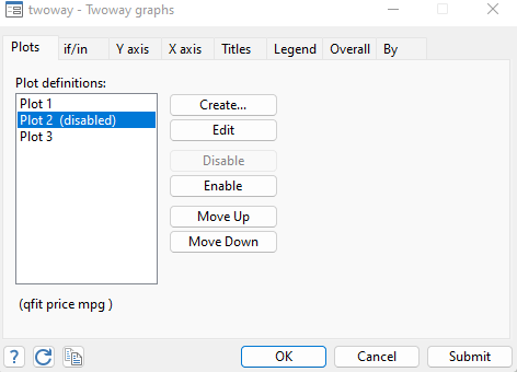
There are different kinds of fitted lines option in the stata that can be used. One can get the different kind of fitted lines, as per the requirement of their data. Similarly, these fitted lines can also be removed from the scatter plots created earlier in Stata. To remove these fitted lines, click on the accept button in the plot window as shown below
The new window will appear where you can disable the both linear and quadratic fitted lines to get the original scatter plots in Stata. These fitted lines were generated using plot 2 and plot 3, as shown below. By disabling plot 2 and Plot 3, these fitted lines can be removed.
Marker Properties in the Scatter Plot in Stata
Markers are the points on the scatter plot used to visualize the presence of points on the graph. These markers show the points where different observations lie. To deal with markers in Scatterplots in Stata, select the marker properties on the twoway graph window, below the Y variable option, as shown below.
Once selected, the marker properties window will appear. In this window, there are different options that could be used to visualize the markers in Scatter plot in Stata. The marker window looks something like as following
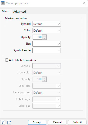
As shown in the above image, there are different options that could be used to customize our markers. By customizing markers, the scatter plot in Stata will also be customized. The color, size and the opacity of the labels can also be customized and changed with our own requirements. Similarly, the labels can also be added to scatter plot in the Stata. For instance, if the make or model of the car is to be mentioned in the scatter plot, we select the option “add label to markers”. Further, we also select the variable to which we want its labels to be mentioned. As in our case, we want to add the make of the car to be mentioned on the markers, so we select the variable make, as shown below
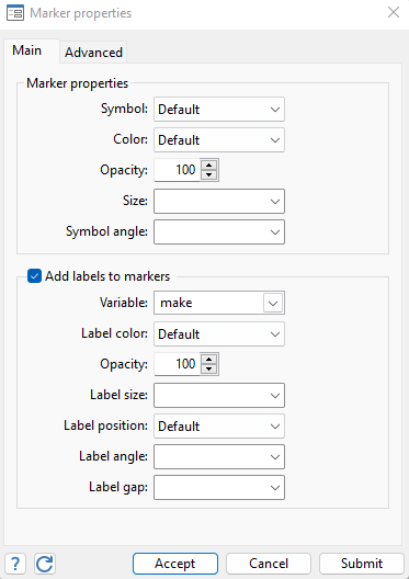
In the above window, the variable will be selected, and click on submit option. Once after submitting the variable, selected as a marker, the scatter plot will look like this
Similarly, as stated earlier, the color and size of the labels can also be changed accordingly. If we want to add label “foreign” to the scatter plot, we choose the variable foreign in the marker properties window. Then by changing the size and the color of the markers, marker will be customized. As foreign variable is used in the data to show whether car is produced domestically or in a foreign country, results will be according to the instructions we provided.
Related Article: Combine multiple graphs in Stata
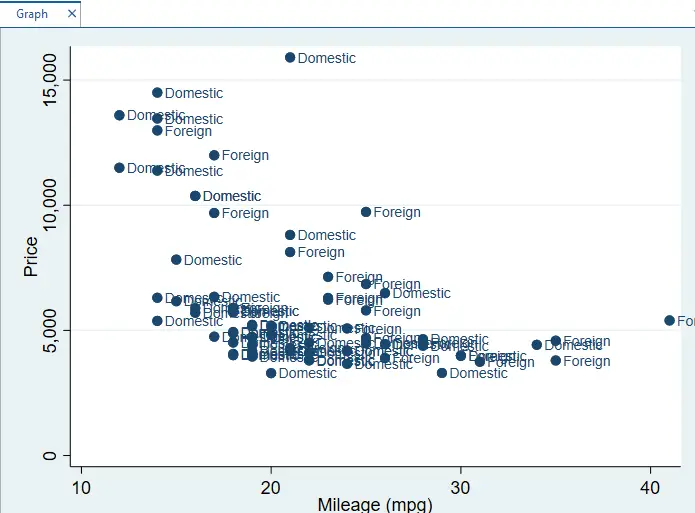
Different Markers for Each Category:
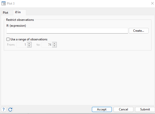
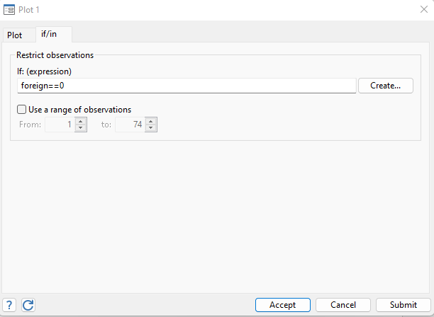
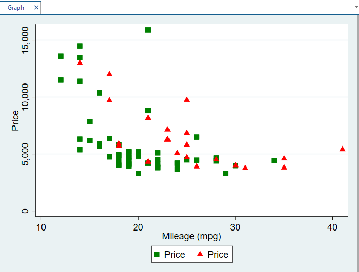
The variable foreign shows whether the car is produced domestically or in a foreign country. The variable is a binary variable, which is coded as 0 or 1 in the data in Stata. The code 0 shows car is produced domestically and 1 when it is produced in foreign country. As in the above image, the labels (make of the car) are clustered around the markers. While being clustered, markers aren’t providing enough information about the required variables. Thus instead of long labels, to avoid clustering, if we want the information about the car produced domestically or in a foreign country through their codes or through customized markers, we can perform a few clicks on Stata and get a clear graph. To do so, first reset the graph again. Then click on the if/in option on the plot window, as shown below.
Now in the If window, we write a condition to label markers. For instance, by writing foreign==0 we are giving instructions that domestic country is coded as 0. Then customize the markers for domestic cars. My selection for marker is square in green color, you can also choose any other specification you want. First, write the if condition as shown in image below:
foreign==0
Note: write the double equal(=) sign to use correct command and avoid any error
Once you have written the if condition, go to the plot window beside the If/In window, (don’t click on the accept button after writing the If condition)
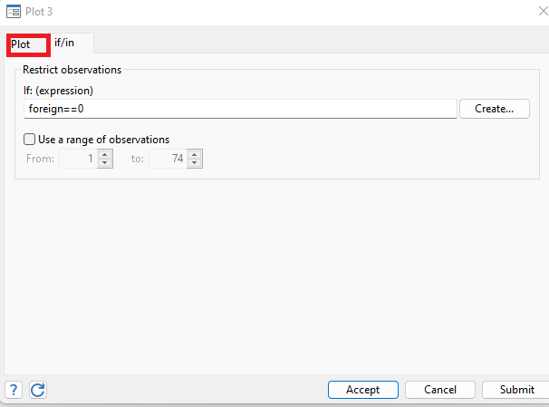
Now, in the Plot window, open the marker properties. Select the shape and color of the marker(square in green color) as explained earlier. Click on the accept button and proceed to customize the marker option for second condition.
Similarly, Click on the create button on Twoway window. Write the If condition again, but now for cars produced in foreign country
foreign==1
Again, go to the plot window and customize the marker properties. For the cars produced in the foreign country, I would customize the marker as triangle in red color.
Once I have specified the properties, I hit the submit button in the plot window as shown
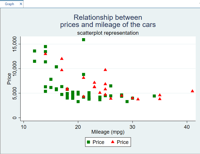
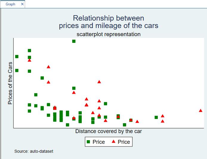
The following Scatter plot is generated in Stata. Here, green marker shows the domestic cars and red shows the foreign cars.
Titles of the Scatter Plots in Stata
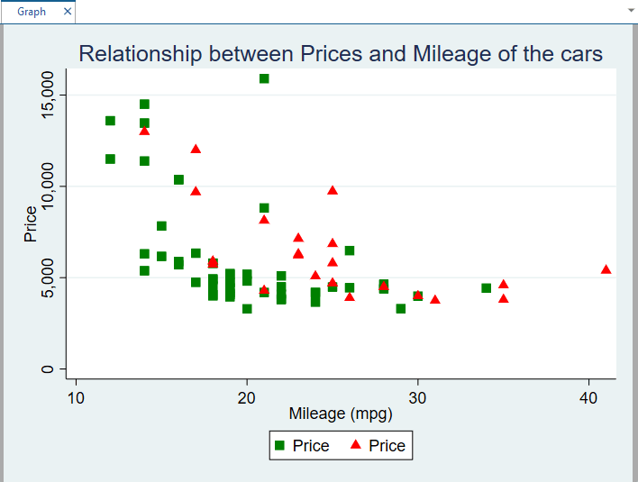
The titles of the graphs can also be added to scatter plots in Stata. To create a title in the graph, we go to titles option in the twoway window and add a title that is relevant to the graph. In the graph we just created, the title given can be “Relationship between Prices and Mileage of the cars. Writing the title in the title bar and clicking on the submit button, we get the following lengthy title of the scatter plot.
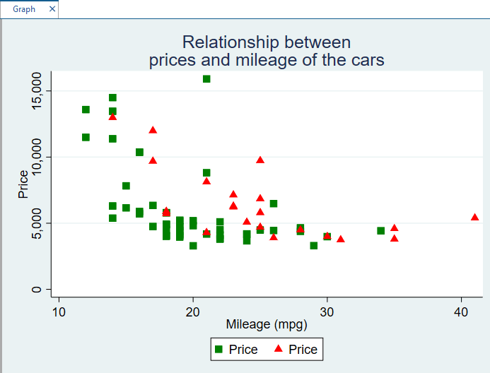
Titles of graphs could be lengthy, and usually appear in one line on the top of scatter plots in Stata. However, these titles can be cut short by adding inverted commas in the title where you want to insert space or move the title to second line. If we want the above title of the graph in two lines, we can use the inverted commas to cut the title short.
"Relationship between""prices and mileage of the cars"
Similarly, along with titles, subtitles can also be added on the top of scatter plots in Stata. To add a subtitle, write the subtitle in the subtitle bar and click on submit button.
There is also an option of notes in the title window of the scatter plot. The notes can be used to provide referencing or provide the information about the source from which data is extracted. As we extracted the data of prices and mileage of cars from the auto data set, we will write the source in the notes option.
Source: auto-dataset
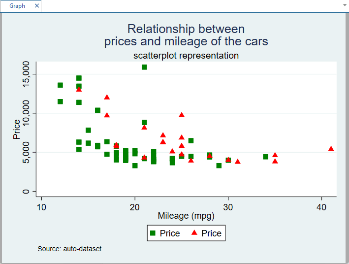
Source appeared in the left corner of the above graph.
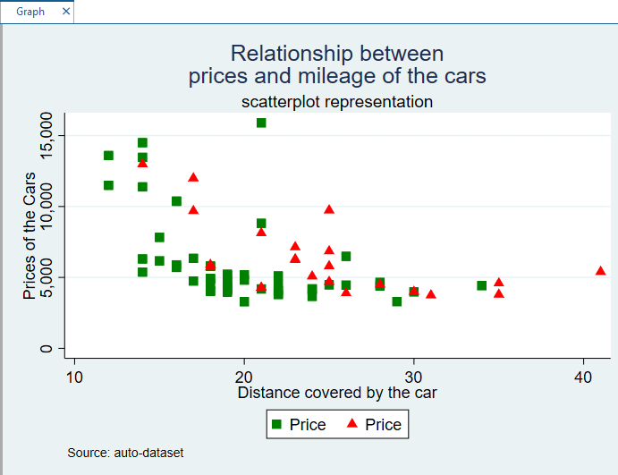
We can also rename the x or y-axis according to description, instead of using the names of variables in the data. If we want to add the X axis as Distance covered by the Car, we will write it in X-axis window. Similarly, for the Y axis, our title could be Prices of the cars. We get the following results.
Similarly, we can also change the size of the text of y-axis or x-axis and their angle as well. In short, the labels, titles, and axis in the scatter plots in Stata can be as much customized as required.
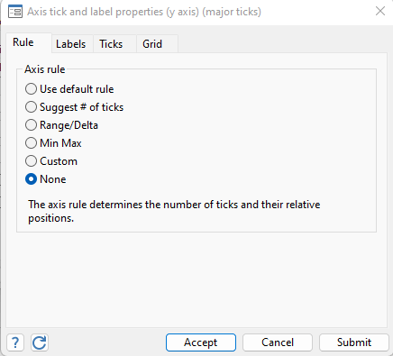
We can also remove the label of scatter plot used in x-axis and y-axis. In x-axis 10, 20, 30, and 40 are labels used and in y-axis prices in multiple of thousands are used. We can simply remove these labels by clicking on Major tick/Label properties and then selecting the following option for each category.
Once you have selected the none option and submitted it for each axis, labels will be removed, and the graph looks like as following
Scatter Plot in Stata for Categorical Variables
Related Article: Descriptive Statistics in Stata and tab command
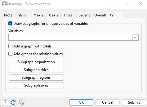
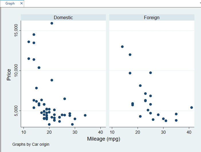
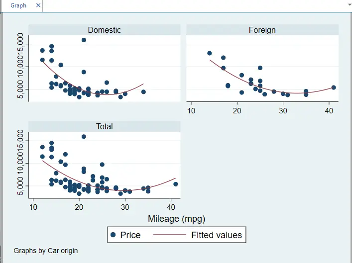
If we have categorical variables, having different categories, we can generate separate graphs for each category in the Stata. This can help us in identifying the individual properties of each category and how data is distributed in each category. In our data set, the categorical variable is Foreign, having two categories; domestic and foreign. To create scatter plot for each category in the Stata, first reset all the graph options, we selected, in the twoway graph window. Now create a simple scatter plot in Stata using previous variables, price and mpg. Once the simple scatter plot is created, use the By option in the twoway graph window, as shown below.
Now in the variables window, choose the foreign variable as it is the categorical variable. The following graph for each category of foreign will be generated
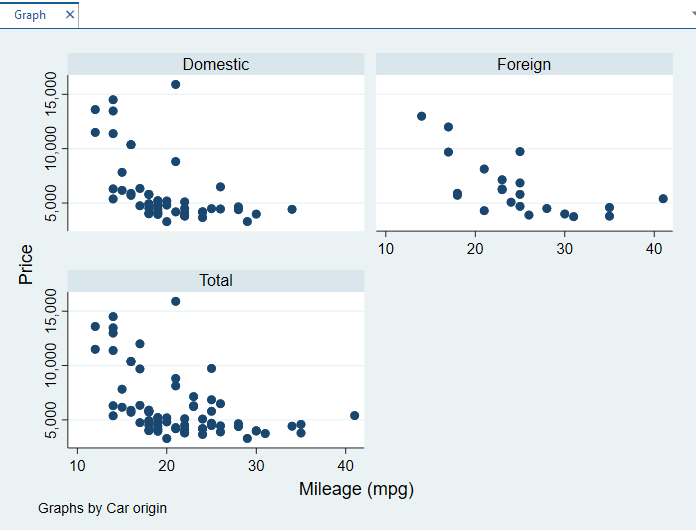
We can also get a graph showing the individual categories and a graph representing the combination of both categories. To get a graph like this, check the box saying “Add a graph with subtotals”. The following graph will be generated
Similarly, if we want a fitted line(either straight or quadratic) on the above graphs, we can get a fitted line through the graphs by using the quadratic line prediction method we did earlier. The following quadratic line will pass through the above graphs
Adding Noise to Graphs with less observations
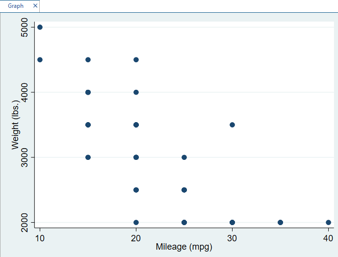
To use a dataset with only a few observations, different kind of scatter plot will be generated which would not give a clear picture of observations in the data. To avoid the unclarity in the scatter plot, we use jitter option in the markers. To demonstrate it further, use the smaller data set by following path
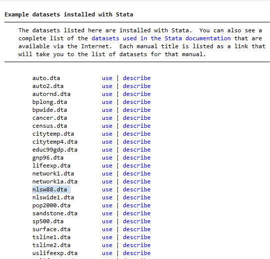
Stata Files > Example Data Set> Example data set installed with Stata > autornd.dta
To create a scatter plot of variables, weight and mileage, we follow the same path used earlier to create a scatter plot.
Graphics > Twoway Graphs > Create > Selection of X and Y variable > Submit
The following graph will be generated. This data has 74 observations, so graph generated is not a scatter plot, rather it is a stacked graph, where observations are stacked over each other, so no pattern can be drawn over this scatter plot.
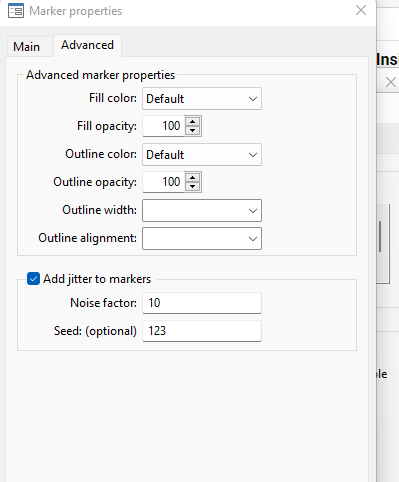
However, to avoid the problem of stacking in graphs, we can add a kind of noise or jitter in the graphs through marker properties. To add a noise in the graph, go to advanced marker properties and check the jitter box. You can add random numbers or values in the jitter box option, as shown in the image below
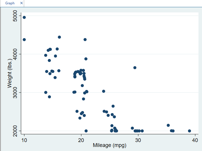
Once submitted, the following graph with added noise will be generated
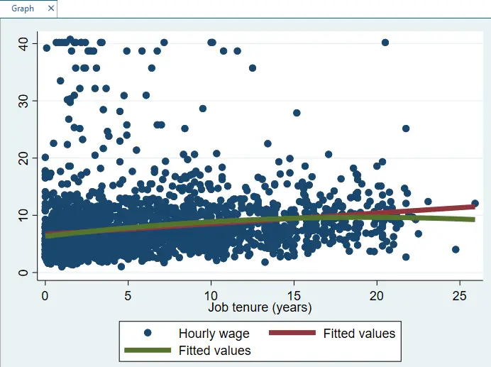
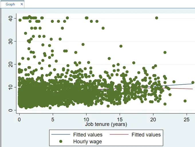
Scatterplot for large data set:
Previously, we created scatter plot for smaller set of data, where not many variables are included, and there is only one categorical variable i.e. foreign. However, now we want to create scatter plot for larger data set having multiple categorical variables. To use a larger data set, go to
Stata Files > Example Data Set> Example data set installed with Stata > nlsw88.dta
Now, if you check the descriptive statistics of the data, using sum command, there are more than 2000 observations in this data. To create a scatter plot for this data, we select the variables, hourly wage and duration or tenure of a worker in the company.
Graphics > Twoway Graphs > Create > X and Y variable > Submit
The following graph will be generated
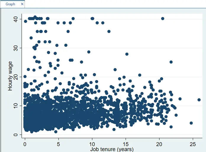
To get a fitted line(both linear and quadratic) through this graph, we will follow the linear and quadratic line method used earlier. The following line will be generated, showing both linear and quadratic methods.

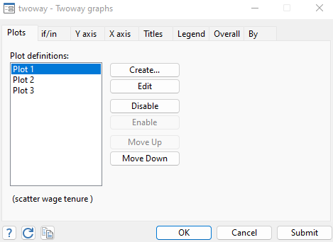
Note: Remember that Scatter plot in Stata will be visible according to the pattern or sequence of the plots. For instance, in above graph, The plot 1 is the scatter plot of two variables, the Plot 2 is Linear fitted line and Plot 3 is Quadratic fitted line. The sequence of these three is as shown below.
However, if we change the above sequence such that plot 1 comes down after the plot 3, as shown below, it can create issue of hindrance in the graph.
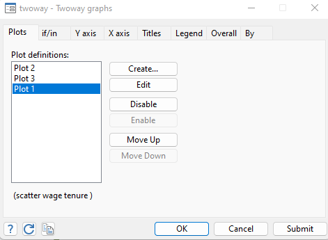
By moving the plot 1 down, that is scatter plot, these fitted lines can be hidden by the observations in the graphs and become invisible, as shown below. This happened, when I moved the plot down in the twoway graphs window.
To set this graph to original, move the plots in sequence as plot 1, plot 2 and plot 3.
Similarly, the thickness of the fitted lines can also be increased. To increase the thickness of the fitted lines, click on the plots by which fitted lines are created. In this case, I created fitted line using Plot 2 and 3. To make linear fitted line thick, I move to the plot 2 edit option, and go to the options window, as shown below
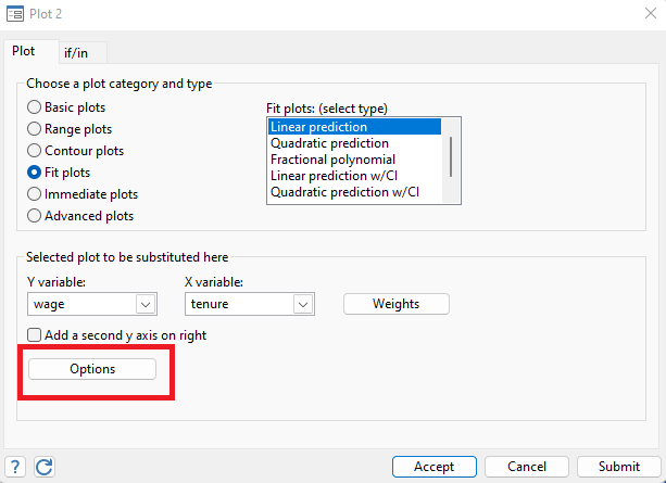
In the options window, click on the Line properties and select the Line width as much thick as you want.
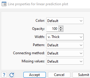
Similarly, follow the same procedure for the plot 3 or quadratic fitted line. Once you have submitted the plot 2 and 3, the graph generated will have thick fitted lines, as shown below.