
Histograms are a common way of graphically representing the frequency distribution of data. In this article we are going to learn how to create Histogram in Stata
Let’s load one of Stata’s inbuilt datasets to see how histograms are created.
Go to File -> Example Datasets -> “Example Datasets Installed With Stata”. Click on the ‘use’ option in front of the dataset name in the list in order to load it in memory. We will use auto.dta for this article.
We now want to create a histogram for the variable ‘mpg’ which holds data for the mileage of an automobile.
To create histogram in Stata, click on the ‘Graphics’ option in the menu bar and choose ‘Histogram’ from the dropdown. In the dialogue box that opens, choose a variable from the drop-down menu in the ‘Data’ section, and press ‘Ok’. A separate window with the histogram displayed will be opened. It should be noted that a histogram can show the frequency distribution (or density, frequency or fraction) of only one variable at a time. Therefore, the drop-down menu in the dialogue box allows you to choose just one variable for the histogram.

In the results section, you will notice the number of bins, their starting value and the bin width also reported. In our example, the histogram for the variable ‘mpg’ has eight bins that start from the x-axis value of 12. Each bin has a width of 3.625.


We now want to make a few changes. Firstly, we want to adjust the bar width. Secondly, we want the vertical axis to display the frequency instead of density which it shows by default.
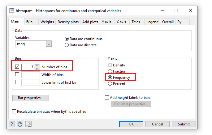
Open the dialogue box again and under the ‘Y axis’ section, check the radio button titled ‘Frequency’. Radio buttons indicate that the options provided are mutually exclusive. Therefore, you can choose only one option for the Y-axis. You can also specify whether your variable is discrete or continuous by choosing any one of the options under the ‘Data’ section.
In the ‘Bins’ section, users can type in the number of bins, width of the bins and the starting value/lower limit of the first bin. Decreasing the number of bins will increase the width of each bin. We only change the width of the bin to ‘3’ by first checking the checkbox beside the respective field and entering in the value.
If we have too many bars, we are not summarizing the data enough, whereas if the number of bars is too low, we are summarizing too much. The number of bins therefore needs to be chosen appropriately.
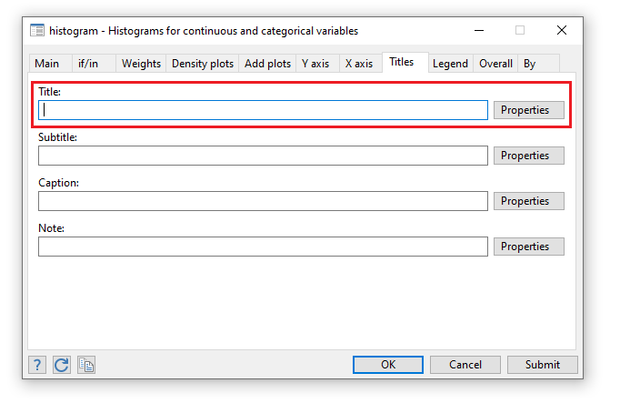
Adding a Heading, Notes
Under the ‘Titles’ tab, we can key in our desired heading for the histogram in the input field under ‘Title’.
The input field under ‘Notes’ can be utilized to add any notes (such as the source of data) under the graph.
Instead of clicking ‘Ok’ which closes the dialogue box, we click ‘Submit’ which generates a histogram but keeps the dialogue box open so we can make any further changes conveniently.

Related post: How to use Stata Do file? Tips and Tricks
Histogram Scheme
We can alter the layout and color scheme of the histogram in Stata from the drop-down menu called ‘Scheme’ in the ‘Overall’ tab. We can, for example, use a template called ‘Stata Journal’ and press Submit. The layout of the histogram generated will now match the Stata Journal default.

Related Book: A Visual Guide to Stata Graphics by Michael N. Mitchell
Naming The Graph
By default, Stata names any graph generated as ‘Graph’. When a new graph is created, it replaces the previous one and is also named ‘Graph’.
Under the ‘Overall’ tab, you can specify the name of the graph in the input field under ‘Name of graph’. Naming graphs allows you to generate and compare multiple graphs at once. The new graph will be opened in a new tab in the graph window.
Displaying The Legend
The legend for a graph can be displayed by checking the ‘Show legend’ radio button under the ‘Legend’ tab.

Adding A Density/Kernel Plot
To add a density plot to your histogram, go to the ‘Density plots’ tab in the dialogue box and check ‘Add normal-density plot’ and/or ‘Add kernel density plot’.

Generating Histograms For Categorical Variables
Graphs for different subcategories of a variable can also be created. This is done by going to the ‘By’ tab and checking the option labelled ‘Draw subgraphs for unique values of variables’. We can then choose our desired variable from the drop down menu below. For example, if we choose the ‘foreign’ variable, which is a binary variable, Stata will generate two graphs; one for observations where the variable equals 1 (Foreign), one for those where it equals 0 (Domestic).

Graph Editor
We can edit the aesthetic looks of the graph from the ‘Start Graph Editor’ ![]() option which is the sixth button in the graph window. Users can then double click on any element of the graph they want to change and edit it as per their requirements.
option which is the sixth button in the graph window. Users can then double click on any element of the graph they want to change and edit it as per their requirements.
Saving Your Graph
Graphs can be saved by pressing the second button in the tool bar in the graph window. It is highly recommended to save the graph with Stata’s default extension for graphs. This allows you to come back to the graph later and edit it. After saving it in the default .gph format, you can go ahead and save another copy in any format of your choice.