
This article will go over how we can check the normality of a variable in Stata. Quite often, it is thought necessary for dependent and independent variables in a regression to have a normal distribution. Though sometimes confused with the normality assumption of regression, however, it is the distribution of the error term that is assumed to be normally distributed when we run OLS regressions.
In this article, we focus on checking the normality of variables. For that, let’s use the inbuilt NLSW, 1988 dataset from Stata.
Download Example Filesysuse nlsw88.dta
Checking Normality of a Variable Using a Histogram
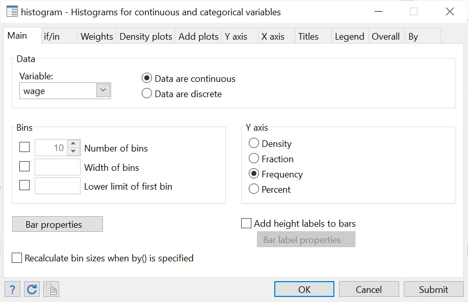
Let’s check the normality of the ‘wage’ variable using a histogram by following the menu options:
Graphics > Histogram > Choose your variable > Choose whether it is continuous or discrete > Select ‘Frequency’ for the Y axis
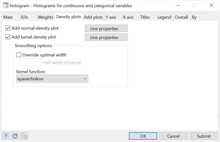
Also select the ‘Add normal-density plot’ and the ‘Add kernel density plot’ option from the “Density plots” tab.
Click on ‘Submit’ to produce the following graph.
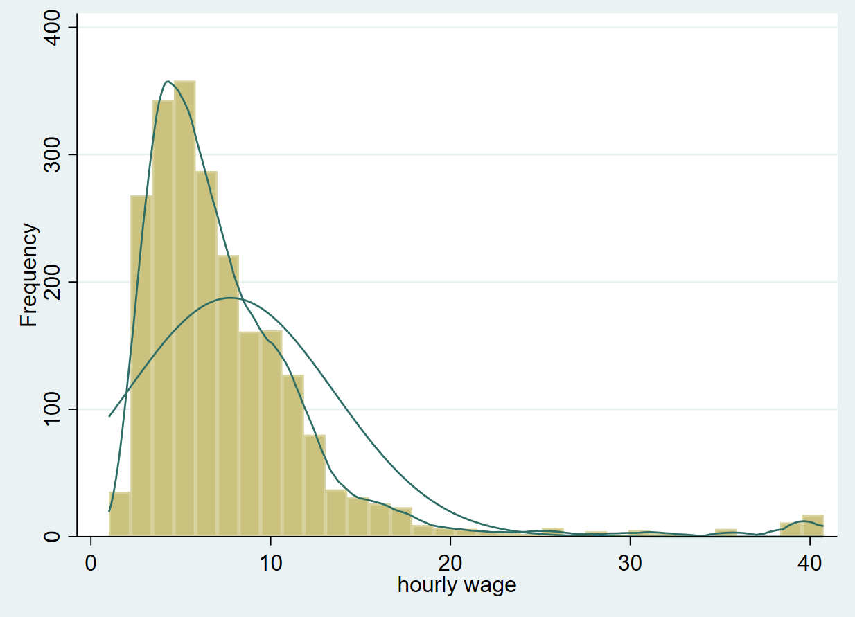
Clearly, this is not normally distributed, which is to be expected with a variable like ‘wage’ since wage data is typically positively skewed. This is because not a lot of people earn a very high wage, while relatively more people earn low to mid-level wages. The latter are thus present in higher frequency on the left side of the histogram.
This histogram can also be generated using the command:
histogram wage, frequency normal kdensity
The histogram command is followed by the variable name we wish to plot. The options here indicate that we need frequency to be plotted on the y-axis, along with plots for the kernel and normal densities. The kernel plot represents the probability density function of the variable which helps us infer how the variable may be distributed in the population based on our sample.
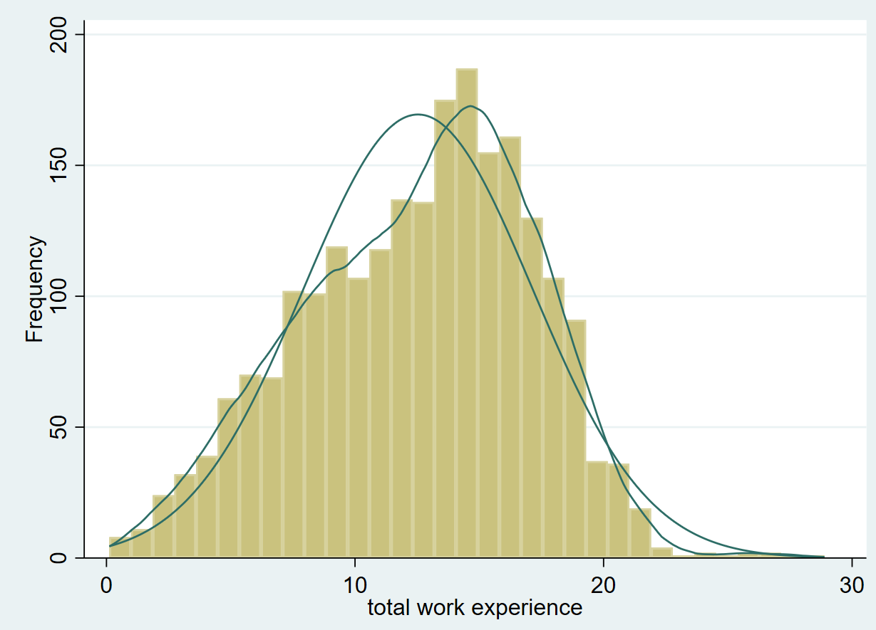
We will now produce another histogram for the variable called ‘ttl_exp’ which represents a person’s experience.
histogram ttl_exp, frequency normal kdensity
Related Book: A Gentle Introduction to Stata by Alan C. Acock
This graph looks relatively more normally distributed than the previous one.
Checking Normality of a Variable Using Hangroot
hangroot is a user-written command which needs to be installed if you haven’t already installed it.
ssc install hangroot
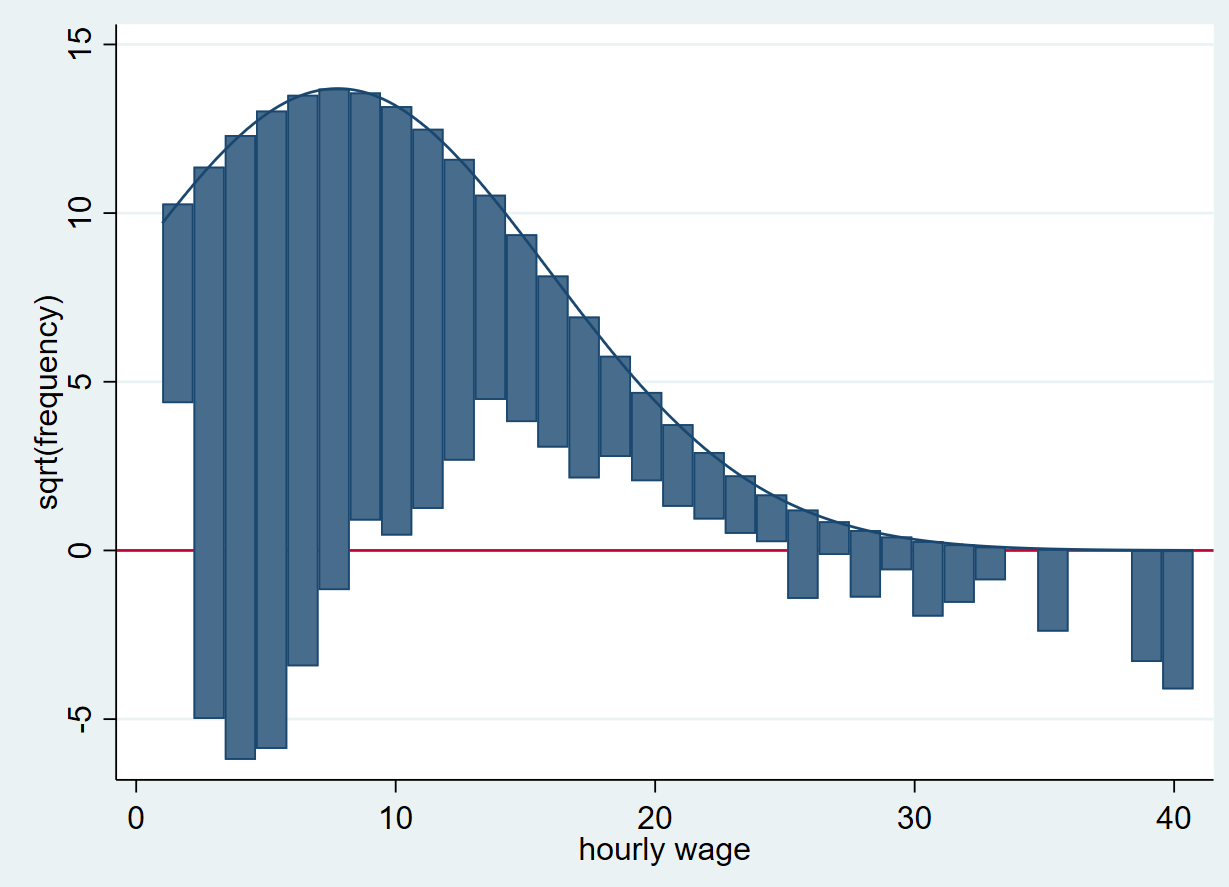
We can produce a graph (called a hanging rootogram) using this command as follows:
hangroot wage, bar
Related Article: Combine multiple graphs in Stata
A rootogram compares the sample distribution (empirical distribution) of a variable (‘wage’ in this case) to an assumed population distribution (theoretical distribution). The population density function is plotted on top. The bars “hang” from the population density function (as opposed to a histogram where the bars are plotted on the x-axis). On the y-axis, instead of simple frequencies, a rootogram plots the square root of these frequencies. This allows for the variations in the sample (in hourly wage here) to be captured. Also note that there is a horizontal line drawn at 0 on the y-axis. This is the point from which the deviations of wage are shown. These deviations are residuals of the empirical distribution from the theoretical distribution.
The residuals above the line mean that there are a lot of observations in a particular wage bin, while those below the line indicate very few observations.
How do we figure out whether the distribution of ‘wage’ is normal from this rootogram? The farther away a bar is from the horizontal line at y=0, the less likely it is for there to be a normal distribution in that area. Bars above the graph represent too many observations for that particular wage bin (positive residuals) while those below it represents that the observations are too few for that particular bin (negative residuals).
Normality Tests in Stata
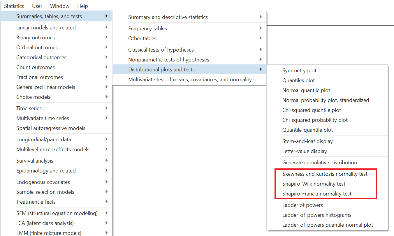
There are also statistical tests that can be done in Stata to test for normality. These can be seen using the menu option: Statistics > Summaries, tables, and tests > Distributional plots and tests. From here, we see three normality tests:
- Skewness and kurtosis normality test
- Shapiro-Wilk normality test
- Shapiro-Francia normality test
Skewness
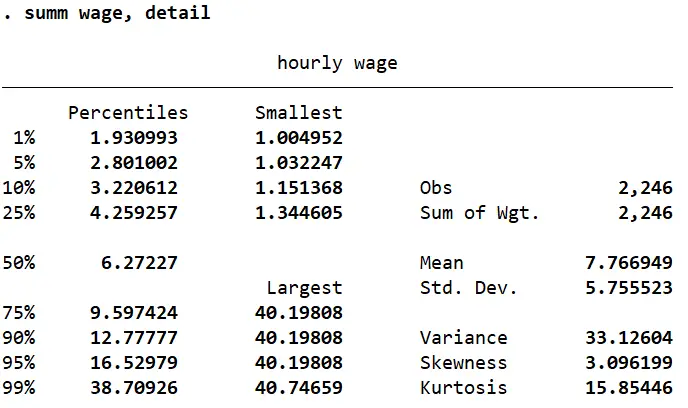
When we summarize the ‘wage’ variable with detail, Stata returns a value each for skewness and kurtosis (among other statistics).
summ wage, detail
Skewness tells us whether the distribution of a variable is tilted towards one end. The histogram with a normal and kernel density curve that we produced above showed that the variable was positively skewed (since most observations were gathered close to the left tail).
A skewness value of 0 would indicate a normal distribution. In fact, any value between -0.5 and 0.5 suggests a fairly symmetrical spread. Any value between 0.5 and 1 (and -0.5 and -1) suggests moderate skewness, while values over 1 (or less than -1) would mean the distribution is very skewed.
In this case, the skewness value of 3.096 shows a strong positive skewness which was backed up by the graphs we saw above. The skewness for ‘ttl_exp’ turns out to be -0.24 which suggests a normal, symmetrical distribution.
Kurtosis
Kurtosis values indicate whether a distribution curve is heavier in the tails or lighter. Generally, a kurtosis value of 3 would mean a variable is normally distributed curve with equal weight on both tails, while anything below 3 suggests a flatter distribution with thin tails and a wider bell shape. Kurtosis values above 3 suggest a tall and narrow peak with heavier/thicker tails.
‘ttl_exp’ has a kurtosis of 2.59 which again indicates a normally distributed curve. ‘wage’ on the other hand, has a very high kurtosis of 15.85 which means that we can expect a tall bell shaped curve with a heavy tail.
Statistical Tests for Normality in Stata
These values for skewness and kurtosis give us an idea about the distribution of variables but they are not statistical tests. The three tests mentioned above can be performed in Stata to get a better idea of how normally (or not) distributed a variable is.
Skewness and Kurtosis Normality Test
If we follow the menu options as defined above and select the Skewness and kurtosis normality test, we get the following dialogue box. Simply enter the variable name.
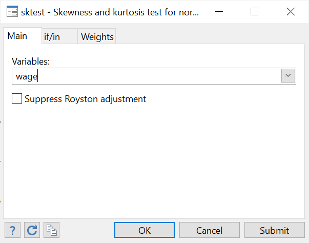
As can be seen from the output, the command for this is sktest followed by the variable name.
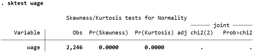
However, the value that we are interested in is the probability (Prob>chi2) which is not displayed here because it is too small. Let’s do this same test for the experience variable ‘ttl_exp’.
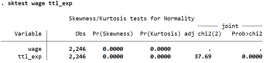
‘ttl_exp’ has a probability value (Prob>chi2) value of 0.0000. The null hypothesis here is that data is normally distributed. Based on the probability value of 0.0000, we can reject this and conclude that ‘ttl_exp’ is not normally distributed afterall.
But why would this test lead us to this conclusion when all our previous approaches to checking normality led us to conclude that ‘ttl_exp’ was normally distributed? This is because these tests are very sensitive to sample size. In large samples, a small deviation from normality lead to a statistically significant result that may lead us to reject the normality hypothesis previously assumed to be correct. Conversely, in smaller samples, a large deviation from normality may not make much of a difference to the statistical significance of a test (even though the normality of data is more important in smaller sample sizes).
Shapiro-Wilk Normality Test
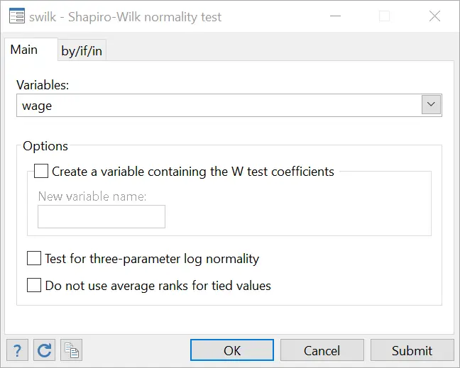
The same menu options will be followed as before and the Shapiro-Wilk normality test selected. Input your variable name in the field in the dialogue box that opens.
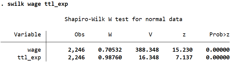
The command for the Shapir-Wilk test is swilk followed by the variable name.
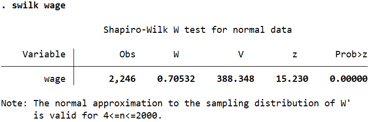
Once again, we conclude that ‘wage’ is not normally distributed based on the probability value of 0.0000 for Prob>z. The same conclusion is drawn for the ‘ttl_exp’ variable when it is added to this command.
Shapiro-Francia Normality Test
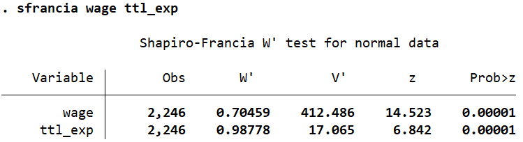
Using either the menu options, or the command sfrancia followed by the variable names, this test too suggests that both ‘wage’ and ‘ttl_exp’ are not normally distributed. We can reject the normality hypothesis based on the low probability values of 0.00001 as shown by Prob>z.
Well written, all my thanks:)
Thank for this