Descriptive statistics, is like a snapshot of data, that provides the quick look of data before we delve deeper into data handling and manipulation. It helps us understand the features of data like mean, median, mode, and frequency of the data. From these summary statistics, one can visualize data by creating different kinds of interesting charts and graphs. These graphs and charts help us understand the pattern of data, and the relationship that exists between different variables. Thus, descriptive statistics tell us the story of a data in a quicker and interesting way.
This article deals with understanding of categorical variable, their descriptive statistics and tabulation. Categorical variables represent qualitative data that can be divided into distinct categories. These variables can take on values that belong to different, non-numeric classes.
Before we start, load the tidyverse set of packages by using the following command
library(tidyverse)
Next, to start with understanding of descriptive statistics of categorical variable, we use a data set that contains enough categorical variables. To import such data set in R, use the following command
data(Arthritis)
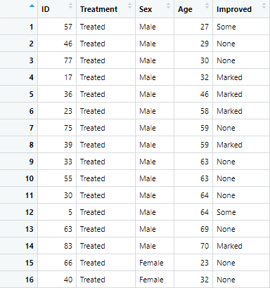
This data set contain information about patients of Arthritis. It has 84 observation for 5 variables. The data is visualized as below
Summary Statistics for the Categorical variables in R
Let’s start by identifying and understanding the categorical variables present in the Arthritis dataset. The str() function is helpful for this purpose.
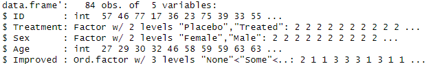
str(Arthritis)You will observe that the variables “Treatment” and “Improved” are categorical. Given that we need to understand summary statistics of categorical variables, we focus on these two variables.
Frequency Tables for Categorical Variables
Frequency tables are one of the type of summary statistics, that provide a simple way to summarize categorical data. To create frequency tables for the categorical variable, we use the table() function in the following way
# Frequency table for Treatment table(Arthritis$Treatment) ## Placebo Treated ## 43 41
The above table is created, showing frequency of both placebo and treated category.
Similarly, a cross-classification table can also be produced, which provides a summary of the joint distribution of two categorical variables.
# Cross-classification frequency table for Treatment and Improved table(Arthritis$Treatment, Arthritis$Improved) ## None Some Marked Placebo 29 7 7 Treated 13 7 21
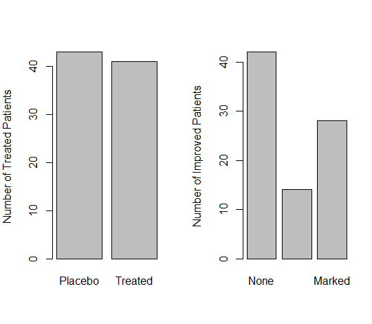
The above frequency tables can also be visualized by creating bar plots for the both variables. To create separate bar plots side by side for each category, we use the following commands
par(mfrow=c(1,2)) barplot(table(Arthritis$Treatment), ylab = 'Number of Treated Patients') barplot(table(Arthritis$Improved), ylab = 'Number of Improved Patients')
In the above commands, the first command R is used to create a layout with one row and two columns for subsequent plots. This means that when you generate plots after this command, they will be arranged side by side in a single row. The two commands after that create the following bar plots for the variables
You can further customize the graphs by adding different colors of your choice.
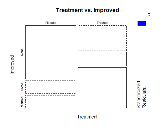
You can also create different kind of graphs to get the better understanding of frequency of categorical variables in data. For instance, if we want to get a mosaic plot, which is a visual representation of a contingency table, we can use the following command
mosaicplot(cross_table, main = "Treatment vs. Improved", color = c("skyblue", "lightgreen"), shade = TRUE)In the above command, cross_table represents the cross-tabulation or contingency table of the two categorical variables you want to analyze. In this case, it is the table created using the table() function for the Treatment and Improved variables in the Arthritis dataset.
Similarly, “main” parameter specifies the title of the mosaic plot. The text within the quotation marks will be displayed as the main title at the top of the plot, and by adding “color” argument, you are specifying the colors for the different categories in the mosaic plot. The first color corresponds to the first categorical variable (Treatment), and the second color corresponds to the second categorical variable (Improved). The shade parameter is set to TRUE to add shading to the mosaic plot. The following mosaic plot is generated from the above command
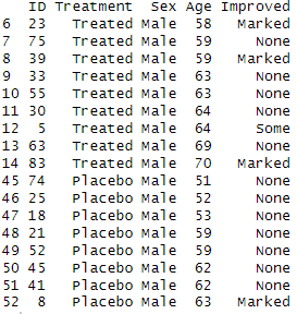
We can also add filters to frequency tables in data. Adding filters to frequency tables can help you focus on specific subsets of the data, providing more targeted insights. In the Arthritis dataset, let’s say you want to create frequency tables with filters for different factors like “Sex” or “Age.” First we set the filter conditions, and then apply those filters using subset() function in command
# Set filter conditions age_threshold <- 50 sex_filter <- "Male" # Apply flter subset(Arthritis, Age > age_threshold & Sex == sex_filter)
In this command, the subset function is used to create a filtered dataset where both age is greater than 50 and sex is “Male.” We get the following output by using the above command
Just like the frequency tables, we can create proportions table for one or more categorical variables in R too. The proportions table will present the frequency of variable in percentage form. To create a proportion table, we use the prop.table() in a command in the following way
prop.table(table(Arthritis$Treatment))
In this example, table(Arthritis$Treatment) creates a frequency table for the ‘Treatment’ variable, and prop.table() is then used to convert the counts into proportions. We get the following output from the above command
## Placebo Treated 0.5119048 0.4880952
Mean, Median and Mode for variables in R
To understand the descriptive statistics in R , let’s load mtcars data set using the following command
data(mtcars)
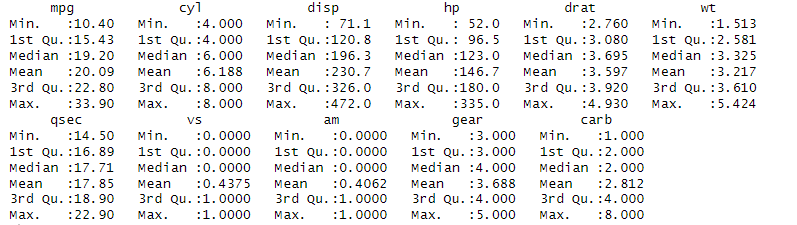
The mtcars dataset in R contains information about various car models, including features such as miles per gallon (mpg), number of cylinders, horsepower, and others. To compute summary statistics for the mtcars dataset, you can use the summary() function.
The summary() function provides a quick overview of the central tendency, dispersion, and other summary statistics for each variable in the dataset. We use summary function in a command in the following way
summary(mtcars)
You get an minimum, maximum, mean and median values of all the variables present in the data set in the following way
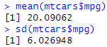
If you want summary statistics for specific variables, you can use functions like mean(), median(), sd() (standard deviation), min(), max(), and others individually. For instance, if you need to get mean and standard deviation of mpg variable in the data, use the following commands
mean(mtcars$mpg) sd_mpg <- sd(mtcars$mpg)
We get the following mean and median from the above commands
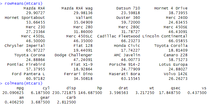
Other than getting individual summary statistics for each variable, we can get mean for each row and each column, or any other statistic for whole row and columns. For instance, if we want to get the mean of each row and each column of the mtcars data set, we use the rowMeans() and colMeans() function which will facilitate the calculation of mean values for each row and column, respectively, shedding light on individual car characteristics and overall variable averages. To get row mean and row columns, use the following commands
rowMeans(mtcars)
colMeans(mtcars)
These commands provide the following results
Similarly, if we want to get row sum or row column for each row and column, we use rowSums() and colSums() functions for this purpose.
Visualization of Descriptive Statistics in R
Visualizing descriptive statistics is a crucial step in exploring and understanding the characteristics of a dataset. In R, there are several packages and techniques available for creating visualizations of descriptive statistics, which can create box plots, density plots, Histograms, Bar charts, and correlation heatmaps. While, we have already covered the visualization of numeric and categorical variables in R, we will visualize descriptive statistics of data here.
1. Boxplots:
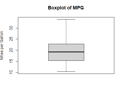
Box plots provide a visual summary of the distribution of a dataset, including measures such as the median, quartiles, and potential outliers. To create boxplot for a variable, say mpg, we can use the following command
boxplot(mtcars$mpg, main = "Boxplot of MPG", ylab = "Miles per Gallon")
The bar plot, along with the title and y axis labelled will be created, as shown below.
2. Histograms:
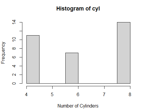
Histograms display the distribution of a numeric variable by dividing it into bins and counting the number of observations in each bin. To create a histogram for a variable of mtcars data set, use the following command
hist(mtcars$cyl, main = "Histogram of cyl", xlab = "Number of Cylinders", ylab = "Frequency")
Following histogram is created from the above command
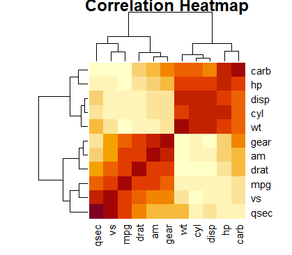
3. Correlation Heatmaps:
Correlation heatmaps are visual representations of the pairwise correlation coefficients between variables in a dataset. Visualizing correlation matrices can provide insights into relationships between multiple variables. A correlation heatmap uses a color scale to represent the correlation coefficients. Commonly, warmer colors (e.g., shades of red) are used for positive correlations, cooler colors (e.g., shades of blue) for negative correlations, and neutral colors (e.g., white) for zero correlations. To get a correlation heatmap for this data set, use the following command
cor_matrix <- cor(mtcars) heatmap(cor_matrix, method = "color", main = "Correlation Heatmap")
The first part of command calculates the pairwise correlation coefficients between all numeric variables in the mtcars dataset, resulting in a correlation matrix. The next part creates the heatmap of correlation matrix, giving it a title of correlation heatmap. The following correlation heatmap is created from the above command