
The data visualization is the important and powerful tool of R software. Using ggplot2 package, one can create multiple kind of bar charts, line and scatter plots etc. to display the world of data in certain figures.
Previously, we have discussed basics of ggplot and creating a scatter plot in R using ggplot2, however this article delves deeper into visualization of categorical variables. When visualizing a categorical variable, you often want to create bar plots or other types of plots that show the distribution of your categories. The bar plots show the relationship between two or more categories of a variable.
To start working with the ggplot2 package, we need to install and load the tidyverse set of packages that contain ggplot2. To install and load tidyverse package, use the following commands
Download Example FileInstall.packages(“tidyverse”) library(tidyverse)
Once the package is ready to use, we load the built-in data set using the following command
data(mpg)
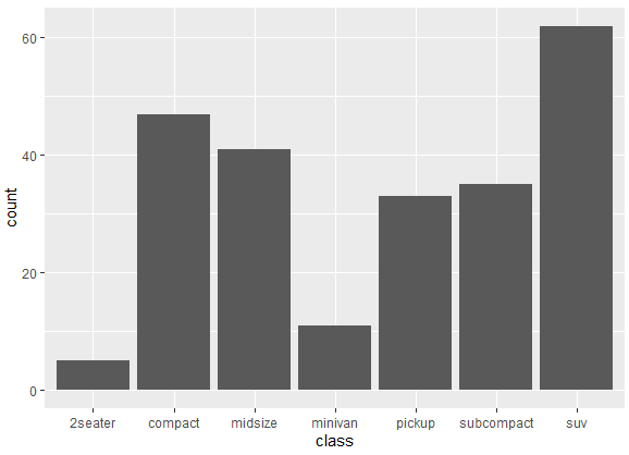
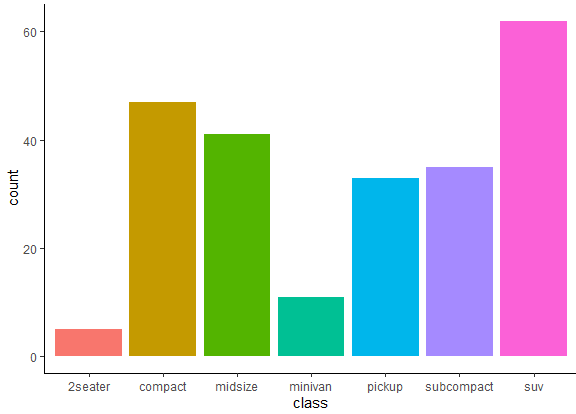
The data has 234 observations of 11 variables containing information about the cars. We create a bar plot of the class variable, which is a categorical variable having seven categories. To create a bar plot for the class variable, we use the following command
ggplot(mpg, aes(x = class)) + geom_bar()
In the above command, ggplot() initializes the creation of a new ggplot object, mpg is the data frame used for plotting and aes(x = class) specifies that the variable on the x-axis (x) should be taken from the ‘class’ variable in the ‘mpg’ dataset. This sets up the aesthetic mapping for the plot. The plus sign “+” is used to add layers to the ggplot, and geom_bar() specifies the type of plot to be a bar plot. This means that the data will be represented using bars. After running this command, the following bar plot appears for the categories of the class variable.
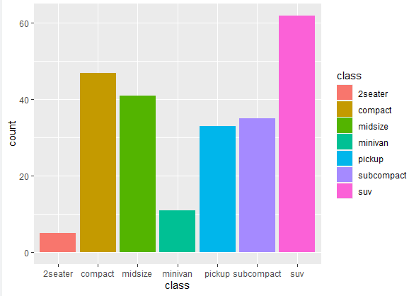
One can customize bar plot in R using ggplot2 by changing their color of various elements to the plot to enhance its visual appearance and convey information more effectively. We can use the fill aesthetic inside the geom_bar() function to change the color of the bars. To change the color of the above bar graph, use the following command
ggplot(mpg, aes(x = class, fill = class)) + geom_bar()
The rest of the command is the same as the previous one, except where the fill is mapped to the ‘class’ variable. This means that each unique class will have a different color. The bar plot we get from the above command is following
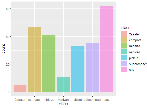
Other than that, we can also change the color transparency of the categories according to requirements. In this case, to change the color transparency of bars in bar plot, we use the following command.
ggplot(mpg, aes(x = class, fill = class)) + geom_bar( alpha = 0.5)
In the above command, the alpha = 0.5 argument sets the transparency (alpha) of the bars to 0.5, making them semi-transparent. This can be useful when you have overlapping bars and want to visually distinguish them. The transparency can be further increased or reduced by changing the number, i.e. o.7 or 0.3 etc. The semi transparent we get from using the above command is shown below
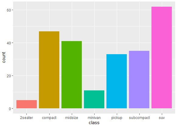
You can customize this graph further by removing the legend, or changing the width etc. of the bar plot. In the above graph, there is legend present in the bar plot. The legend in a bar plot provides a key or guide that helps you understand the meaning of colors, shapes, or other visual elements used in the plot. It’s like a map for interpreting the different components of the graph. Like in the above bar plot, it lays out the detail for each category separately. However, the category’s name is mentioned in the y-axis of the graph too, so the information provided by legend is unnecessary here.
To remove the legend in the above plot, we use the following command
ggplot(mpg, aes(x = class, fill = class)) + geom_bar(show.legend = FALSE)
The show.legend = FALSE argument in the above command is used to suppress the legend for the fill color, and thus the following graph is generated
Notice that in above bar plots, there are grid lines present. These grid lines can make the bar plot look crowded and may affect the aesthetics of the bar plot. For a neat and clean graph, we can remove these grid lines. To remove the grid lines in the bar plot created with ggplot2, you can use the theme() function. The theme() function will be used in the following way in a command to remove grid lines
ggplot(mpg, aes(x = class, fill = class)) + geom_bar(show.legend = FALSE) + theme_classic()
In above command, we set the theme to classic, to clear the grid lines. The graph without grid lines will appear as following
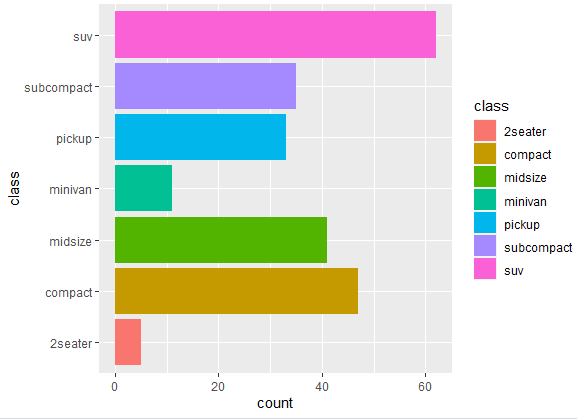
We can also customize the graph by changing the axis. The categories appearing on y-axis will now appear in the x-axis if we use the folloiwng command.
ggplot(mpg, aes(x = class, fill=class)) + geom_bar() + coord_flip()
The coord_flip() argument in the above command does the magic by flipping the axis in such a way that we get the following bar plot, having categories on x-axis now. This is particularly useful when you want to create a horizontal bar plot, as opposed to the default vertical orientation.
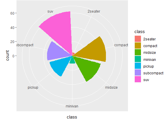
Apart from coord_flip(), there are several other coord_ functions available for different types of coordinate systems. Each one of them is used for different purpose. For instance, one of the function coord_polar() is used to create polar coordinate plots. Unlike built-in coordinates where the x and y axes are horizontal and vertical, polar coordinates use a circular arrangement of axes. This is particularly useful for visualizing data that has a circular or periodic nature, such as time series data or directional data. To visualize this function, use the following command
ggplot(mpg, aes(x = class, fill=class)) + geom_bar() + coord_polar()
Using this command gives us an interesting bar plot, shown below. Looks interesting, doesn’t it?
Sorting Bar Chart based on Frequency
The above bar plots created aren’t sorted in any specific way, and they follow the alphabetic order in displaying bars in the plot. But what if we want to change the sorting in such a way that bars in the bar plot are sorted based on frequency of the data. Now, it’s important to keep certain things in mind. First is to check the data type of variable that will be sorted. The data type of variable matters in sorting a dataset because different data types are sorted in different ways. For instance, if the variable is numeric (e.g., integers, decimals), sorting is typically done by numerical order, either in ascending or descending order. When you have a factor variable, having categories, the categories of the factor determine the sorting order. By default, categories are sorted in the order they appear in the dataset or whatever is their inherent order.
To visualize this, let’s use and check the structure of another data set using the following commands
data(diamonds)
str(diamonds)
This data set contains information about diamonds, including their carat, cut, color, clarity, depth, table, and price. The str() function will display information about the variables in the dataset, including their names, data types, and a preview of the first few values. This is useful for getting an overview of the available variables and their characteristics. The overview of data we get from the above command is following
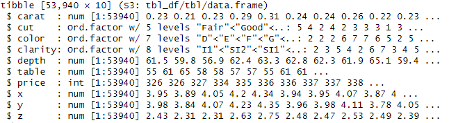
The data contains numeric, integer and factor variables. Let’s create the bar plot for the cut variable, a factor variable, in the diamond data set by using the following command
ggplot(diamonds, aes(x = cut)) + geom_bar()
By running this code, you’ll get a bar plot showing the distribution of diamond cuts in the diamonds dataset in the following way
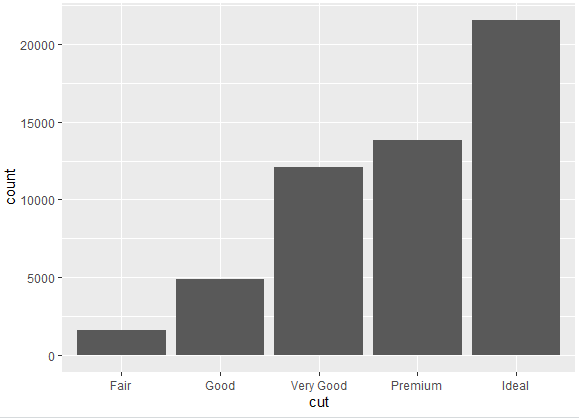
Without specifying any order, the categories of the variable are sorted in a decent way. The categories aren’t plotted in alphabetic order, but by level, representing “ideal” leads “premium”, and premium is followed by very good and so on.
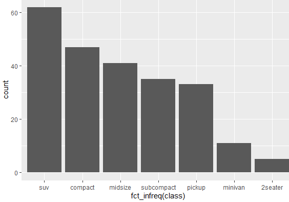
Now this stands true for diamond data set because the cut variable is in oridnal scalre, however, the data set we used earlier “mpg” data set doesn’t have any ordinal factor variable and its categories get plotted in alphabetic manner. To change that and get the categories in a certain manner, we can use the following command
ggplot(mpg, aes(x = fct_infreq(class))) + geom_bar()
In the above command, fct_infreq reorders the category of a factor based on the frequency of each category, so the category with higher frequency will appear first. By using the above command, we get the following plot, where categories aren’t placed by alphabetic order but by their frequencies.
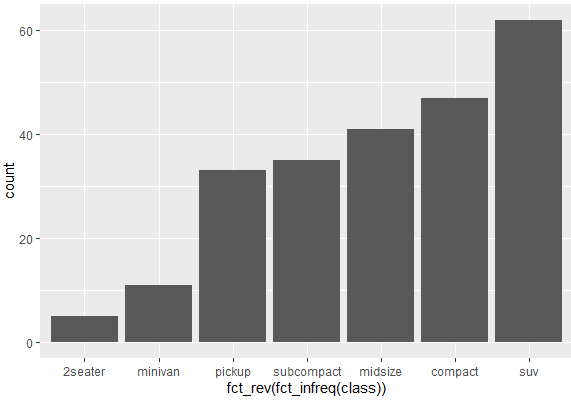
Now the above graph is in descending order, where the category with the highest frequency is shown first and so on. But we can reverse the order too, where the category with the lowest frequency appears first, followed by the increasing frequency. To do so, use the following command
ggplot(mpg, aes(x = fct_rev(fct_infreq(class)))) + geom_bar()
Yes, you guessed it correctly. The “fct_rev” argument in the above command reverses the default option and creates the following bar plot with frequencies in ascending order.
Bar plots of two categorical variables in R (Stacked or Grouped Bar Chart)
We can also create bar plots of two categorical variables in R using the ggplot. For the current data in use, let’s create a bar plot of two categorical variables; class and drv. To create their bar plot, use the following command
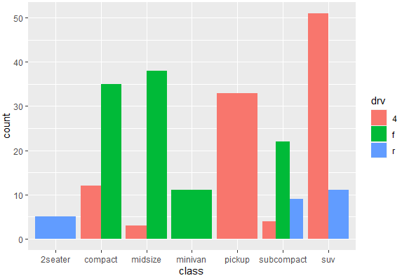
ggplot(mpg, aes(x = class, fill = drv)) + geom_bar()
This command allows you to visualize the distribution of the drv variable within each category of the class variable using a stacked bar plot. This creates the following bar plot, where categories are stacked over each other.
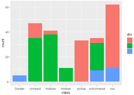
Although this is an appealing graph to present somewhere, but it doesn’t really provide much information about the categories and their relation to each other. To create a relatively informative graph, we use the following command, where categories will be presented side by side, rather than stacked over each other
ggplot(mpg, aes(x = class, fill = drv)) + geom_bar(position = "dodge")
The position= “dodge argument will display the categories side by side to provide much helpful information about their frequencies, and their relationship with each other.
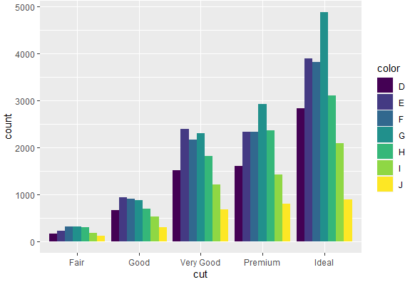
We can use the similar command for the diamond data which has relatively large number of observations and that can give us an interesting graph. To create a bar plot for cut and color variable of diamond data set, we use the following command
ggplot(diamonds, aes(x = cut, fill = color)) + geom_bar(position = "dodge")
This gives the following grouped bar chart with both categories
We can have separate bar plots of each category while creating a bar chart. To do so, we use the following command
ggplot(mpg, aes(x = class, fill = drv)) + geom_bar(position = "dodge") + facet_wrap(~drv)
In this command, facet_wrap function is used to create separate panels for each category of the drv variable. It means that you’ll have a separate plot for each drive type. The graph created from it will be like following
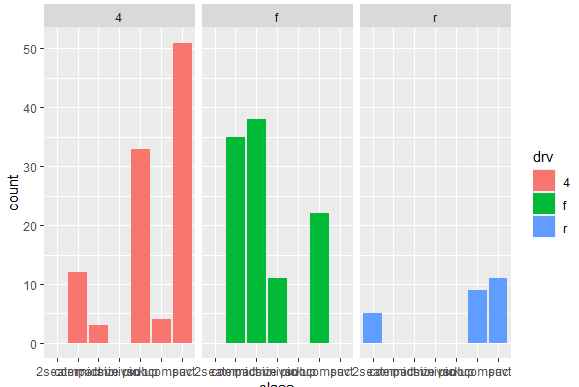
The above graph looks good, except the part where we can’t find any meaning out of the text written in x-axis. To change that, and make the text readable and understandable, we can make a few adjustments in the plot. To add those changes, we use the following command
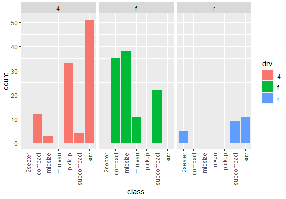
ggplot(mpg, aes(x = class, fill = drv)) + geom_bar(position = "dodge") + facet_wrap(~drv) + theme(axis.text.x = element_text(angle = 90, vjust = 0.5, hjust=1))
The last part of the command will make the test readible and create the following bar chart
Dealing with Missing values in Bar chart
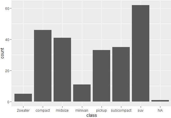
Handling missing values in a bar chart in R can be important to ensure that your visualizations accurately represent the underlying data. In ggplot2, missing values are typically represented by blank spaces on the plot. There aren’t any missing values in mpg data, so to understand the missing values, we first generate some missing values in the mpg data by using following command
mpg$class[1] <- NA
In above command, we are modifying the first element in the class column of the mpg data frame and setting it to missing (NA).
Now we again create another bar chart for the class variable, to understand how missing value is treated in the bar chart, by using the following command.
ggplot(mpg, aes(x = class)) + geom_bar()
The above command gives following result, having NA being treated as a separate category.
However, we know that NA isn’t a separate category, but it’s a missing value and should be treated as a missing value. To deal with such kind of situation, we instruct R to treat missing values as missing values. This would be done using the following command
mpg %>% drop_na(class) %>% ggplot( aes(x = class)) + geom_bar()
The above command uses the drop_na function from the tidyverse to remove any rows where the variable class has missing values. Thus the new graph generated wouldn’t have NA as a separate category.