
Data visualization is one of the important and interesting aspect of any software. In the landscape of data analysis and interpretation, effective visualization is key to unlocking insights and communicating findings. Like other softwares, R can also visualize data in form of bar charts, Line Plots and other graphs etc. However, data visualization in R is more interesting than any other tool because of its variety of features. One of the most popular packages for data visualization in R is ggplot2. This article explores the fundamental principles and practical applications of ggplot2, demonstrating how it enables users to go beyond simple charts, creating sophisticated visuals that enhance data exploration and storytelling.
Download Example FileBasics of ggplot
Before diving into actual data visualization, we need to understand the basics of ggplot package. This package is included in the tidyverse set of packages. Thus to use ggplot, one needs to install and load the tidyverse package by using the following commands
install.packages("tidyverse") library("tidyverse")Now, once the package is loaded, we use a certain built-in data set by using the following command.
data(mpg)
This data set has 234 observations of 11 variables containing information about cars, their manufacturer, model etc.
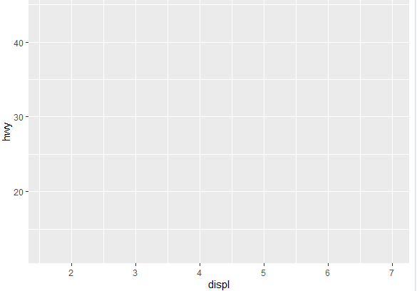
The next step is to visualize the above data using ggplot. Imagine it as preparing the canvas for a painting. We’re creating the base layer, a blank slate where we can later add all sorts of interesting elements. To create a base layer for the above data, use the following command
ggplot(data = mpg)
In the above command, ggplot is the function used to create a base layer, and mpg is the data we are going to use for data visualization. A simple canvas like layer is created. Now, to set up the basic structure of a plot using the mpg dataset, we use the following command
ggplot( data = mpg, mapping = aes(x = displ, y = hwy) )
In the above command, first we define the data set going to be used for visualization, which is mpg in this case, and then we specify the aesthetic mappings. In this case, the second part of the command tells ggplot to map the x-axis (x) to the “displ” variable and the y-axis (y) to the “hwy” variable. The aes() stands for aesthetics, and it is used to map variables to visual properties of the plot.
However, this code alone won’t produce a visible plot because we haven’t specified the type of plot or added any geometric elements. The following thematic strucutre is presented using the above command
To add the additional layer of geometric elements in above graph, we use the following command
ggplot( data = mpg, mapping = aes(x = displ, y = hwy)) + geom_point()
The rest of the command is the same except the geom_point() function. This function creates a scatter plot where each point represents a combination of displ and hwy values from the mpg dataset. The scatter plot is shown in the following image
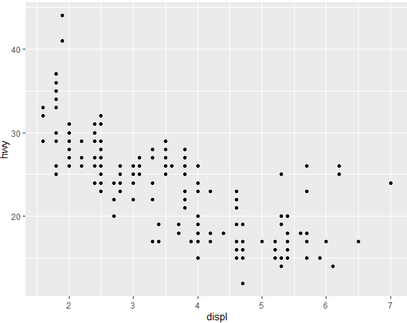
Another easier way to get the same scatter plot is by using the following command, which works essentially the same way as the previous command but doesn’t need to add unnecessary words like data and mapping.
ggplot(mpg,aes(x = displ, y = hwy)) + geom_point()
The command produces the same scatter plot as produced above.
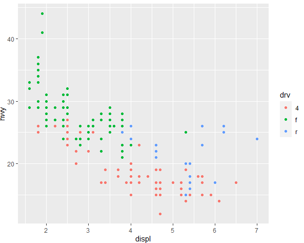
Color of Markers
Markers are the scattered points on the scatter plots. The color of these markers can be changed. To change the color of these markers, use the following command
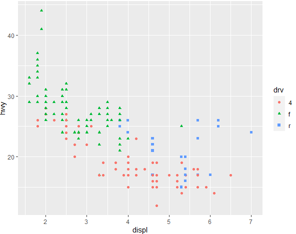
ggplot(mpg, aes(x = displ, y = hwy, color = drv)) + geom_point()
In the above command, the color = drv does the magic by assigning different colors to different levels of the variable drv. So, each unique category in the drv variable will be represented by a different color in the scatter plot. This is useful for visually distinguishing between different categories or groups in your data. In this specific case, drv is likely a categorical variable indicating the drive system type (e.g., front-wheel drive, rear-wheel drive, or four-wheel drive). The colors of markers for the drv variable will be as following
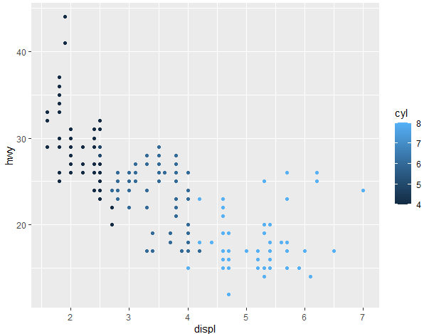
The above example is of the categorical variable, where there are different categories present for a variable. However, when the variable is continuous, the same command can be used to generate the scatter plot with different colored markers.
mpg %>% ggplot(aes(x = displ, y = hwy, color = cyl )) + geom_point()
This will generate the following scatter plot for the continuous variable, where the categories aren’t clearly distinguished but continuous here, so it represents if with the same color but with different shades.
Changing the Shape of Markers
Shape of the above markers can be changed using ggplot too, to better distinguish the categories of the variable. To change the shape of markers from typical cirlce to square or triangles, set by default in R, use the following command
ggplot(mpg, aes(x = displ, y = hwy, color = drv, shape = drv)) + geom_point()
In the above command, the shape aesthetic is used to specify the shape of the markers in the scatter plot, and the values for the markers are determined by the categories of the drv variable. Thus, each unique category in the drv variable will be represented by different shaped markers in the scatter plot. The markers with different shapes and colors are shown below.
However, there is a drawback in using the above command for a variable that has lots of categories. For instance, we want to create a scatter plot for the variable “class” in the mpg data, and distinguish the categories by different color and shape. We do that by using the following command, which has just the variable named changed.
ggplot(mpg, aes(x = displ, y = hwy, color = class, shape = class)) + geom_point()
The following scatter plot is shown for the class variable.
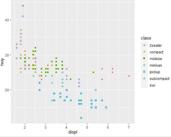
However, notice that in the above scatter plot, there is no shape or color assigned to the suv category. This is because when we run the above command, a warning message appears that only 6 categories of a variable can have different shapes and colors and the rest of the observations for the remaining categories get deleted.
So be mindful of when changing the shapes of markers for the variables that has more than 6 categories.
Adding additional layers using ggplot
Let’s go back to the first scatter plot that we created for the drv variable. If you look in the first scatter plot, there is a downward trend, however, we cannot make sure of the downward trend exactly, and it’s specifically difficult to understand the trend for the different categories. Thus, to get the idea of trend, we need to add a trend line in the scatter plot. To add a trend line, we use the following command
ggplot(mpg, aes(x = displ, y = hwy, color = drv, shape = drv)) + geom_point() + geom_smooth()
The rest of the command is the same as previous commands, except the last part. The geom_smooth() function adds smoothed lines to the plot, and the lines depend on the underlying data. In this case, we have three categories and there will be three lines for each category. The scatter plot having additional layers is shown as following
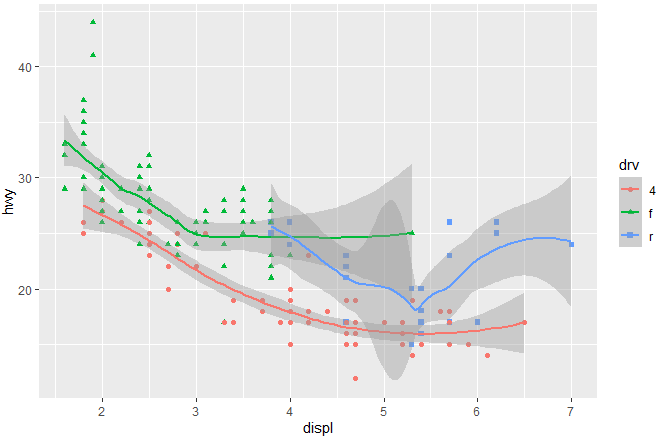
The grey area you are seeing is the confidence interval around the fitted line. The function geom_smooth() by default includes a shaded region representing the confidence interval of the fitted line. This interval is a measure of the uncertainty associated with the estimated relationship between the variables.
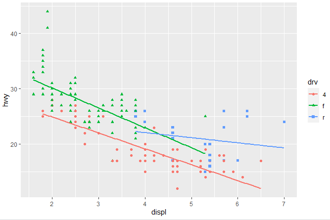
What if we want linear lines instead of smooth lines in the scatter plot, and we don’t want to include the confidence interval in the scatter plot too? We can do that simply by adding a few arguments in the above command. The command for specifying the linear line and removal of confidence interval will be as following
ggplot(mpg, aes(x = displ, y = hwy)) + geom_point(aes(color = drv, shape = drv)) + geom_smooth(method = "lm" , se=F)
The argument (method = “lm” specifies a linear line instead of the smooth line and “se=F” means that the confidence interval should not be displayed around the line in the scatter plot. The scatter plot we get by using the above command will look like the following, where we have linear lines and no shaded area.
Change titles of Scatter Plot
You can add titles to your ggplot in R using the labs function to modify the labels of different plot elements. To add the titles, and subtitles in the aboe scatter plot, we can use the following command
ggplot(mpg, aes(x = displ, y = hwy)) + geom_point(aes(color = drv, shape = drv)) + geom_smooth(method = "lm" , se=F) + labs( title = "Engine displacement on Highway miles", subtitle = "Compact, Midsize and Pickup Cars", x = "Engine displacement", y = "Highway miles (per gallon)", color = "Type of Drive", shape = "Type of Drive", caption = "Source: mpg data from R" )
This seemingly big command is easy to understand if you pay attention. The rest of the command is the same, and then you can add titles, subtitles and labels of x and y-axis as described above in the command. The scatter plot with labels is shown as below
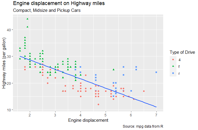
So, the overall command creates a scatter plot of highway miles per gallon against engine displacement using data from the “mpg” dataset. Points are colored and shaped based on the type of drive train, and a linear regression line is added. Titles and labels are provided for better understanding and interpretation of the plot.
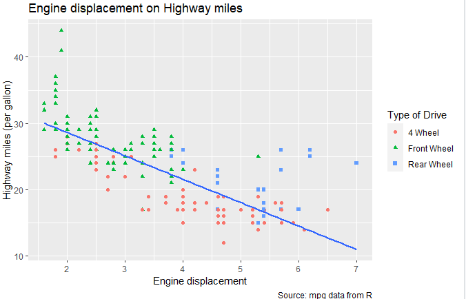
If you notice in the above scatter plot, the labels for the categories of drv are missing. We can also add the lables for categories by using legend in the command. Legends are used to provide information about the mapping of variables to aesthetics (like color and shape) in the plot. Legends help interpret the meaning of the visual elements in the plot. The following command is used to add labels for the categories of the drv variable.
ggplot(mpg, aes(x = displ, y = hwy)) + geom_point(aes(color = drv, shape = drv)) + geom_smooth(method = "lm" , se=F) + labs( title = "Engine displacement on Highway miles", subtitle = "Compact, Midsize and Pickup Cars", x = "Engine displacement", y = "Highway miles (per gallon)", color = "Type of Drive", shape = "Type of Drive", caption = "Source: mpg data from R" ) + scale_colour_discrete( labels = c("4" = "4 Wheel", "f" = "Front Wheel", "r" = "Rear Wheel") ) + scale_shape_discrete( labels = c("4" = "4 Wheel", "f" = "Front Wheel", "r" = "Rear Wheel") ) In the above command, there are two types of legends used: the color legend and the shape legend. The scale_colour_discrete is the color legend and modifies the color of each unqiue category of the drv variable (“4”, “f”, “r”). The scale_shape_discrete modifies the shape legend for each unique category of drv variable. By using this command, rest of the labels will be same as in the above scatter plot, however, now the three categories of the variable will also be labeled, as shown in the image below.
Changing theme of the Plot
You can change the theme of a ggplot2 scatter plot in R to customize its appearance. The theme() function is used for this purpose. To change the theme of the scatter plot we are creating, use the following command
ggplot(mpg, aes(x = displ, y = hwy)) + geom_point(aes(color = drv, shape = drv)) + geom_smooth(method = "lm" , se=F) + labs( title = "Engine displacement on Highway miles", subtitle = "Compact, Midsize and Pickup Cars", x = "Engine displacement", y = "Highway miles (per gallon)", color = "Type of Drive", shape = "Type of Drive", caption = "Source: mpg data from R" ) + theme_classic()
The theme we chose for this scatter plot is classic, however, there are other themes available for use too. To get wide range of themes, install and load the ggthemes package in R by using following commands
install.packages("ggthemes")
library("ggthemes")
Now you should be able to use functions and themes provided by the “ggthemes” package in your R environment.
Creating Separate Graph for Each Category
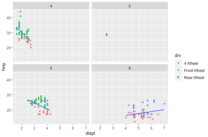
We can also divide the graph into categories of variables into separate panels by using the facet_wrap function. The facet_wrap() is used to create separate panels in the plot for each category of the given variable. This is particularly useful when you have a categorical variable (in this case, “cyl”) and you want to see how the relationship between “displ” and “hwy” varies for each category. To divide graphs in this way, we use the following command
ggplot(mpg, aes(x = displ, y = hwy)) + geom_point(aes(color = drv, shape = drv)) + geom_smooth(method = "lm" , se=F) + facet_wrap(~cyl)
In the above command as the “cyl” has, 4 levels the facet_wrap(~cyl) will produce four separate panels in the plot, each showing the scatter plot and linear regression line for the data points corresponding to the specific “cyl” category.
Flipping graph sideways
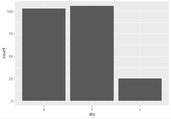
Bar Plots can also be created in R using the ggplot function. To create the bar plot of the drv variable in the data we are using, we use the following command
ggplot(mpg, aes(drv)) + geom_bar()
The geom_bar() adds a bar plot layer to the ggplot object. Since no specific variable is specified for the y-axis, it is assumed to be the count of occurrences for each unique category of the drv variable specified. The following bar plot is generated
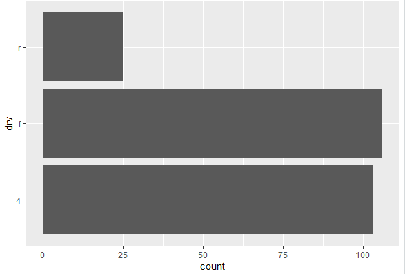
This bar plot is vertical, however, it can also be flipped and categories of the variable will be on x-axis instead of y-axis. To flip the bar plot, use the following command
ggplot(mpg, aes(drv)) + geom_bar() + coord_flip()
The rest of the command is same as of previous one, except the coord_flip() function. This function is used to flip the coordinates of the plot, switching the x and y axes. So, the bar plot, which was initially vertical, becomes horizontal. The categories of the drv will be thus horizontally displayed instead of vertically. The horizontal bar plot is visualized as below
In conclusion, data visualization using ggplot2 in R offers a powerful and flexible framework for creating insightful and aesthetically pleasing plots. With its intuitive syntax, ggplot2 allows users to easily customize and tailor visualizations to their specific needs. The package excels in producing a wide range of plot types, from basic scatter plots and bar charts to more complex visuals like heatmaps and treemaps.
Moreover, the ability to customize color schemes, labels, and themes ensures that the resulting visualizations are not only informative but also visually appealing.