Data visualization is a powerful tool for gaining insights into the patterns and trends hidden within numerical variables. Just like one or more categorical variables can be visualized using ggplot2 package in R, hidden trends of numerical variables can also be traced and discovered using the same package. To get started with the package, as you must know, we need to install and load the tidyverse package using the following commands
install.packages("tidyverse") library(tidyverse)Let’s create a random data for stock price, which contains a single variable named price. However, before that, we need to ensure that random data we are generating is reproduce-able. To do so, we use the seed function. Setting the seed to 123 ensures that every time you run this code, you’ll get the same simulated stock price dataset, making your results reproducible. To set the seed equal to 123, use the following command
set.seed(123)
Now to generate a random set of numbers, use the following command
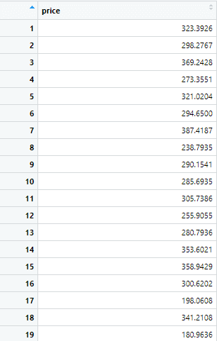
abc_stock <-data.frame(price = rnorm(3000, mean = 300, sd = 50))
The resulting data frame “abc_stock” contains 3000 rows, each representing a randomly generated price value that follows a normal distribution with a mean of 300 and a standard deviation of 50. This type of data generation is commonly used in simulations or modeling scenarios where synthetic data with specific statistical properties is needed.
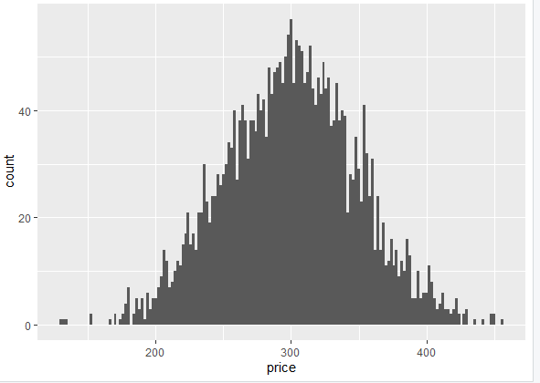
Now, let’s say we want to create a histogram for the above data, keeping the price variable on the x-axis. To create such a histogram, we use the following command
ggplot(abc_stock, aes(x = price)) + geom_histogram(binwidth = 2)
This code uses ggplot2 to create a histogram of the “price” variable in the abc_stock data frame. The aes(x = price) specifies that the x-axis represents the “price” variable. The geom_histogram function creates the histogram, and binwidth = 2 sets the width of the bins. The above command generates the following histogram.
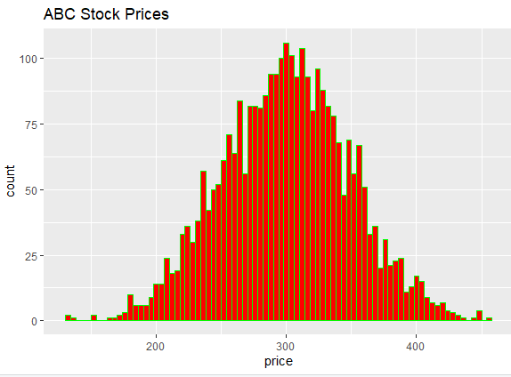
The boring-looking histogram can be made colorful by specifying certain colors for the histogram. To specify colors for the histogram, we use the following command
ggplot(abc_stock, aes(x = price)) + geom_histogram(binwidth = 4, fill = "red", color = "green") + labs(title = "ABC Stock Prices")
The color and titles can be customized according to one’s requirements. The histogram created from the above command will look like following
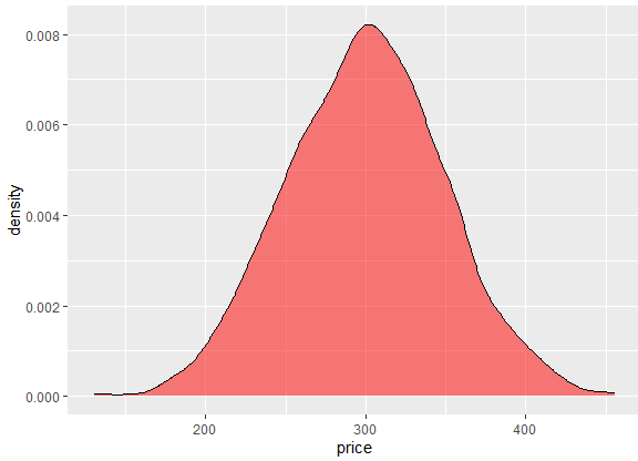
Just like the histogram, a density plot can also be created for a numeric variable in R using ggplot2. A density plot is a graphical representation of the distribution of a numerical variable. It provides an estimate of the probability density function of the underlying data. To get the density plot for the prices of the stock in given data, we can use the following command
ggplot(abc_stock, aes(x = price)) + geom_density(fill = "red", alpha = 0.5)
In the above command, geom_density adds a density plot layer to the ggplot. This layer represents the distribution of the “price” variable. The other part of the command specifies that the area under the density curve should be filled with the color red and alpha = 0.5 sets the transparency level of the filled area to 0.5. This can be changed according to one’s transparent, making the density plot more customized.
The density plot we get from the above command is following
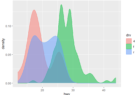
Let’s try to visualize a different data set containing multiple variables. To load the mpg data set, use the following command
data(mpg)
To create the density plot for the mpg data set, use the following command
ggplot(mpg, aes(x = hwy, color = drv, fill = drv)) + geom_density(alpha = 0.5)
The rest of the command is the same as explained earlier, except the “aes” part, which represents that the x-axis should represent the “hwy” variable, the color aesthetic is mapped to the “drv” variable, which represents the drive type. while the fill aesthetic is also mapped to the “drv” variable, indicating the fill color for the areas under the density curve.
This generates a density plot for the variables in the “mpg” dataset, which is visualized as below
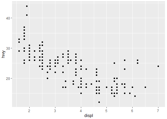
Create a Scatter Plot
We can also create a scatter plot for the mpg data set, using ggplot2. To create a scatter plot for numeric variables using ggplot2, we’ll need a dataset with at least two numeric variables.
ggplot(mpg, aes(x = displ, y = hwy)) + geom_point()
The geom_point function helps in creating the scatter plot for two variables. The scatter plot will be visualized as below
The scatter plot can be customized by selecting different colors and shapes for the markers. Similarly, titles of the plots can also be added. To visualize these changes, where we have a different color and shape of markers, and title or label of the scatter plot, we use the following command
ggplot(mpg, aes(x = displ, y = hwy, color = drv, shape = drv)) + geom_point()
While the rest of the command stays the same, it additionally adds color and shape aesthetics based on the “drv” (drive type) variable. The scatter plot created will be as following, having different color and shape of the markers.
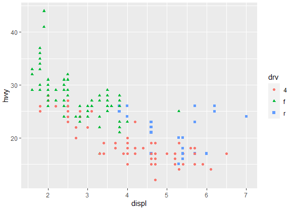
The color and shape of markers can be traced to different variables of your choice, be it class variable or another variable.
Similarly, size of markers can also be changed depending on your preference. Marker sizes can be customized on a certain parameter or on the size. To change the size of markers, following command should be used.
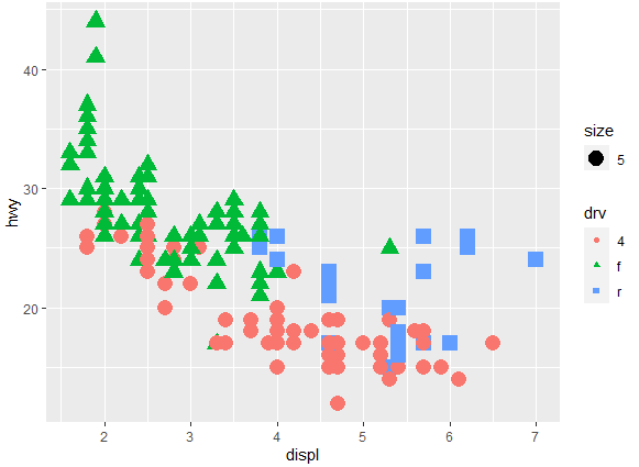
ggplot(mpg, aes(x = displ, y = hwy, color = drv, shape = drv, size = 5)) + geom_point()
One can either increase or decrease the size of markers, depending on their requirements. The plot with size of markers 5 will be visualized as following
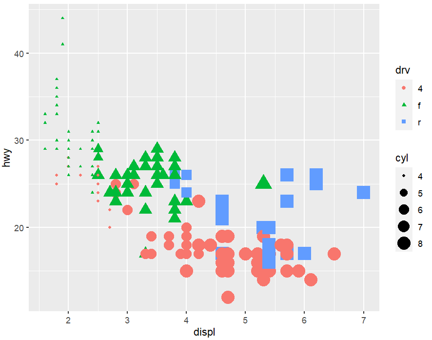
The size of markers can also be based on a certain variable, say cylinder in this case. To use a variable as a base for the size of markers, one can write the name of variable in front of the size argument, as shown in the command below.
ggplot(mpg, aes(x = displ, y = hwy, color = drv, shape = drv, size = cyl)) + geom_point()
Adding Additional Layers in Scatter Plot
You can add additional layers to the scatter plot in R using ggplot2 to enhance the visualization. These additional layers can come in the form of a regression lines in the scatter plot, confidence intervals, layers dividing the plots into facets etc.
To add a smooth or regression line in the scatter plot, use the following command.
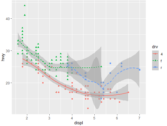
ggplot(mpg, aes(x = displ, y = hwy, color = drv, shape = drv )) + geom_point() + geom_smooth()
Remember to add plus sign “+” while adding the new layers in the plot. The above command creates a scatter plot where each point represents a combination of engine displacement and highway miles per gallon. The points are colored and shaped based on the drive type, and a smoothed regression line is added to capture the overall trend in the data. The following plot will be created from the above command

The smooth line present in the data can be customized to differentiate among the categories further. To differentiate the line types of the smoothed regression line in the scatter plot based on the levels of a variable, say drv variable, we use the following command
ggplot(mpg, aes(x = displ, y = hwy, color = drv, shape = drv , linetype = drv)) + geom_point() + geom_smooth()
This command will create a layer of smooth line and a layer of points to the scatter plot.
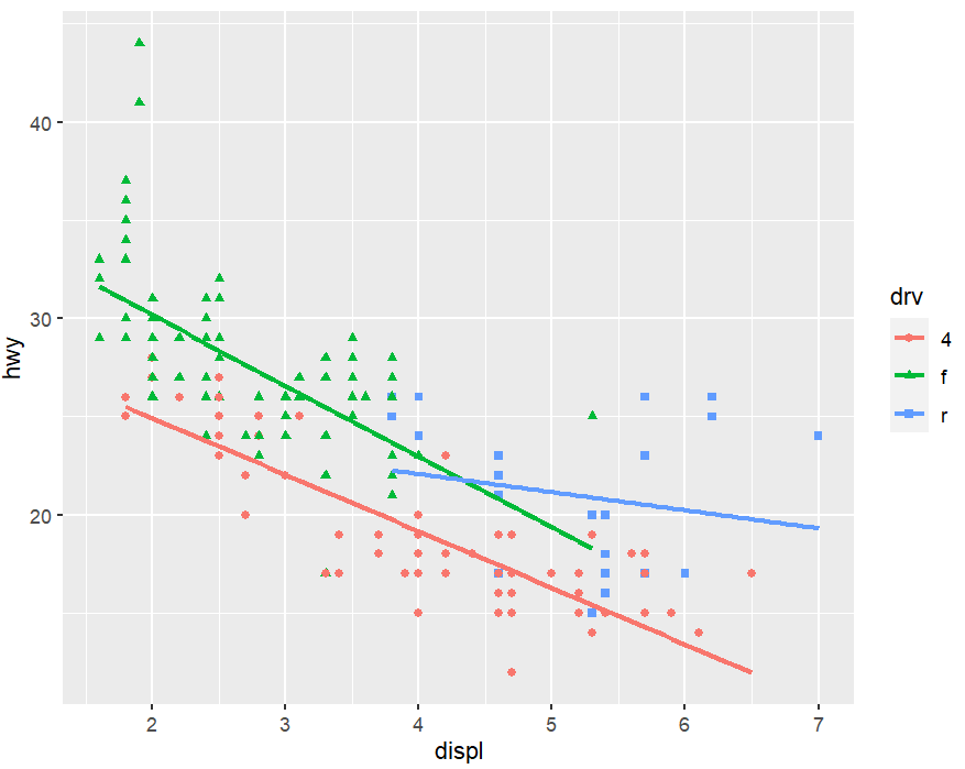
We can also create a linear line in the scatter plot by setting the geom_smooth() argument equal to “lm” method. The command for which will be as following
ggplot(mpg, aes(x = displ, y = hwy, color = drv, shape = drv)) + geom_point() + geom_smooth(method = lm, se = FALSE)
The method = "lm" argument specifies that you want to fit a linear model to the data, resulting in a linear regression line on the scatter plot, creating the following plot.
Creating a Box Plot using ggplot
Creating a box plot in ggplot2 involves using the ggplot() function to specify data and aesthetics, followed by geom_boxplot() to add the box plot layer, allowing for visualizing the distribution of a numerical variable across different categories.
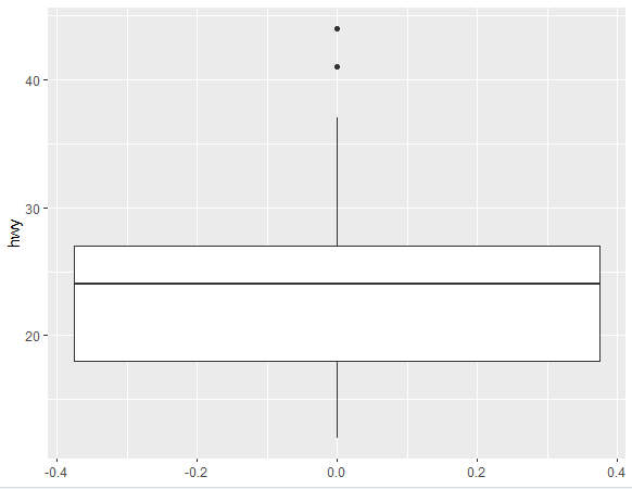
ggplot(mpg, aes(y = hwy)) + geom_boxplot()
The following box plot is created from the above command, for the hwy variable.
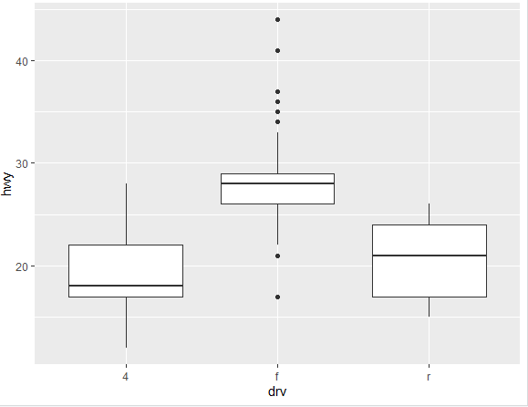
Similarly, multiple box plots can also be created in the way, where variables can be assigned to x and y-axis, using the following command
ggplot(mpg, aes(x = drv, y = hwy)) + geom_boxplot()
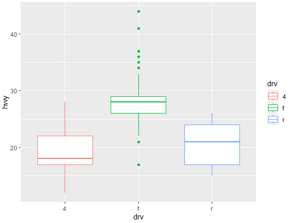
Bored of seeing black and white box plots? We got you covered. Just like scatter plots, box plots can also be customized and made colorful using the color argument in the command
ggplot(mpg, aes(x = drv, y = hwy, color = drv )) + geom_boxplot()
The following colorful box plot is created
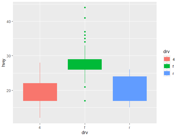
To fill the whole box plots with color, you can use the fill argument in the command in following way
ggplot(mpg, aes(x = drv, y = hwy, color = drv, fill = drv)) + geom_boxplot()
This will fill the box plots with color as shown below
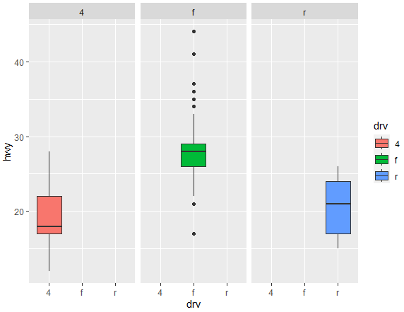
There is a way to make separate box plots for each category using ggplot2, from the following command
ggplot(mpg, aes(x = drv, y = hwy)) + geom_boxplot(aes(fill = drv)) + facet_wrap(~drv)
Following box plot is created from the above command