Box plot is a type of graph or plot, used to visualize the five number summary of a data set. The five number summary includes mean, median, first Quartile, third Quartile, maximum values. Box Plot can be generated in the Stata. To go into detail and learn how to create a box plot in Stata, we import the Automobile data set. To import data, use the following command
sysuse auto.dta
If you open the data viewer window, there are different types of variables in the data. The variables contain either numeric data or categorical data. For instance, the variable named foreign is a categorical data containing two categories; Foreign and Domestic. It depicts whether cars are made in domestically or in a foreign country.
To proceed with Box Plot in Stata, box plots can be created from window menu or using the command. It’s better to move things from easier to harder way, so we start creating box Plots from windows menu.
To create a box plot of, say foreign variable, the path given below should be followed
Graphics > Box Plot
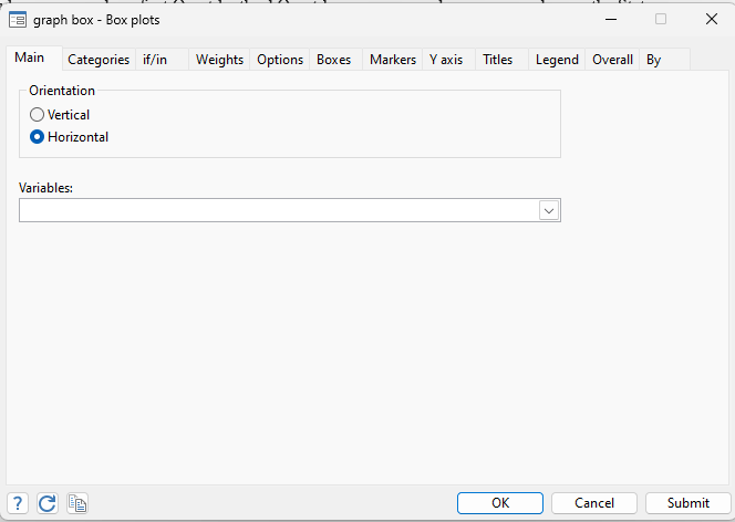
The following window appears, which leaves us with two options to create box plot. We can either create box Plot horizontally or vertically.
Vertical Box Plot
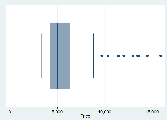
We begin by creating vertical box Plot in Stata. To create a vertical box Plot, choose the vertical option in the above window and then choose variables. In this case, we choose the variable Price and click on submit.
The following Box Plot will be generated for the chosen variable

The above Box plot is generated through menu window. However, if you are more of a command person rather than using menu option, you can create the same graph by using the following command
graph box price
Note that we didn’t specify Stata whether to create a vertical or horizontal graph while using command, so it will use the default option to create a vertical graph using above command.
Horizontal Box Plot
To create a horizontal Box plot in Stata of mpg variable, follow the similar path used above.
Graphics > Box Plot > Horizontal > Choose variable
Once you have chosen the horizontal option and price as variable, the following graph will be generated in Stata.
The same graph can be generated using following command
graph hbox price
Here we are instructing Stata to create a horizontal Box Plot by adding “h” alphabet with the box command.
Creating Box Plots by Category
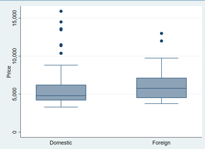
Till now, we have created Box plot using single variable in Stata. Now moving on, the box plots of categorical variables can also be created, using over() option in Stata. For instance, if there is a need to create box plot of manufacturing of cars, using price variable over the categories, whether the cars were manufactured foreign or domestically, this can also be done using the box plot window option.
To create a box plot by category, we again follow the given path.
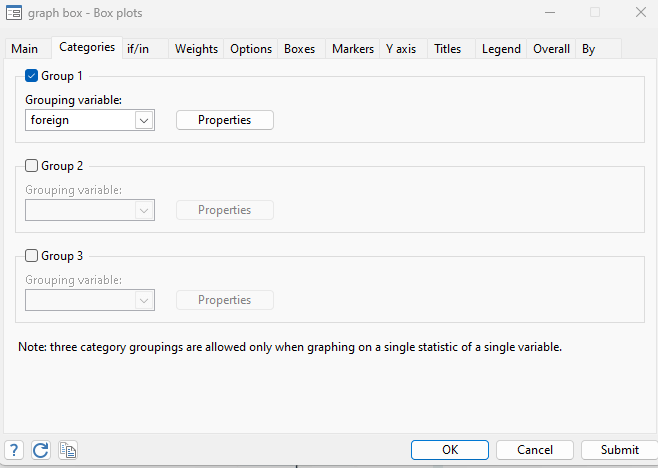
Graphics > Box Plot > Choose Variables > Categories > Group 1 > Choose variable
Here, however, we also select the group 1 for categorical variable, as shown in the window below
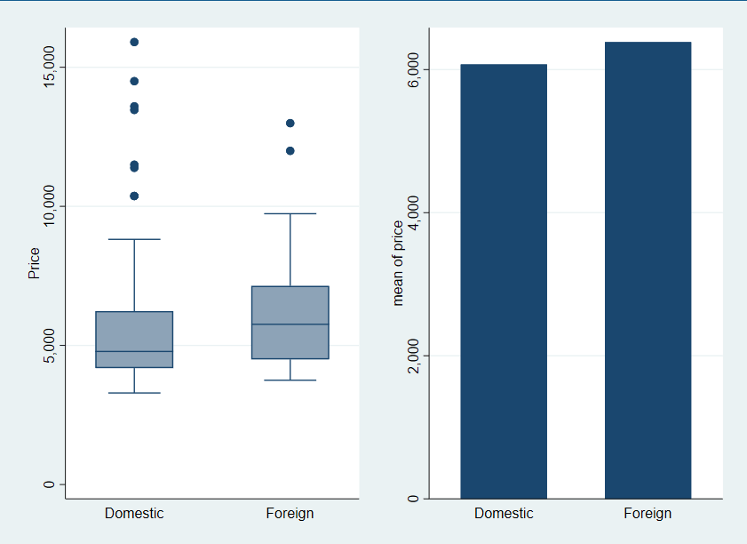
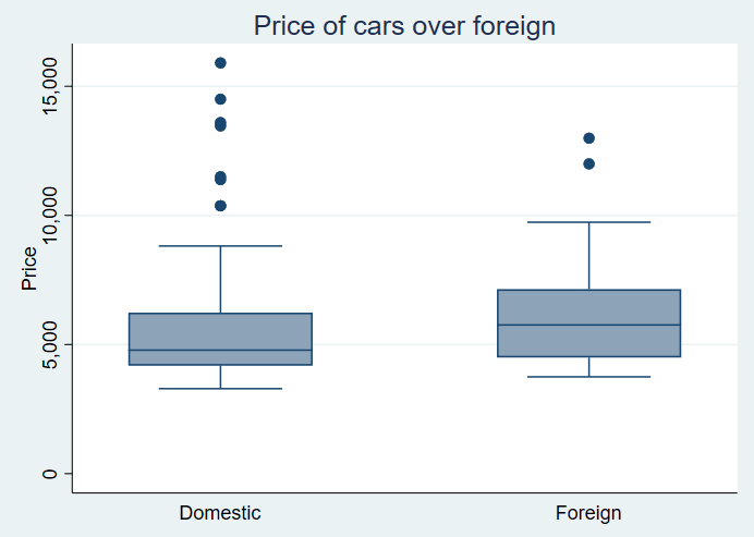
The following graph will be generated that shows that cars are manufactured either domestically or in a foreign country, with their prices on y-axis.
Similarly, this graph can be generated using the following command in Stata
graph box price, over(foreign)
Again, this graph is vertical because Stata wasn’t instructed, and it created the graph using in-built function. However, if you want to create the above graph horizontally, the command will look like this
graph hbox price, over(foreign)
This will create a horizontal graph for the same variable, i.e. price over foreign category
Creating Multiple Graph Plots by Category
If the data requires you to create multiple box plots, using two or more than two variables, it can also be done using Stata. For instance, if we want to create multiple Box Plots based on two variables by categories, let’ say we wish to see the repair records of the car and trunk space of car based on its category that whether car was produced domestically or in foreign country, we do this by using the menu path mentioned above.
Graphics > Box Plot > Variables > Categories > Group 1 > Variable
Once the variables rep78 and trunk, representing repair records and trunk space of car respectively, has been added in the main variables window and variable foreign has been added in the category, click on submit button. Clicking submit will generate the following graph
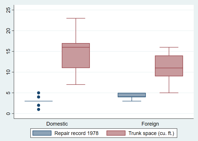
Now total of 4 box plots are generated, divided in two categories, foreign and domestic. Other details are mentioned under the box plot.
The command for the above Box plot is following
graph box rep78 trunk, over(foreign)
Change Formatting of the Box Plot in Stata
We can also change the formatting of Box plots, including changing of color, adding a title to Box Plot, creating a note in the title, and changing x or y-axis etc.
Color : While working with data can be monotonous and a boring task, colorful graphs can give a fresh look to data visualization. The color of Box Plots can be changed according to one’s choice and requirement.
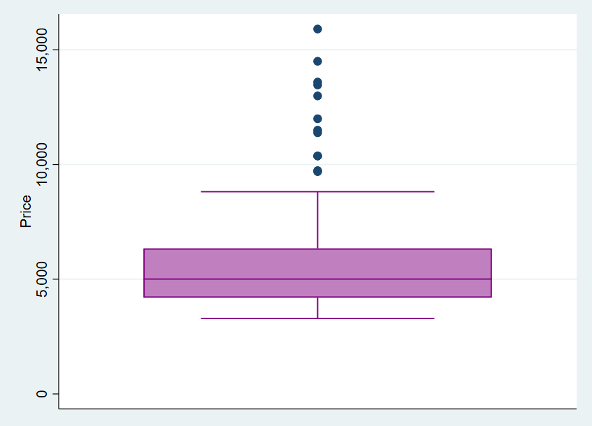
What’s the usual color of most of the graphs we work with on daily basis? Blue or Red, right? Let’s change the color of our box plot to orange or purple, which gives it a lively look. To change the color of Box plots generated using price variable, use the following command
graph box price, box(1, color(purple))
You can choose any color to work with in Box Plots.
The Stata will generate the following colorful Box Plot
Titles: Graphs without titles give an impression that one has missed the important step in mentioning details of graph. It is thus important to provide the reader with details they are dealing with. To add title into graph plot, go to
Graphics > Box Plot > Titles
In the window, you can add whatever title defines your graph accurately. The title window will look like this
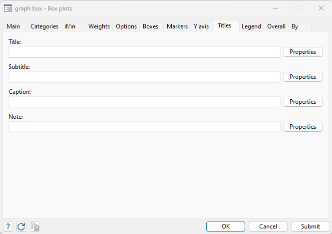
Whatever title you want to give to your Box Plot can be added to Title space bar. The graph generated after the title will be as following, having a proper title in it
The title can be added through command too. To add the title using command, use the command given below
graph box price, over(foreign) title(Price of cars over foreign)
Similarly, subtitles or Notes can also be added into the Box plot titles, which can provide further insights into what the Box plot is about and data source etc. For instance, If we add certain details into our graph, it will look like as follows
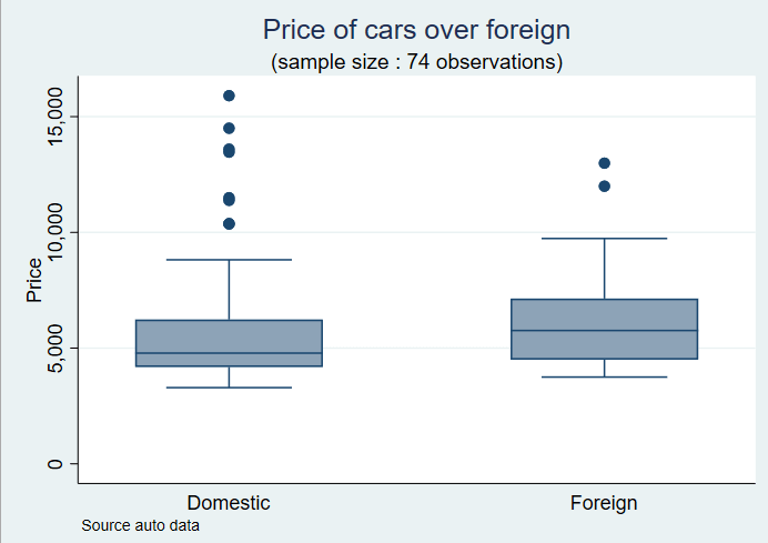
Now the above generated graph has a title, subtitle and note in it. You can add whatever title and subtitle is your requirement as per data. Like previous graph, we can also use this graph through command, if we are not feeling too lazy. We use following command to add the title, subtitle and note in Box Plot
graph box price, over(foreign) title(Price of cars over foreign) subtitle((sample size : 74 observations)) note(Source auto data)
Formatting Labels: Moving on, we can also change formatting of Labels in Box Plots. Labels represent values of variables present on x or y-axis. For instance, in the above image, on the y-axis the 0, 5000, and 10,000 values are labels and domestic and foreign in x-axis are also labels for x-axis. The formatting of labels can also be changed in Box Plots in Stata. If we want to change the labels of y-axis from vertical to horizontal, it can be done by using the menu window. To do so, go to
Graphics > Box Plot > Choose variables > Y axis > Major Tick/Label Properties > Labels > Angle > Horizontal
The window showing labels properties and other formatting functions look as following
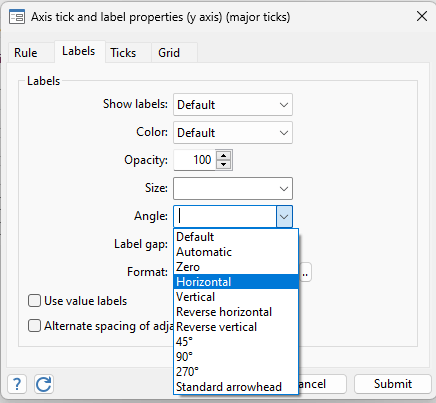
In above window, it is clearly shown that other than changing angle of labels, many other formatting options are also available. You can change the color of labels, their size gap and many more. However, we stick to changing the angle option. Once the horizontal option is selected, and we click on submit button, the labels will appear horizontally in Box Plot. This is shown below
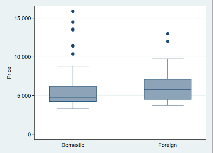
The command for changing the label of y-axis to horizontal is following
graph box price, over(foreign) ylabel(, angle(horizontal))
Identifying an outlier in Box Plot
The data in variables is usually not evenly distributed, and one or more values can be extremely smaller or extremely larger. These values on upper or lower extremes are known as outliers. These outliers can be identified using different methods, including variety of graphs. However, here we would stick to identifying outliers in Box Plot. To identify an outlier, let’s generate a box plot for rep78 variable in our data using following command
graph box rep78
The following Box Plot will be generated in Stata
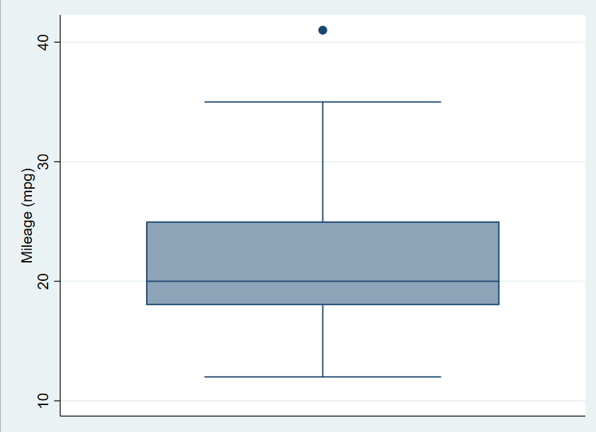
Do you see that blue circle above the Box Plot? well, that’s not a circle exactly but an outlier. This outlier has been identified for the mpg variable. Outliers aren’t usually desirable to work with. So to remove outliers, we first need to identify the exact value or specification of outlier. To get an exact value or observation, that lies far below or above from the data, we need to use the following command
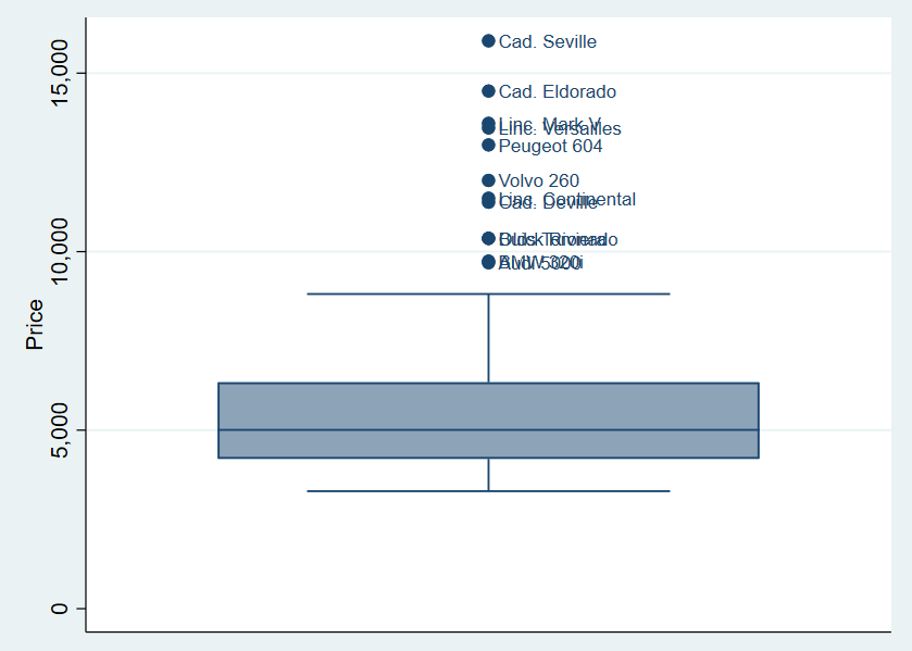
graph box mpg, mark(1, mlab(make))
The above command can be explained in such a way that we create the Box plot for the required variable, and if the outlier is present, we identify that outlier. To identify the outlier, we use the word mark (as used in above command) for marking the outlier and then mlab word that labels the outlier. The word make used in above command specifies the variable from which that outlier can be identified or labelled.
This command labels the value which is causing data to lie far away from average data. The labeled outlier looks like following

Similarly, to see more outliers present in data, we run the command for the price variable for identification of outlier.
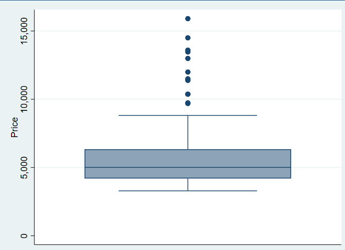
The price variable has many outliers present in data. To identify and label them correctly, we again use the command used earlier, but now for price variable
graph box price, mark(1, mlab(make))
The following cars are identified whose prices lie far above the mean prices.
If you want to know more about identifying outliers in Stata, head to The Data Hall’s other article.
Combine Box Plots
The data often requires comparing or combining two different graphs simultaneously. This can be done in Stata using combine option in Stata. Let’s say, if you want to combine a box plot and a bar chart in Stata, we can easily do this. First, we need to create a bar plot using the following command
graph box price, over(foreign) name(g1)
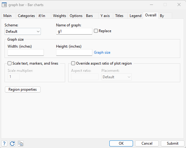
It is important to give name to graphs, so one can specify Stata which graphs are to be combined.
Graphs can also be named in the menu, under the overall window, as shown below.
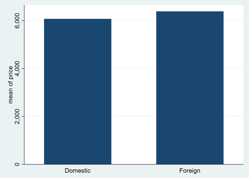
Once the Box Plot has been created, next move towards creating a bar chart in Stata. Let’s create a bar chart of prices of cars over foreign category. To create a chart, use the similar method followed for box plot
Graphics > Bar Chart > Summary Statistics > Choose Variable > Categories > Choose Variable > Overall > Name of Graph > choose any name you want to
If the above path seems like alot to follow, use can simply use the following command for creating bar chart
graph bar (mean) price, over(foreign) name(g2)
g2 is the name we are assigning to Bar Chart
The following bar chart will be created
Once the chart has been created, we can combine the graphs. To combine both graphs, use the following command
graph combine g1 g2
Graphs will be combined side by side in following way