
This article will delve into what outliers are, how we can identify outliers in Stata, and finally, how they can be treated in Stata.
Defining Outliers
Put simply, an outlier is a value/observation in a dataset that is either extremely high or extremely low as compared to other values/observations in a given dataset. The meaning and interpretation of the term ‘outlier’ may change depending on the type of data, the researcher’s objective, and the research setting. Whether they are treated or not is something that the researcher decides based on the context and setting of their research. For details you may refer to Chapter 10 of A Gentle Introduction to Stata Alan C. Acock
This article will only cover univariate outliers. These are outliers that pertain to only one variable in the dataset i.e. only one variable is affected by the presence of outliers.
Identifying and Finding Outliers in Your Data
Download Example FileWe start this by loading our dataset of choice, which in this case will be Stata’s built-in auto dataset:
sysuse auto.dta
Method 1: Sorting the Data
Let’s sort the price variable (in ascending order) to see how outliers can affect it. We use the command
sort price edit
The edit command opens the dataset for you to inspect and edit. In this case, the price variable appears to have no extreme values. Sorting and inspecting will only serve to fulfill this part: i.e. give you a visual overview of how a variable’s values increase and whether a few extreme values exist in isolation.
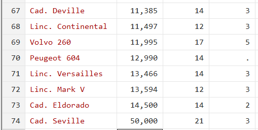
If we were to change the last (maximum) value to, say, 50,000, it becomes an outlier since it is now a very high value as compared to its previous observation (14,500) (We are replacing this value because we want to demonstrate the process, you don’t have to replace the value in your data). If such a value does exist in your dataset, sorting will easily help you identify it.
Method 2: Box Plot
A box plot is the graphical equivalent of a five-number summary or the interquartile method of finding the outliers.
To draw a box plot, click on the ’Graphics’ menu option and then ‘Box plot’. In the dialogue box that opens, choose the variable that you wish to check for outliers from the drop-down menu in the first tab called ‘Main’. Click ‘Ok’ to produce the graph.
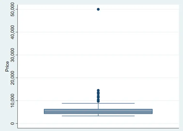
The plotted value at the very top indicates an outlier since it lies outside the typical distribution/pattern of the variable. However, this does not let us know the exact value observation that helps give more context to it. For this, we have to manually sort the data. To get around this issue, let’s ask Stata to label the graph.
Let’s generate a variable called id that would act as a unique ID number for each row.
gen id=_n
This will generate a variable that starts from 1 for the first observation and increments by 1 for each subsequent observation. In other words, this variable depicts the observation number for each row.
Let’s use the command box to draw the box plot now. Commands to generate graphs are typically started with graph, followed by the graph type, and then followed by the variable(s) we wish to plot. This can then be followed by options you may want to add
graph box price, mark(1,mlabel(id))

The mlabel() option ensures that the plotted dots for the price are labelled with the corresponding observation numbers. Now, the graph shows a label saying ‘74’ beside the outlier value (as well as with other plotted values of price). This way, one can go and directly check the 74th observation (or more if there are multiple outliers) in the dataset without having to sort and inspect manually.
One problem associated with a box plot is that it does not allow us to change the interquartile level. This affects our ability to inspect outliers that are defined differently. Some definitions suggest anything above the 150% of the interquartile range as an outlier, while others define 220% or 300% of the IQR as outliers. To address this, we will now turn to the extremes command.
Related Article: Combine multiple graphs in Stata
Method 3: Extremes Command
The third method entails using the extremes command which is not built into Stata; it is a user-written command. In order to install it, we type:
ssc install extremes
The basic syntax is simply the command itself followed by the variable of interest.
extremes price
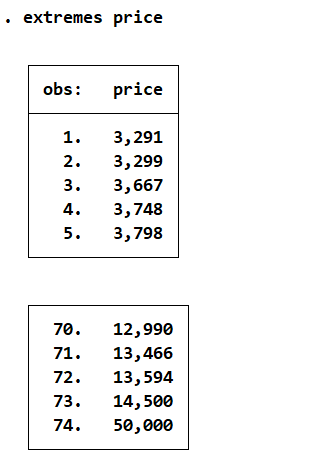
This returns the first and last five observations of the variable (based on an ascending sort). To tailor the output according to a certain percent of the IQR, we add the option:
extremes price, iqr(1.5) extremes price, iqr(3)
The first command returns a list of outliers that are 150% of the IQR, while the second command returns outliers that are 300% of the IQR.
Adding another variable name after the first variable name produces the same output, except that it also adds the values/data for the new variable in the output table as well.
extremes price mpg, iqr(3)

Method 4: Histogram
A histogram can be created by clicking on the ‘Graphics’ menu option and then choosing ‘Histogram’. Select the variable you wish to plot from the first drop-down menu in the ‘Main’ tab. Change the Y-Axis setting to ‘Frequency’ (in the same tab) as well. Press ‘OK’.
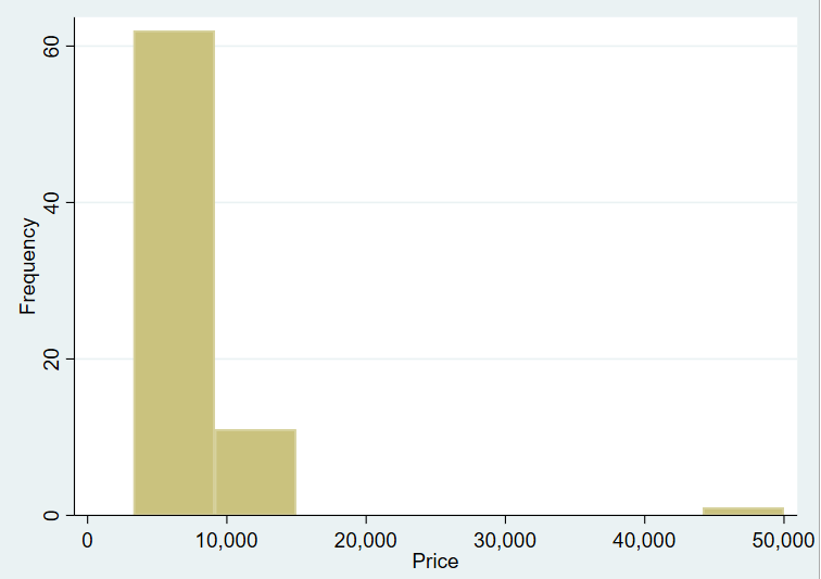
The bar at the extreme end of the graph clearly indicates an observation that occurs with very little frequency with a very high value relative to other observations.
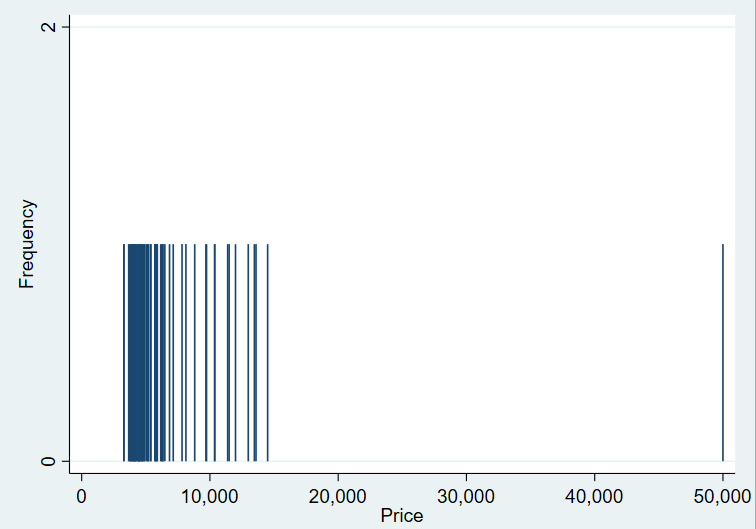
Method 5: Spike Plots
In order to create spike plots, go to Graphics > Distributional graphs > Spike plots and rootogram. Select the relevant variable name, in this case ‘Price’ and click ‘Ok’. Unlike with histograms where data is summed up in bins, spike plots show the individual spike of each value of a continuous variable. Spikes for data points that are clustered together can be concluded as not being outliers. Any spike at a significant distance from these clusters would suggest the presence of an outlier. In this case, a spike at 50,000 is seen in isolation.
Method 6: Z-Score
This method entails calculating the z-score of variables. If any of these values fall outside of three standard deviations from the mean (in this case, this mean would be zero since calculating z-scores involves standardizing), the corresponding observations will be treated as an outlier.
Z-scores can be generated by standardizing a variable using the following command – here we standardize the price variable:
egen stdprice = std(price)
The z-score for all observations falls under 1.5 with the exception of the observation where price takes the value of 50,000. The z-score in this case is 7.49.
Treating Outliers
Let’s now turn our attention to treating outliers once they are identified. There are a few things that can be done:
Keeping the Outliers
We can simply choose to leave outliers as they are. Instead of removing them, we can perhaps use some other non-parametric tests that are not affected by the outliers. For example, let’s assume the average height for a majority of a sample is 5.5 feet. But there might be an outlier individual who is 7 or 8 feet tall. We wouldn’t necessarily want to delete this observation either; we will keep the outlier.
Correct Data Entry Error
Sometimes outliers exist because there has been an error when entering the data. Perhaps, while coding the gender variable as 0 and 1, someone accidentally enters ‘11’ – this obviously is an outlier and needs to be corrected.
Winsorization
Winsorization refers to changing the value of an outlier to the nearest observation (that is not an outlier). In the current example, the nearest value of price to the outlier (50,000) is 14,500. We can replace the former with the latter. While it might be possible for a car to have such a high price, this single observation is not representative as far the automobile data is concerned. We can thus choose to winsorize it.

To winsorize data in Stata, we start by downloading a user-written command:
ssc install winsor2
This command replaces the outliers with the percentiles that we specify. A quick overview of the distribution of a variable can be obtained in tabular form using the detail option with the summarize command – it will return values at various percentiles.
sum price, detail
The winsor2 command can then be used as follows:
winsor2 price, replace cut(1 99)
This command replaces the outlier with the 1st and 99th percentile values. In this case, 50,000 happens to be the 99th percentile so no change is made. Try tweaking the cut off as follows:
winsor2 price, replace cut(5 95)
We should now expect outliers on the higher extreme to be replaced with the 95th percentile value, 13,466. Stata, however, also changes the three values before 50,000 to this new value. It would thus have been better to specify the cut of at the 97th or 98th percentile.
In summary, all values beyond the the 95th percentile were replaced by the value at the 95th percentile. If we were to implement the workings of this command manually, we would have written the command:
replace price = 13466 if price > 13466
Try changing your cut off values and notice how the data changes to get further understanding of how the command works.
Trimming
In this final method, we get rid of the outliers, for which we make use of the winsor2 command again. Here, we add the trim option.
winsor2 price, replace cut(5 95) trim
The outlier value is replaced with a missing value now.
Thank you
An excellent step-by-step explanation of identifying and addressing outliers. Thank you!